FRANK COVINO, LONG-TIME FRIEND AND MENTOR, HAS PASSED

Covino Portrait1P1070431PaintingWorkshopCovinoFrank4-2015

Dear Artists and Friends,

It is with ineffable sadness in our hearts, that I must report this news.  Our friend and long-time art teacher and mentor, Maestro Frank Covino, passed away suddenly on Tuesday, February 16, 2016, after being pronounced “cleared of cancer” just last week.

If I may use a bold simile, his loss feels like looking up at the mountains in Sugarbush, where Frank worked hard to build the home he loved, and seeing that the grandest of summits has disappeared from our sight.

Here is a note from his wife, Barbara Covino, that you will all want to read:

Subject: It is with a deep abiding sorrow in my heart that I write this letter…forgive the delay but it has taken time to believe this is true…

Beloved friends and family , one and all,

After two days of profoundest shock, and countless tears I realize I must write you.  It is with a heavy, heavy heart that i must inform you that dear Frank has passed away unexpectedly on Tuesday night, February 16th.  It was quick and he did not suffer–a death we would all prefer–but he had been progressing so well, it was a gut-wrenching shock that still is unbelievable.

I truly cannot imagine a world, or a life without him…32 years of happiness and adventure.  Life was never boring with him!!! What an amazing talent, a brilliant man with a wealth of knowledge, a gentle and sensitive man who had to excel in everything he did, and was thus an inspiration to all who knew him.  He encouraged others to strive for excellence and to believe in themselves, giving them the tools to create a positive reality in their lives, whether it be art or health.  We all can repeat that golden maxim: IT’S NEVER TOO LATE TO AMELIORATE! Wise encouraging words, those.

But he was more than the sum of his parts; he was a genuine force of nature, a real Renaissance man, but above all else, he had a kind heart and a very great soul. We all loved him so; there will never be another Frank.  But I know it is now time for each and every one of us who was touched by his life, to take that spark and pass it on.  He gave us wings and it is time for us to fly…Make him proud!!!

I am too choked up to continue writing.  God Bless each and every one of you who had a place in his heart…family, friends, students….He loved you all sincerely and without guile….

We are in the process of collaborating with the family and planning both a smaller family funeral as well as a larger set of celebrations of his life and legacy open to all who loved him–one in Vermont and one on Long island.  As soon as the Covino south clan and Mark and Jennifer and I hammer out the details, I will email you all, soon as can be done.

We are going to give that wonderful man a send off he won’t soon forget!!!

Love and blessings , Barbara Covino

PS: PLEASE FORWARD THIS to everyone you can think of. It has grown into a cast of hundreds, and forgive the delay but it has taken time to believe this is true.

AN AMAZING ALTARPIECE, MOSAIC, AND WOODEN SCULPTURE

Even though they didn’t fit into my “paintings” category, I just had to show you three unique pieces I saw at the Getty and de Young museums.  The altarpiece room was exceptionally dark, so the following photos are the best I could get. Click on the text photos to make them readable.

The first is the Ecco Homo Altarpiece by Maerten van Heemskerck (1498-1574), Netherlands. About the artist:

HeemskerckNetherlands

About the Ecco Homo Altarpiece:

EccoHomo

EccoHomoAltarpieceHeemskerck

EccoHomo1

EccoHomoRevealed

The central panel:

EccoHomo2

About fading and discoloration:

EccoHomoFadedPaints

The reds:

RedsDiscoloration

The blues:

BluesDiscolorations

The greens:

GreensDiscoloration

When the altarpiece is closed, the following two figures are what you see:

EccoHomoStMargaretVerso

StMargaretOfAntiochHeemskerck

EccoHomoStJohnVerso

StJohnTheEvangelistHeemskerck

Here, you can see another exceptionally worthy altarpiece, the Ghent Altarpiece by Hubert and Jan van Eyck with extreme closeup, X-radiography, infrared macrophotography, infrared reflectography and so much more, at http://closertovaneyck.kikirpa.be/#home/sub=altarpiece

Next, look at the amazing artistry and detail of this mosaic:

PortraitOfCamilloRospigliosi

Portrait of Camillo Rospigliosi, about 1630-40, glass mosaic, by Giovanni Battista Calandra, Italian, 1586-1644

“This mosaic depicts Rospigliosi, brother of Pope Clement IX and Knight Commander of the Order of Santo Stefano, whose cross insignia he wears. Because mosaics are composed of many pieces of small stones, ceramic, or glass tiles, they preserve their color more permanently than paintings–thus making them an appropriate medium for the commemorative art of portraiture. Like the painters of this period, Calandra rendered his subjects with great realism.”

Here are some closeups:

CloseupOfCamilloRospigliosi

CloseupOfCamilloRospigliosi-1

CloseupOfCamilloRospigliosi-2

And finally, this sculpture is made of wood, believe it or not. It is called Saint Gines de La Jara, about 1692, by sculptor Luisa Roldán (aka La Roldana), Spanish, 1650-1706. The one who painted the sculpture (aka polychromer) is Tomas de Los Arcos, Spanish, born 1661.

P1070014

It was so tall that this upward shot was the best I could get. See the hands?

P1070011

And the feet?

P1070013

“Saint Ginés de La Jara exemplifies La Roldana’s artistic talents. The body is relatively straight and self-possessed, while the arms stretch outward. La Roldana masterfully worked the hands and feet, sculpting the veins and bones so that they dramatically push against the taut skin. The painting by her brother-in-law, Tomás de Los Arcos, enhances the carving. The statue displays the realistic expression found in Spanish religious imagery made for churches and convents in the second half of the 1600s.”

Note: All text in quotes is taken from the Getty or de Young museum placards posted beside paintings.

DUTCH? FLEMISH? MORE DUTCH PAINTINGS

In my feeble attempt to clarify the impossible, a side note is in order here as to why some of these “Golden Age” painters are noted as being “Flemish” as opposed to “Dutch.” There was an area called Flanders just prior to 1800 (whose southern borders were nebulous) that encompassed parts of Belgium, the Netherlands, and France. Most of it became part of Belgium in 1830, but yet Flanders is still referred to as an autonomous area called the Flemish region with their own government including a congress. Ypres, Ghent, and Bruges are included in the area known as Flanders. To this day, some think of Brussels, Belgium as being in Flanders as opposed to Belgium. Also, they refer to part of the area as the Benelux Region (with it’s own flag) that encompasses Belgium, Netherlands and Luxembourg. This area was formed in 1944 to promote free trade between these three countries. I don’t think I would want to be involved in a property rights dispute here. Confusing as all that seems, it must be clear to the millions that live there, although they are in a bit of political upheaval at the moment. If anyone can help describe it more clearly, please jump in and comment. Anyway, here are the last of the Dutch Golden Age paintings that I photographed at the Getty and the de Young:

JanSteenBathshebaAftereTheBath1

Bathsheba after the Bath, About 1665-70, Jan Steen, Dutch, 1626-1679, oil on panel

“Depicted here is the moment from the biblical story when Bathsheba receives a letter of summons from King David. In Steen’s interpretation, Bathsheba is a temptress rather than the innocent victim of the king’s passion. Unconcerned by her partial nudity, she stares brazenly at the viewer while her maidservant cuts her toenails. The shoe in the right foreground is a symbol of wantonness; the fountain probably alludes to fertility.”

JanSteenTheDrawingLesson2

The Drawing Lesson, About 1665, Jan Steen, oil on panel

“In a studio filled with artistic props, a painter corrects a drawing by one of his two pupils, a young boy and a teenage girl. The cool, clear light from the main window of this idealized interior reveals an array of materials and precisely rendered textures, from plaster to satin, fur, glass, and bone. Steen’s unusually refined technique suggests that this work was meant to celebrate the art of painting.”

JacobVanRuisdaelBridgeWithASluice

Bridge with a Sluice, About 1648-49, Jacob van Ruisdael, Dutch, 1628/29-1682, oil on panel

“Ruisdael’s ability to create complex, monumental images from humble motifs helps explain why he is considered one of the finest landscape painters of the 1600s. Here a rustic sluice, used to regulate water levels and irrigate farmland, is illuminated by a shaft of sunlight. Although the picture contains only one figure, evidence of human activity dominates the scene. Set against a background of productive pastureland, the sluice testifies to man’s continual struggle to control nature.”

JacobVanRuisdaelTwoWaterMillsAndAnOpenSluice

Two Water Mills and an Open Sluice, 1653, Jacob van Ruisdael, oil on canvas

JanVanHuysumVaseOfFlowers

Vase of Flowers, 1722, Jan van Huysum, Dutch, 1682-1749, oil on panel, 31 1/4 x 24

JanVanHuysumVaseOfFlowersCloseup

Vase of Flowers closeup

“In this work, flowers from all times of year–roses, anemones, hyacinths, and tulips, among others–have been painted directly from life. Van Huysum’s painstaking application of multiple layers of think oil glazes captures the brilliant colors and delicate textures of the petals. His vivid greens, however, were fugitive; here the leaves have faded to blue. Because he insisted on only painting each kind of flower while it was in season, it sometimes took the artist years to complete a picture.” http://www.getty.edu/art/gettyguide/artObjectDetails?artobj=817

JanVanHuysumFruitPiece1

Fruit Piece, 1722, Jan van Huysum, oil on panel, 31 1/4 x 24

JanVanHuysumFruitPieceCloseup

Fruit Piece closeup

“This lavish still life of fruit and flowers combines the lustrous realism of Dutch paitnings of the 1600s with the bright colors and sinuous rhythms characteristic of the Rococo style of the 1700s. The effect is lush and extravagantly varied–van Huysum deftly captured the translucence of overripe fruit, the weight of heavy blooms, the crisp surfaes of leaves, and the wiry tension of vines. The artist jealously guardedd his technical secrets, allowing no one to visit his studio.” http://www.getty.edu/art/gettyguide/artObjectDetails?artobj=818

Oh, if only we knew something about van Huysum’s working methods! We could learn so much from him. These paintings were affected by the skylights so that I had a very difficult time photographing them sans reflections.

Note: All text in quotes is taken from the Getty or de Young museum placards posted beside paintings.

FINISHING UP THE DUTCH/FLEMISH PHOTOS

Today, I am posting a lot of photos I took of Dutch/Flemish works that were on exhibit at the de Young and the Getty museums, beginning with Frans van Mieris the Elder (Dutch, 1635-1681). The first is Pictura (Allegory of Painting), 1661, oil on copper. This one was behind glass so please excuse the reflection.

The caption reads, “The allegorical figure shown here represents the art of painting. She holds a palette,, brushes, and a small plaster sculpture. The mask on a chain may refer to art’s deceptive illusions. Instead of being hung on a wall, a painting of this size, like a precious object, would have been kept in a cabinet for close examination. ”

FransVanMierisOilCopperPicturaAllegoryOfPainting

FransVanMierisTheDoctor'sVisit

The Doctor’s Visit, 1667, oil on panel

“Van Mieris was well known for his finely painted works. Here a young woman faints as a doctor examines a vial of her urine. The ostentatious doctor, whose extravagant clothes suggest that he is a quack, was a stock figure in contemporary theater. The erotic painting over the fireplace hints that the woman suffers from lovesickness, while the burning ribbon held by the crying girl was seen at the time as a sign of pregnancy.”

FransVanMierisAYoungWomanFeedingAParrot

A Young Woman Feeding a Parrot, 1663, oil on panel

Painted in the same year as Vermeer‘s “A Woman Holding a Balance,” Van Mieris’ elegant scene was one of the most celebrated and most copied compositions of the time.

The following two Frans Hals paintings are quite large–larger than life.

HalsLucasDeClercque

Lucas de Clercq, Dutch, about 1635, Frans Hals, oil on canvas, 49 13/16 x 36 5/8

HalsFeynaVanSteenkiste

Feyna van Steenkiste, Dutch, about 1635, Frans Hals, oil on canvas, 48 7/16 x 36 5/8

HalsFeynaVanSteenkisteHandsCloseup

Closeup of Feyna’s hands

These two paintings came to the Getty as part of the conservation partnership program. For information on the restoration and removal of old varnish on these two paintings as well as stories about Lucas and Feyna’s lives and additional insights into Hals’ working methods, go to http://www.getty.edu/museum/conservation/partnerships/rijksmuseum_hals/index.html

This painting by Anthony van Dyke was huge. I include the first photo to give you an idea of just how large it was:

AnthonyVanDyckPortraitOfAgostinoPallavicini

AnthonyVanDyckPortraitOfAgostinoPallavicini2

Portrait of Agostino Pallavicini, About 1621, oil on canvas, Anthony van Dyck, Flemish, 1599-1641

“This portrait commemorates the sitter’s service as ambassador of the Republic of Genoa to the newly elected Pope Gregory XV. The artist depicted Agostino Pallavicini, the future head of the state of Genoa, in his sumptuous robes of office, seated before a billowing curtain that bears his family’s coat of arms. The elegant formality of the image exemplifies van Dyck’s highly influential approach to portraiture.”

Note: All text in quotes is taken from the Getty or de Young museum placards posted beside paintings.

VERMEER AT THE GETTY

VermeerWomanInBlue

Woman in Blue Reading a Letter, about 1663–64, Johannes Vermeer (Dutch, 1632–1675)

Oil on canvas (18 5/16 x 15 3/8 in.), Rijksmuseum, Amsterdam. On loan from the City of Amsterdam (A. van der Hoop Bequest).

VermeerWomanInBlueBeforeRestoration

Woman in Blue Reading a Letter,  before restoration.

Information from the Getty Museum, Los Angeles:

http://news.getty.edu/press-materials/press-releases/vermeer-masterpiece-woman-in-blue-reading-a-letter.htm

One of Johannes Vermeer’s most celebrated masterpieces, Woman in Blue Reading a Letter, “comes to the Getty on special loan from the Rijksmuseum in Amsterdam, which is completing ten years of extensive renovations this year. Since October 2012, Vermeer’s masterpiece has traveled the world as an “ambassador” for the Rijksmuseum’s remarkable collection of Dutch paintings. Following presentations in Shanghai and São Paulo, Los Angeles is the last and only North American stop on the painting’s tour, after which it will return to Amsterdam in time for the Rijksmuseum’s much-anticipated opening on April 13, 2013.”

“’This truly represents an extraordinary opportunity for Southern California,” explains Timothy Potts, director of the J. Paul Getty Museum. “Vermeer’s Woman in Blue is one of his greatest and most famous masterpieces. It has very rarely traveled outside of Amsterdam and this is the painting’s first visit to the West Coast. Vermeer’s paintings of women reading letters and engaged in other private, domestic activities have a unique intimacy and reality to them that can only be fully appreciated in the flesh. His finest works, like the Woman in Blue, have a magical immediacy that has never been rivaled.’”

“Praised as one of Vermeer’s most beautiful paintings, Woman in Blue Reading a Letter demonstrates the artist’s exceptional command of color, light, and perspective. Portraying a young woman absorbed in a letter, it exemplifies the artist’s ability to create innovative scenes of everyday life imbued with great emotional intensity.  The mystery of the painting makes it even more compelling— although it is most likely a love letter, we do not know who the letter is from, what it is about, or why the painting’s subject is so engrossed by the correspondence.”

“’This small but powerful painting is exquisitely nuanced, with a marvelously balanced composition and refined use of light that creates a soft, diffuse atmosphere,” suggests Anne Woollett, curator of paintings at the Getty Museum. “Vermeer’s extraordinary command of color is apparent here and visitors will surely be taken with the varied hues of blue that he used throughout the painting.’”

“Woman in Blue Reading a Letter was recently cleaned and studied in Amsterdam by the Rijksmuseum’s restoration department. Past treatments were rectified and the yellowed varnish was removed, reestablishing the legibility of the composition. Significantly, the treatment revealed Vermeer’s brilliant range of blue hues, visible in their remarkable intensity for the first time in generations, along with a subtle palette of taupes, yellows, ochres, and whites, which themselves have a bluish tint.”

“Technical studies of the painting, also done at the Rijksmuseum, have revealed that Vermeer made important adjustments to the composition while working on the painting. For example, he extended the left vertical edge of the map on the wall behind the woman toward the window, narrowing the field of white created by the wall. He also eliminated the flared shape of the back of the woman’s blue jacket, emphasizing her vertical presence. Both changes serve to focus the viewer’s attention on the female subject and her thoughts.”

I feel so fortunate to have seen this painting. It is a work of fine, delicate beauty that one must really see to fully appreciate.

Note: All text in quotes is taken from the Getty or de Young museum placards posted beside paintings.

REMBRANDT AT THE MUSEUM–NOT AN ALL FOOLS’ DAY JOKE

Here are more museum postings, which I will continue to do in order to give you the flavor of all we saw. Please keep in mind that there were many unavoidable light reflections, not only from the skylights and track lighting, but also from the surprising fact that many of the works were covered with glass; and no matter how good the museum quality of that glass, there were still added light aberrations in a few of the photos.

Today is Rembrandt’s day:

An Old Man in Military Costume, About 1630-31, Rembrandt Harmensz, van Rijn, Dutch, 1606-1669, Oil on panel

“This fantasy portrait belongs to the type known as a tronie, or a character study of a head. These pictures were created for sale on the open art market in Holland. Rembrandt frequently dressed the models for such portraits in fanciful costumes, as in the case of this man in military garb. The attire probably symbolizes Dutch fortitude and patriotism during the struggle for independence from Spain.”

RembrandtAnOldManInMilitaryCostume

The Abduction of Europa, 1632, Rembrandt Harmensz, van Rijn, Dutch, 1606-1669, Oil on panel (2 photos)

From the Getty:  “In the Metamorphoses , the ancient Roman poet Ovid told a story about the god Jupiter, who disguised himself as a white bull in order to seduce the princess Europa away from her companions and carry her across the sea to the distant land that would bear her name.

During his long career Rembrandt rarely painted mythological subjects. Here he conveys a narrative story through dramatic gesture and visual effects. Bewildered, Europa grasps the bull’s horn, digs her fingers into his neck, and turns back to look at her companions on the water’s edge. One young woman falls to the ground and raises her arms in alarm, dropping the flower garland intended for the bull’s neck into her lap, while her friend clasps her hands in consternation and watches helplessly. The carriage driver above rises to his feet and stares at the departing princess in horror. In the background, a city shrouded in mist extends along the horizon, perhaps serving as an allusion to the ancient city of Tyre as well as to contemporary Amsterdam.The dark thicket of trees to the right contrasts with the pink and blue regions of the sea and sky. Sunlight breaks through the clouds and reflects off the water, but the sky behind the trees is dark and foreboding.

A master of visual effects, Rembrandt took pleasure in describing the varied textures of sumptuous costumes and glittering gold highlights on the carriage and dresses.”

RembrandtTheAbductionOfEuropa

RembrandtTheAbductionOfEuropa

A Portrait of a Rabbi, About 1640-45, Rembrandt Harmensz, van Rijn, Dutch, 1606-1669, Oil on panel

“Rembrandt painted and drew numerous elderly male subjects in contemplation throughout his career. Here, strong light illuminates the man’s chest and face, which is energetically modeled with fine, textured brushstrokes. In contrast, the heavy folds of his gown and soft material of his hat are more loosely executed. Rembrandt was sensitive to Jewish tradition, and sought to capture its character through the representation of physical appearance and an internal spiritual state.”

RembrandtAPortraitOfARabbi

Portrait of a Girl Wearing a Gold Trimmed Cloak, 1632, Rembrandt Harmensz, van Rijn, Dutch, 1606-1669, Oil on panel

RembrandtPortraitOfAGirlWearingAGoldTrimmedCloakCropped

RembrandtCloseupPortraitOfAGirlWearingAGoldTrimmedCloak

And from the Getty http://www.getty.edu/art/installation_highlights/rembrandt.html:

Rembrandt Harmensz. van Rijn‘s Portrait of a Girl Wearing a Gold-Trimmed Cloak is on temporary view at the J. Paul Getty Museum at the Getty Center. The work, which has not been on public view since the 1970s, is on loan from a private collection in New York.

The sitter, an unknown woman, is richly dressed in the fanciful costume Rembrandt favored for biblical and mythological paintings. He scratched in the thick, wet paint to create the pleats of the subject’s white shirt, and rendered gold embroidery on her black gown with almost an abstract series of daubs. Light from the painting’s upper left creates atmosphere behind the sitter and strongly illuminates one side of her rounded face, along with the strand of pearls in her hair and one of her large pearl earrings.

Portrait of a Girl Wearing a Gold-Trimmed Cloak inspired the facial types of many of Rembrandt’s heroines in the early 1630s.

RembrandtPortraitOfAGirlWearingAGoldTrimmedCloakGettyImage

We’re off on a three-day job, so more photos in a few days….

Note: All text in quotes is taken from the Getty or de Young museum placards posted beside paintings.

PHOTOGRAPHS OF PAINTINGS AND CAMERA LENS DISTORTION

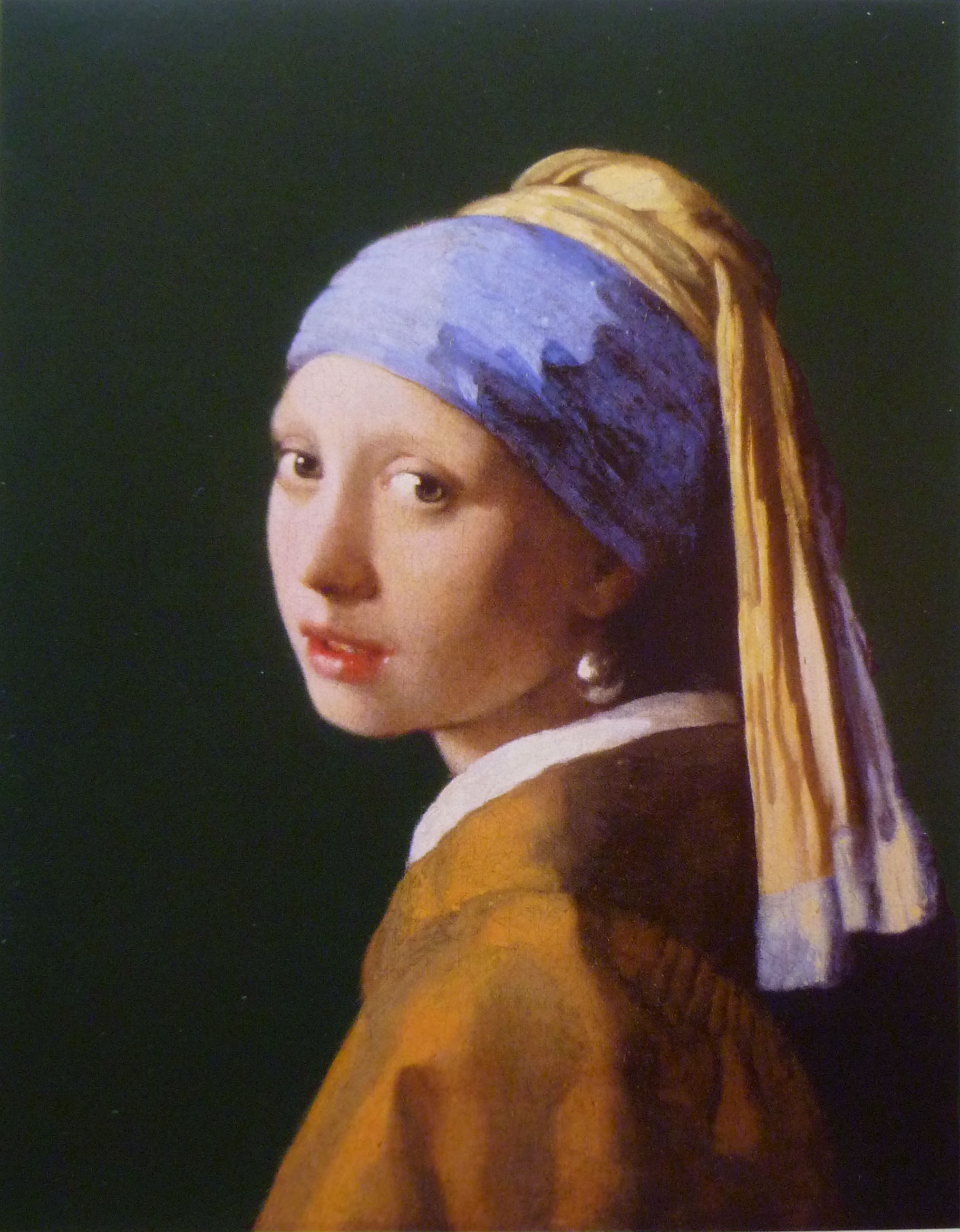
On our trip to the de Young and Getty museums last week, we took photos of paintings wherever possible. Of course I know it’s difficult for photography to capture the true essence of paintings and their myriad nuances of colors and values, but now I really know it. There aren’t many paintings like Girl with a Pearl Earring with which I have such intimacy, so arriving at a more complete understanding of this was a kind of epiphany for me.

During the painting’s latest restoration (1994), they discovered that Vermeer’s original background had a dark green enamel-like surface, accomplished through the application of glazes. However, the pigments available to him faded so much over 350 years, that the background looked blackish. This was corrected by the restorers and now, you can almost see the brushstrokes of the slightly sketchy transparent earthy-green glaze applied over the dark background underpainting.

Here is a photo of a high-quality postcard I bought, since the de Young did not allow photos of the special exhibit on loan from the Mauritshuis, particularly of the “Dutch Mona Lisa,” as she is called. They had her under guard at all times. Although a photo doesn’t pick up on the background color that well, can you see the slightest hint of  green?

VermeerGirlWithAPearlEarring

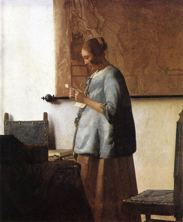
And here is a photo of the installation of Vermeer’s Woman in Blue Reading a Letter. Look at how the line curves where the floor and wall meet–this is an excellent example of barrel lens distortion:

vermeerinstall

And on the subject of picture taking, what photography can and cannot do has been discussed and written about ad infinitum, so I won’t go into it much here other than to say that if you are painting from photographs, a solid understanding of the way the camera plays tricks on you is essential. Certainly it matters the quality of camera and lens you use. However, beyond that, you must be aware of how all cameras visually distort images, and then make adjustments in the painting you create from these photos.

For example, make sure to adjust your composition to account for the camera’s barrel distortion (convex lines), pincushion distortion (concave lines),  flattening; and adjust for the fact that reds will “read” much darker in value than they really were when you took the photo. You can make these changes right on you drawing, or they can be adjusted in Photoshop first. We all love what cameras do for us, but be aware that edges will appear sharper and you will have to soften them in your painting to create recession in your work. As Frank Covino always teaches, “Don’t gray the shadows; gray the shadow’s edges.” You must soften edges where you want to round your images and make them appear recessional.

You can always tell when someone paints from photos and is unaware of flattening, for instance. The subject’s hands or feet will appear larger than they are in real life, and out of proportion with the rest of the figure, because hands or feet are typically in front of the figure. You must know this and make them proportionately smaller in your drawing to compensate and adjust sizes to their correct proportions. In other words, don’t make the hands as big as the head, even though they may appear that way in the photo.

You can find out more about the subject of camera distortion at this excellent site: http://www.kenrockwell.com/index.htm

Also, James Gurney at http://www.gurneyjourney.blogspot.com (the famous creator of Dinotopia) has provided an ongoing and wonderfully thorough exploration into how we humans see.

Something that struck me about these exhibits were that, no matter how much impasto the artist used, they began with the smoothest of canvases or boards. I looked up at various angles and marveled at how perfectly prepared they were. I can never seem to get mine that smooth but I continue to search for the trick to it.

Another thing that surprised me was Girl with a Pearl Earring‘s eye color; they are not light golden brown, or blue, or green, or gray. They are gray-blue with the absolute slightest hint of light golden brown, so difficult to describe. I stood there trying to figure out how he accomplished that and if I were trying to duplicate that color without causing the eyes to become greenish, I would paint them gray-blue first, let them dry completely, and then ever so gently, glaze just a small part of the reflected light area of the iris with a golden brown glaze. I still can’t imagine how Vermeer really did it, but that would be how I would approach it.

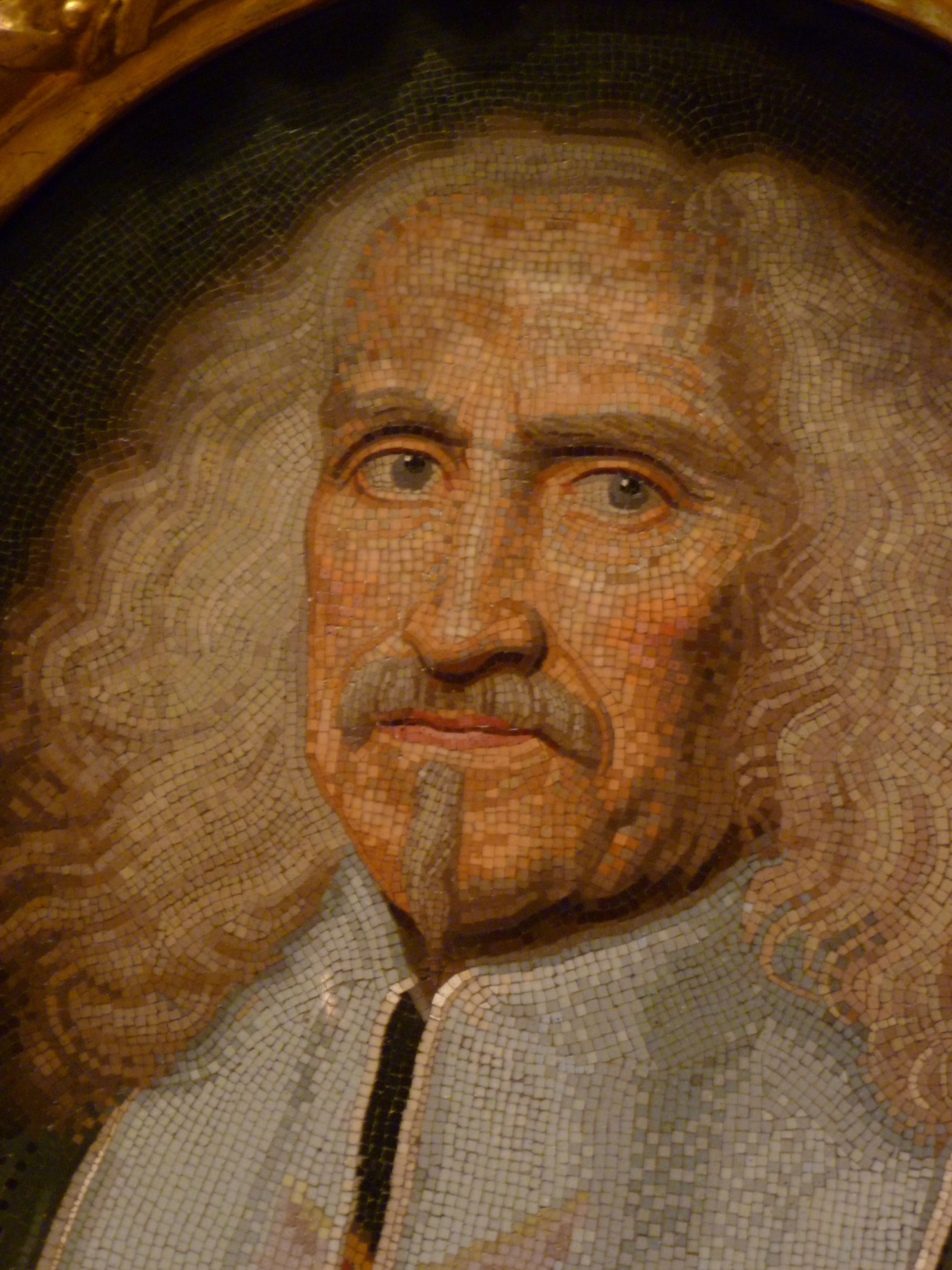
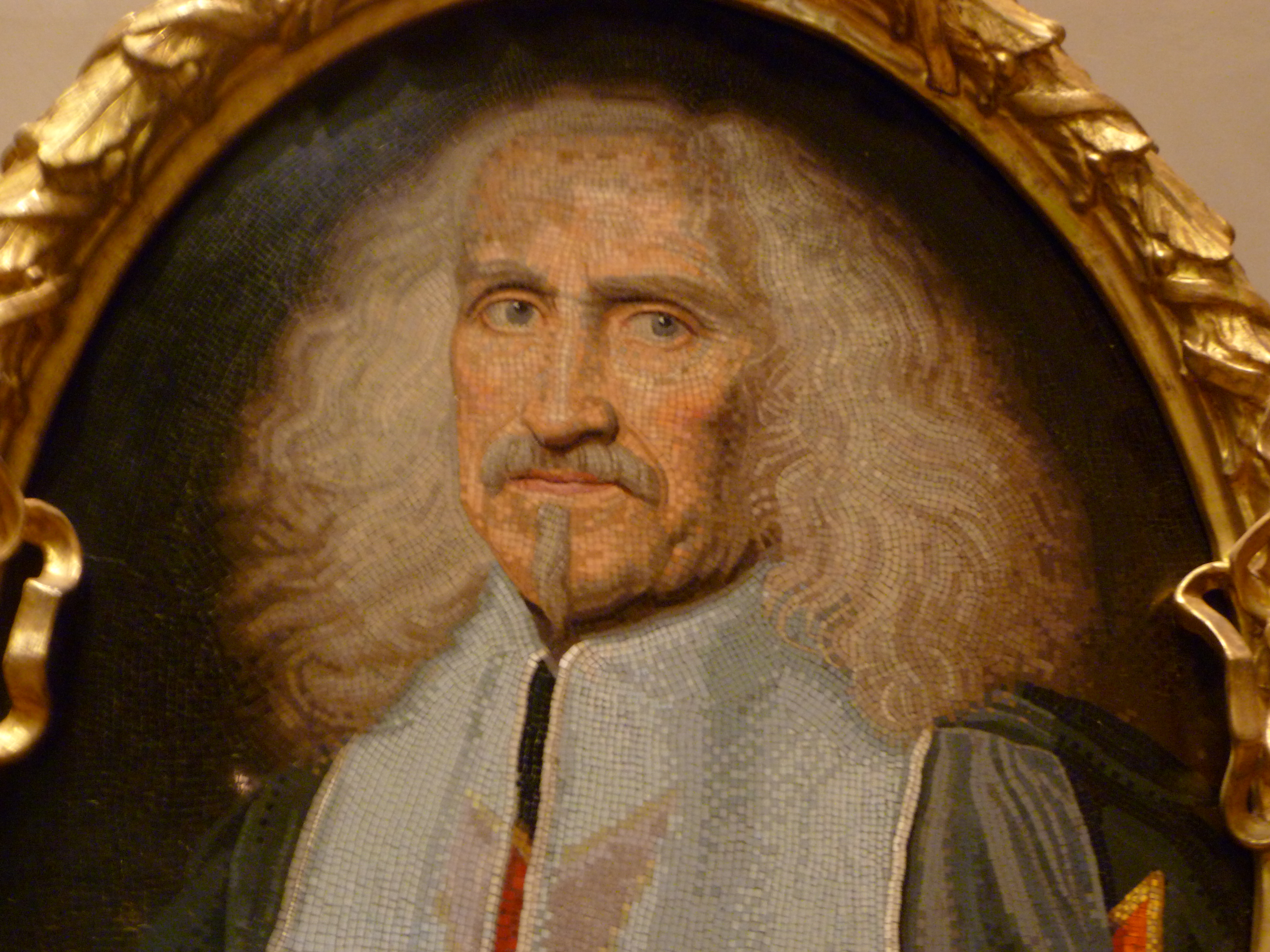
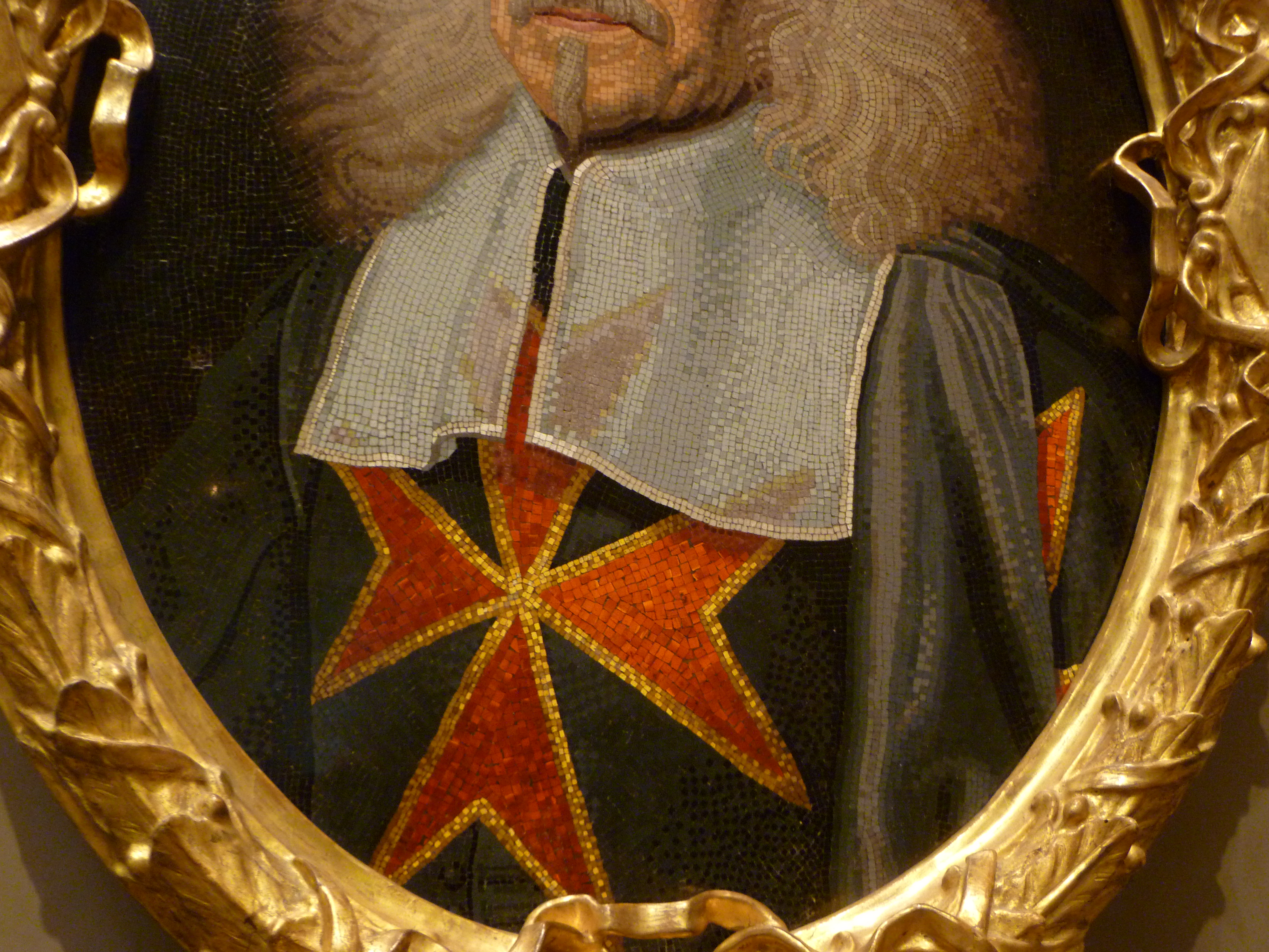
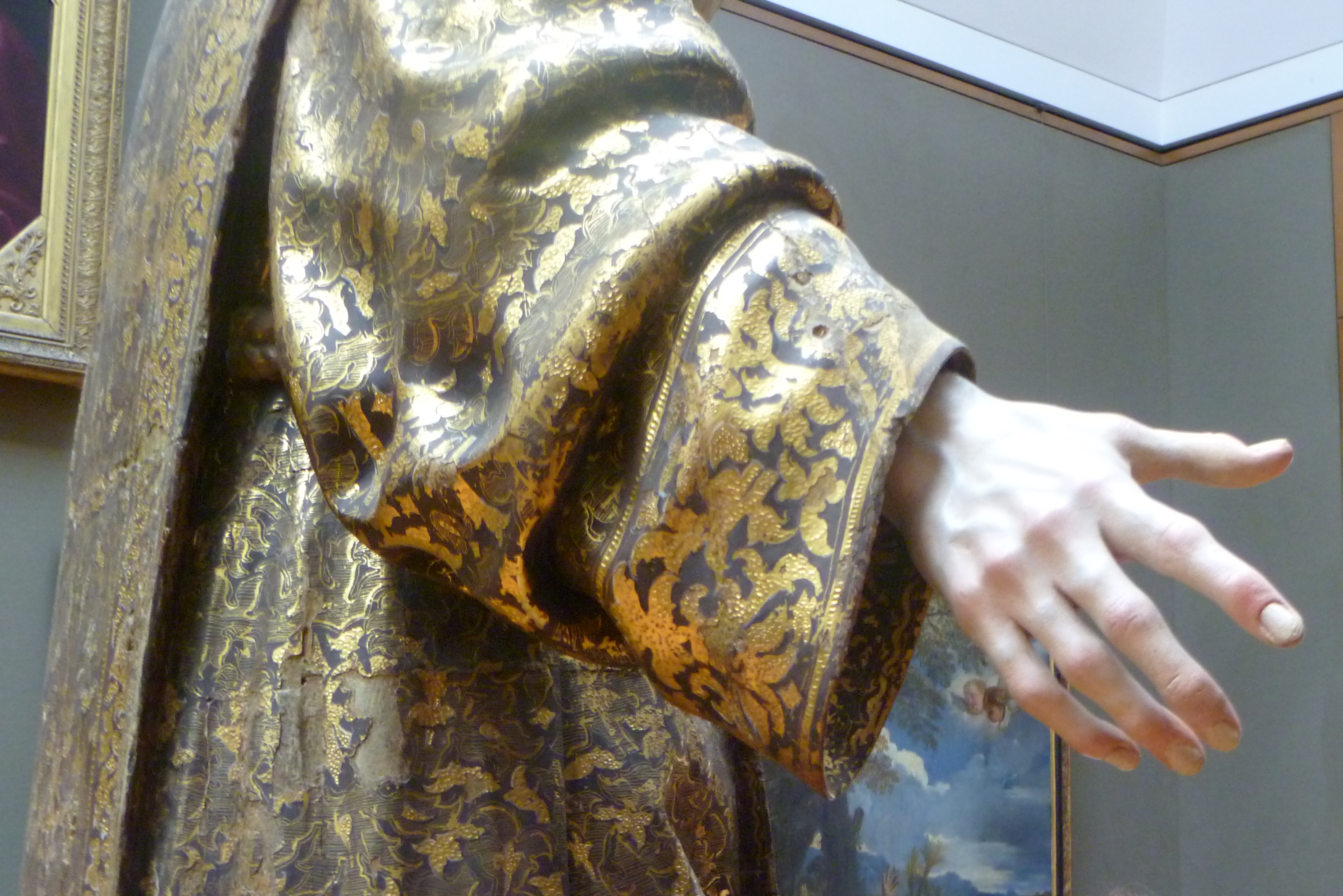
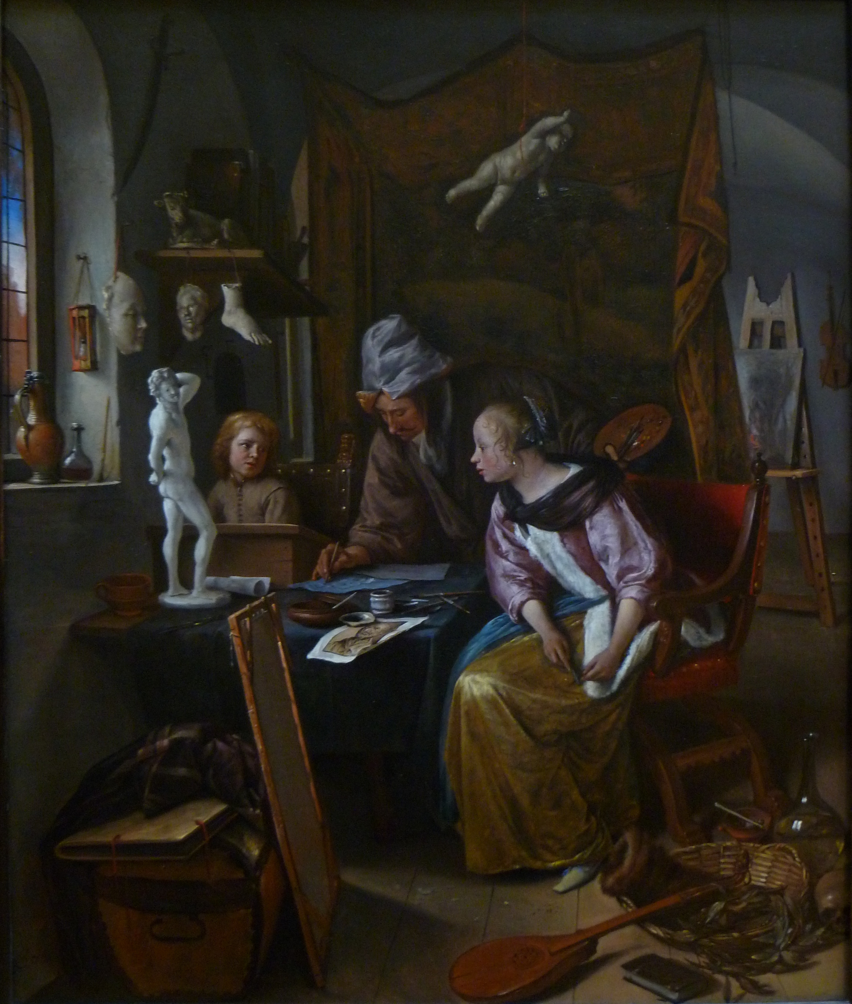
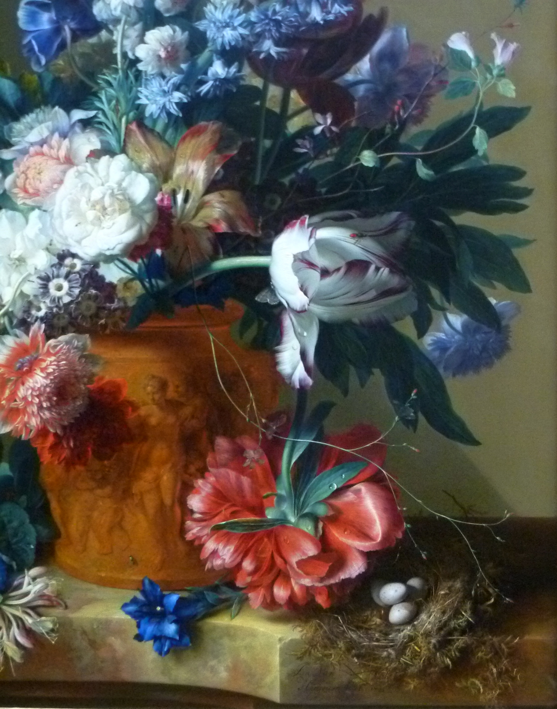
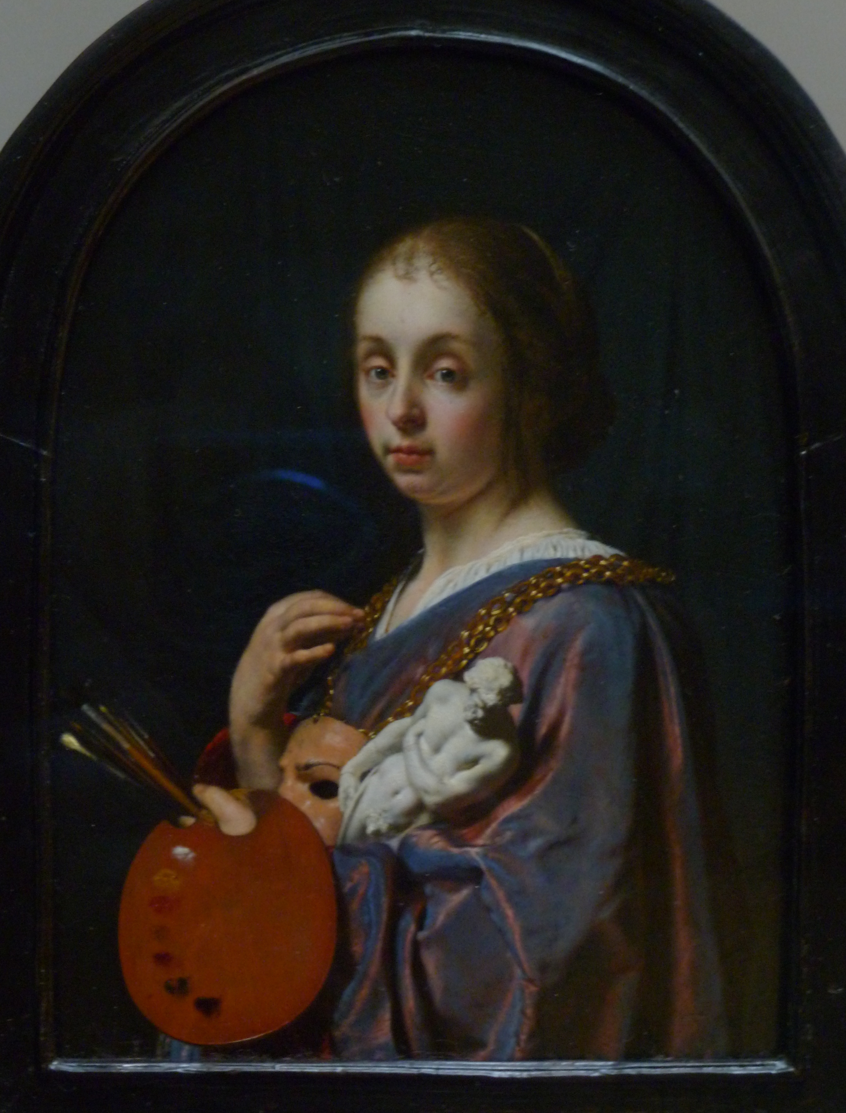
Below are some other photos (including 2 closeups) I took that you might enjoy:

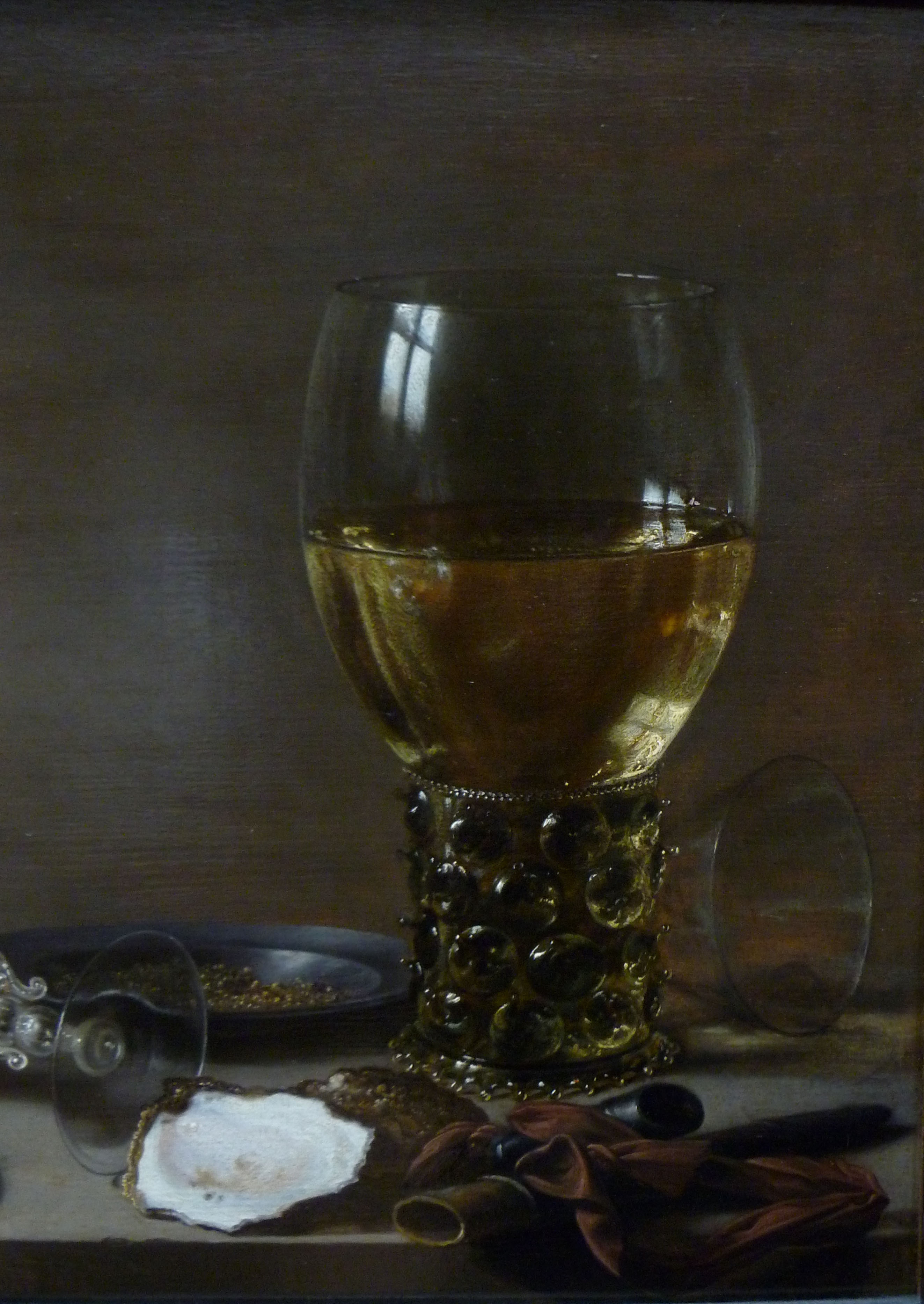
A Banquet Piece, About 1630, Pieter Claesz, Dutch, 1596/97-1660, Oil on panel

“A shaft of light from an unseen window poetically illuminates the textures and surfaces of a few objects on a stone ledge. This type of still life, known as a “monochrome banquet piece” for its harmonious though limited palette of browns and grays, was an artful invention intended to astonish the viewer with its beauty rather than a portrayal of an actual meal. Imported items such as a peeled lemon and the overturned Venetian-style glass contrast with local oysters and the monumental Dutch drinking glass with a textured stem. Claesz’s nuanced rendering reveals his interest in optical effects, such as the reflected windowpanes and the fall of light across the luminous lemon rind.”  de Young Museum

PieterClaeszTheBanquetPiece

PieterClaeszABanquetPieceCloseup1

PieterClaeszABanquetPieceCloseup

Mars and Venus Surprised by Vulcan, About 1606-10, Joachim Wtewael, Dutch, 1566-1638, Oil on copper

“Here the blacksmith god Vulcan pulls back the fine metal net in which he has trapped his wife, Venus, and her lover, Mars, exposing them to the laughter of their fellow gods. Like other Mannerist painters, Wtewael delighted in complexity and paradox. In this work he presents heroic figures on a tiny scale and Olympian gods in a compromising situation.”

JoachimWte

I had to take this photo through a glass case. I have been experimenting with painting on copper as many of the Old Masters did so, and saw the paintings on copper exhibit at the Phoenix Art Museum many years ago. They are exquisite to this day, with no craquelure. Experts attribute this to the fact that copper expands and contracts at approximately the same rate and temperature as does traditional oil paint.

Note: All text in quotes is taken from the Getty or de Young museum placards posted beside paintings.