WORTH REPEATING

This subject was addressed a long time ago, but it is so critically important that it bears repeating. Of course, it’s about values because, without a thorough understanding of them, you cannot create significant paintings.

Many teachers assume that we all know what “value” in paintings means, so they don’t really elaborate and tell us HOW to see them. The concept is easy to understand when we’re talking about a greyscale, but extrapolate that to color, especially the various colors juxtaposed together to make a painting, and the values concept becomes murky.

You can make an entire painting a monochromatic green or even pink and, as long as those pinks have correct values, your painting will “read” and make sense to the viewer no matter what color you make it. Value is simply how dark or how light that color is.

Yes, but so what? Where’s the “how?” Well, first you have to learn to squint enough at something until the color disappears and you are left with a percentage of light. What amount do you see? Make your own value scale and go around your house placing it next to various objects; squint to make the color disappear so that you can just see the value of the object and not the color. This is a great way to train your eye.

Here is a value scale you can print, showing values 1-9 with the addition of black (which is the absence of light) and white. The lowest value is 1, or 10 % light; the next is 2, or 20% light and so on, up to value 9 at 90%, with white being 100% light:

value scale

When making a painting, values aren’t actual light, of course, but values create the illusion of dark and light in varying degrees (shadows and highlights). Value deals with the lightness or darkness of a color.

Here is part of Bouguereau’s Vendangeuse (The Grape Picker) in color:
Vendangeuse (The Grape Picker)BouguereauCropped
And here it is in greyscale, showing just the range of lights and darks (aka “values”):

Vendangeuse (The Grape Picker)BouguereauGrayscale

And here is the pink version:

Vendangeuse (The Grape Picker)BouguereauGrayscale

So, even in pink values, we still see the little girl, instead of a Botox Babe.

When we do a value-scale underpainting, we are separating the problems of seeing values in one hue vs. seeing those values in juxtapositions of many colors (hues). This makes the painting much easier to execute, and more accurate, because now you have a process.

And that’s why I say you must know how to see value because value analysis and then value duplication is the basis of all perception. It is the common denominator for the replication of all things, whether landscapes, still lifes, or portraits.

Follow my blog to get the latest post sent to you.

All the best,

Marsha


PART 7, CLASSICAL ACADEMIC APPROACH, MIXING VERDACCIO

Before you begin your verdaccio underpainting, make sure you have completed everything you want to accomplish with India ink, charcoal, and gesso and/or gelatin in bas relief, so that your rendering looks as perfect as it can.  This functions as your value map for the underpainting, and if it is perfect, nearly everything at Value 5 and under can be quickly glazed, rather than painted.  Of course, the need for the perfect underpainting is that glazes are transparent, and everything will show through!

Look closely at the enlarged version of this drawing; can you see the areas where it seems to be especially white? Those are the places where, if you could run your fingers over the board, you feel the bas relief of the gesso that has been built up only in the areas you want to advance, to give the painting extra dimension.  Pretend you are a sculptor and pay special attention to areas like jewelry, headwear, the forehead, nose bone and tip, shoulders near the viewer, lower lip,  muscle structure, illuminated areas of dark garments, fabric folds that are closest to the viewer, and anything else you want to advance.  Make sure you smooth those built up edges so they blend smoothly into the board surface–you don’t want them looking pasted on.  You should not see the physical edges of the build up:

P1060404

P1060407

Mixing verdaccio in nine values is the next step. Here is where you will make your life so-o-o much easier if you have purchased Frank Covino’s Controlled Palette.

PaletteFront

Before mixing any paint on the Controlled Palette, coat it lightly with olive oil.

To mix verdaccio:

*Put 2, 8″ strips of chromium oxide green on Value 2
*Put 1, 8″ strip of mars black on Value 2
(= 3 strips total on Value 2)
Mix together thoroughly for a “Value 2 verdaccio.”
Value 1 is comprised of equal parts of Value 2 with Mars Black.
Values 3 – 9 are made by the addition of Flake White to Value 2, then 3, etc. (aka a “color string”).

Then cover it with Saran Wrap (the most non-porous wrap in my tests) and put it in the freezer until you’re ready to paint. Even better is to buy multiples of the three colors and some empty tubes, and tube your mixtures. That way, you won’t have to mix it again for a year or more.

Follow my blog to get the latest post sent to you.

All the best,

Marsha

P. S.  Just a note to let you know of an upcoming workshop

Hello, readers. The Arizona Renaissance Art Guild is hosting a one-week workshop with Maestro Frank Covino, art teacher extraordinaire. If you will be in the Phoenix area on April 6-10, 2015, we would like to invite you to attend and make some new painting friends.  The cost for the week is $695.  Respond to this post if you are interested.  We still have two spaces available.

PART 6, CLASSICAL ACADEMIC APPROACH, CHARCOAL DRAWING AND INDIA INK

Kind Readers,

My sincerest apologies for the extended hiatus since my last post. There has been a long illness in my family that required my full attention, but gratefully, the outcome was positive. Thanks to some dear art friends inspiring me today to start posting again, I am doing this one especially for them. I’ll try to make it up to you all in this post by adding additional pictures of the process for you to at least see where we’re going. I’ll comment on them as needed in later posts. Feel free to posit your questions or comments as well.

A few more points to make about handling the marble gesso before we go on with the process~~Remember that you must smooth the edges of each successive application of gesso either with your finger while it’s wet, or with  sandpaper (about 100 grit) after it’s dry.  It is easiest to do it with your finger, followed by the sandpaper only if necessary.  Some illuminated areas you may want to sculpt, in addition to those mentioned in Part 5, are clothing (especially folds) , the nose bridge and tip, the forehead, the forward shoulder, the forward knee, and the part of the lower lip in the light.

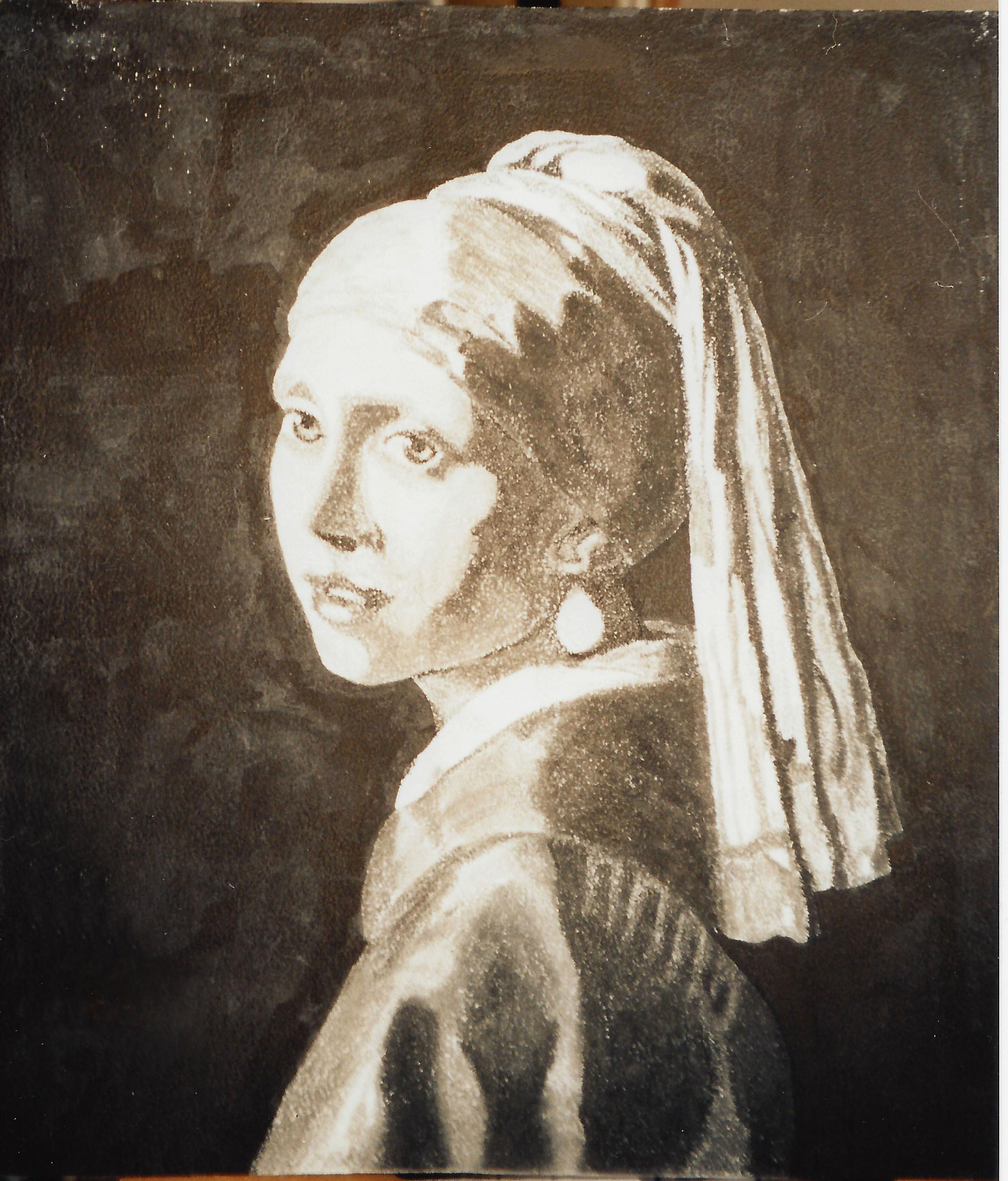
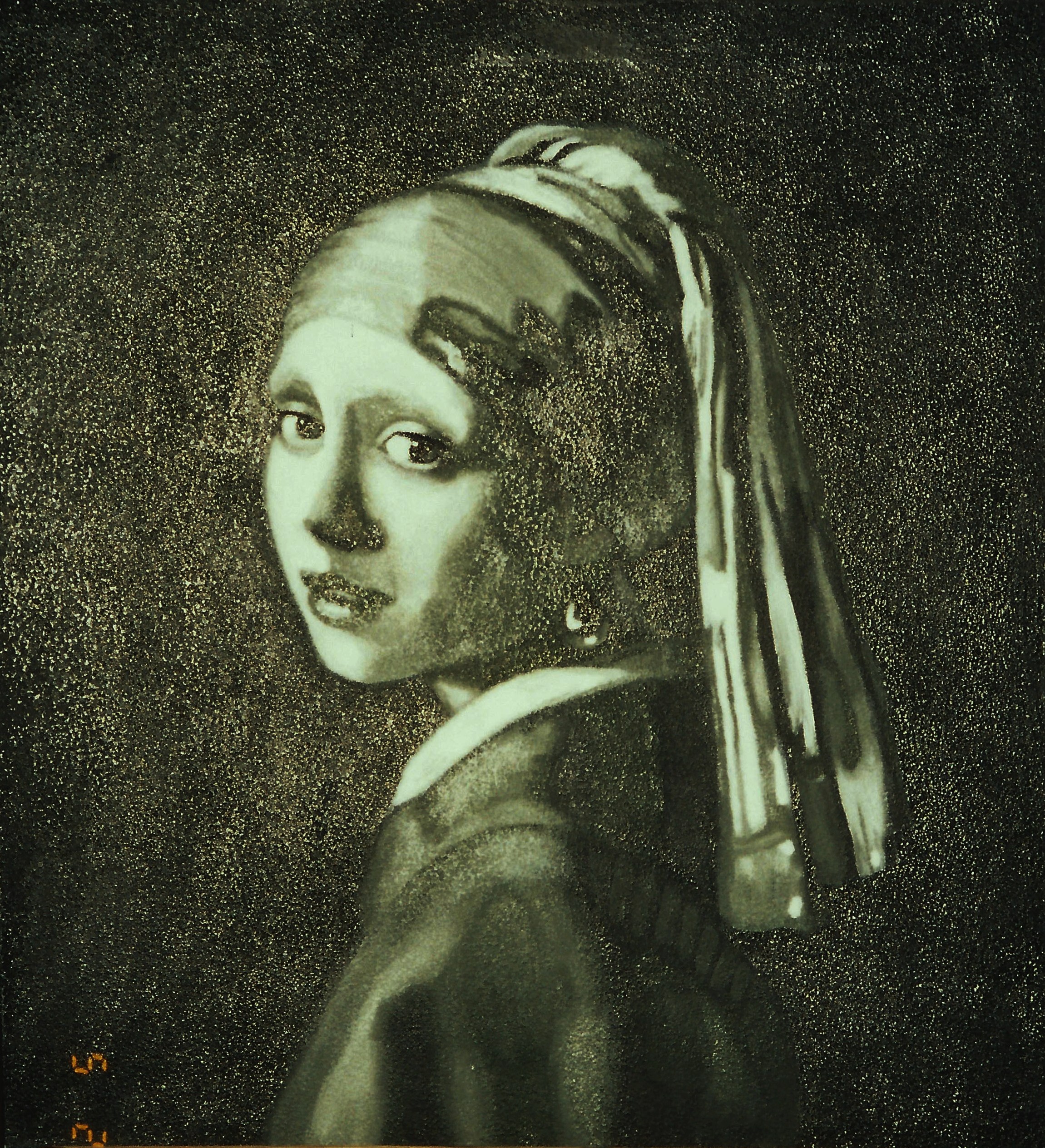
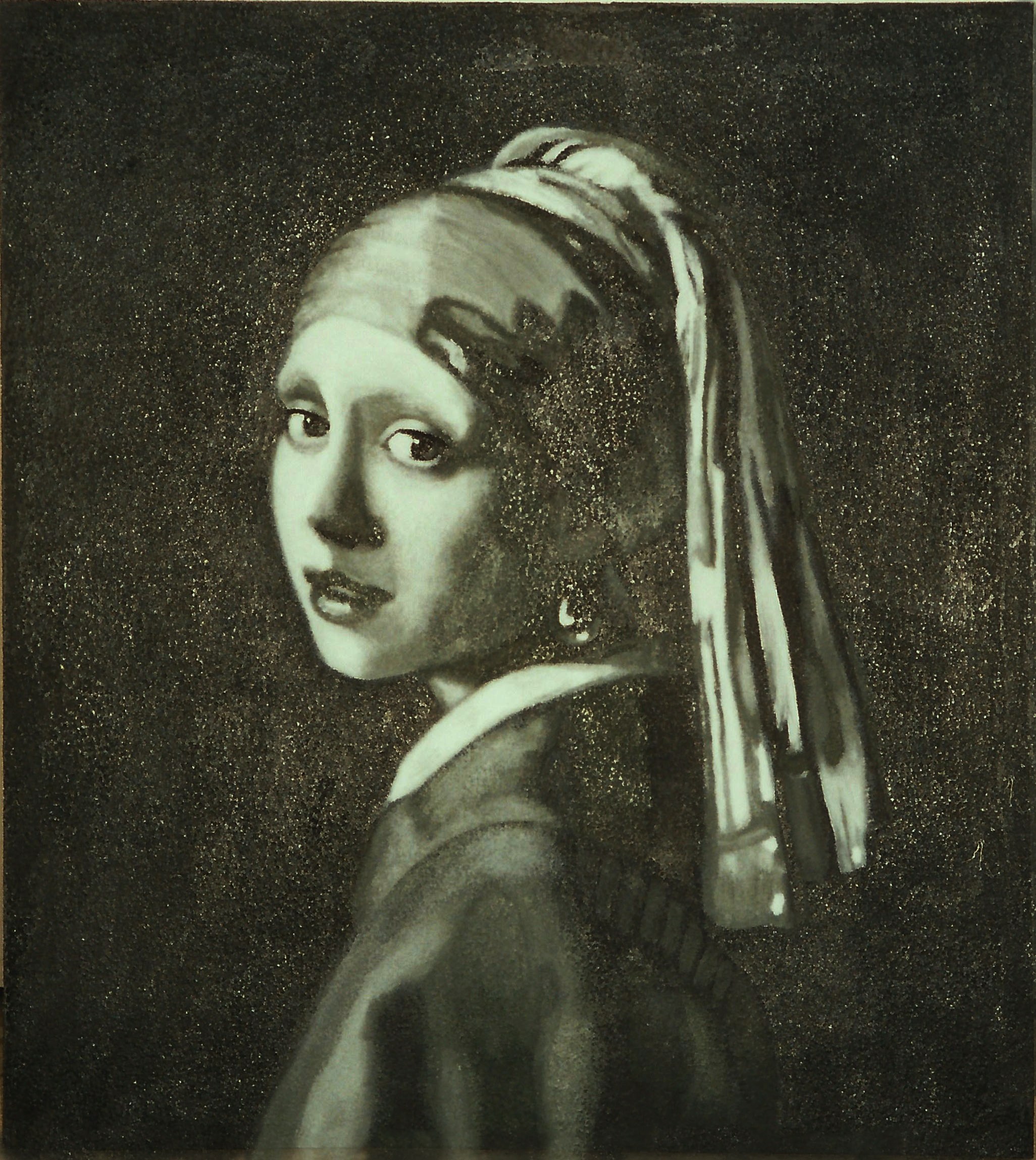
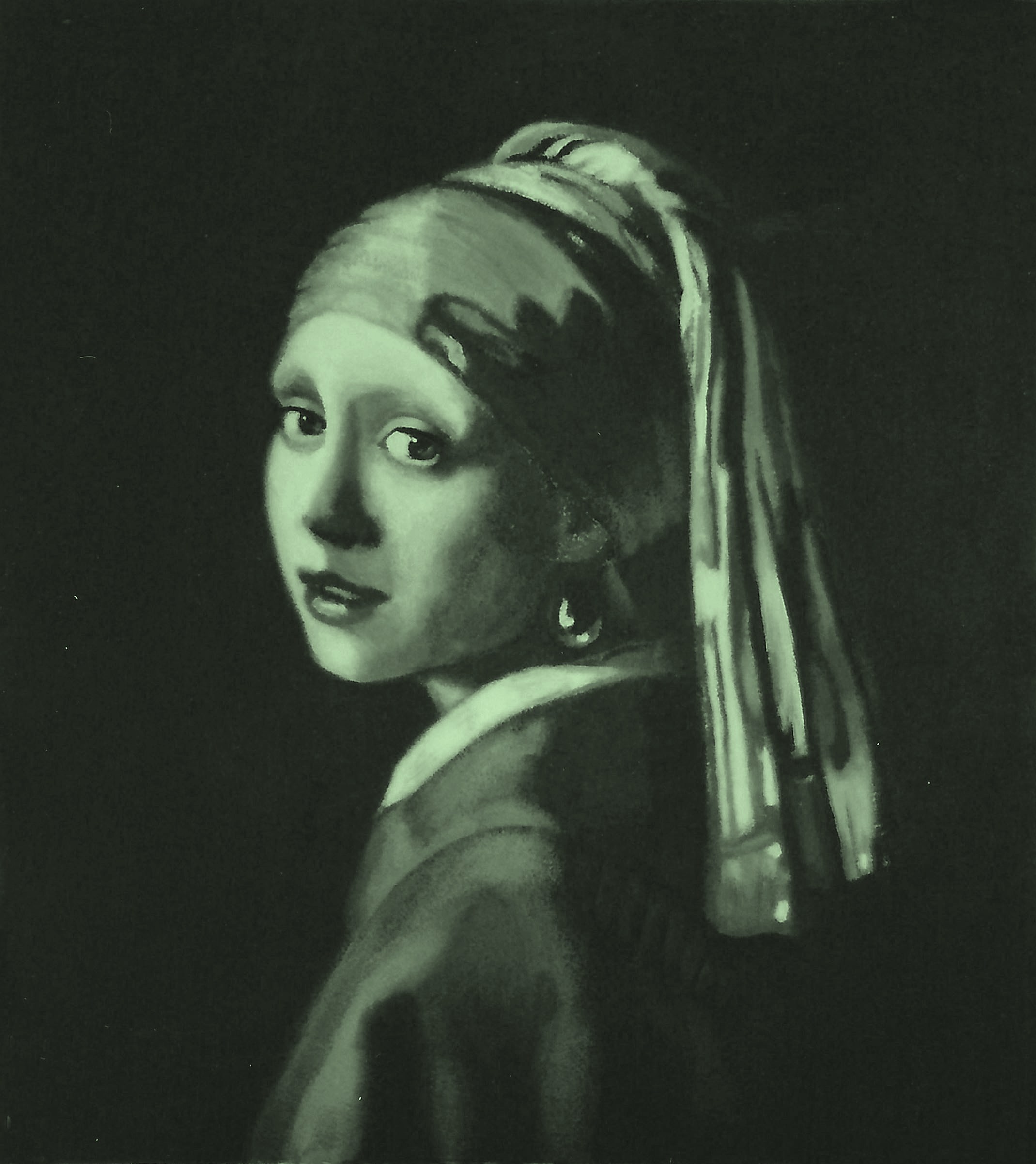
At this stage, remove the gridded acetate cartoon, and render a complete charcoal study by referring to the grayscale printout of the artwork reference. It’s best to start with the easiest squares or triangles, piece by piece, then progress to the others as you gain more confidence.  Use a tortillion to really blend and push the charcoal into the gessoed surface.  You can always lay the grid back on to check your drawing if you lose your place or make a mistake.  Repair mistakes on your drawing with a kneaded eraser, or scrape it carefully with an exacto knife or single-edged razor blade.  Periodically, take the drawing outside and spray it with fixative as you progress and are sure it’s correct.  As you continue with the rendering, keep asking yourself, “What value is it on my reference?”  Then place that value on your surface.  If the values are right, it will look like the form when you’re finished.

PaintingProcessStep3

PaintingProcessStep4

PaintingProcessStep5

When your drawing is complete, take it outside with a final coat of fixative, sprayed rather liberally. Be careful with this stuff–it’s toxic (see the label).  The photo below shows the wet fixative reflecting on the lens.  At this point, put the fixative away.  It will not be used again for the duration of this painting and, for the sake of archivability, you do not want to accidentally mix it up with the retouch varnish.

PaintingProcessStep6

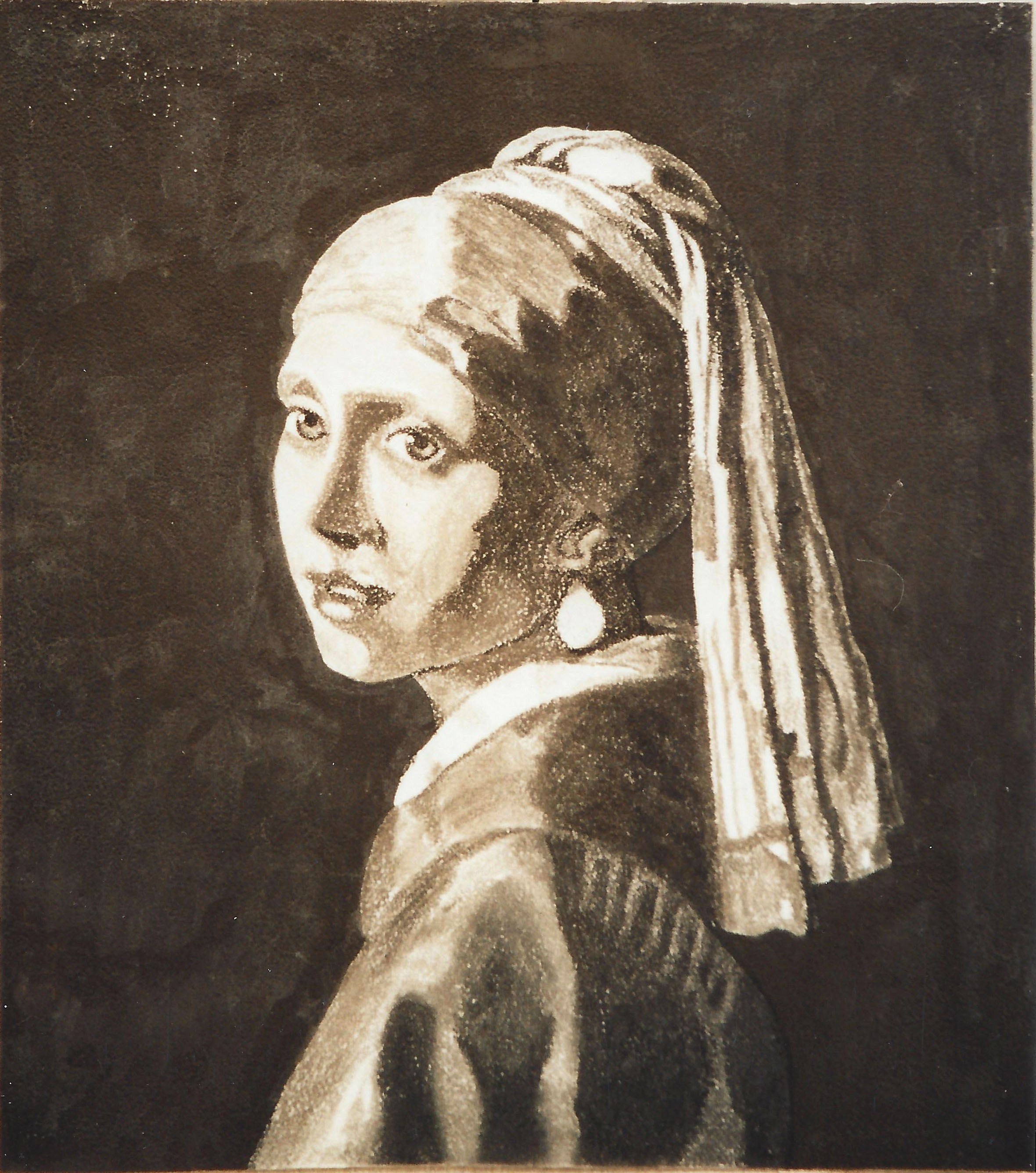
As far as India ink is concerned, inking can be done at any stage of the drawing.  I personally like to do it after I have applied the gesso or gelatin and have refined my cartoon into a full-value detailed charcoal drawing.  Use a very fine brush and keep some water handy.  It’s very difficult to remove dried India ink, and it dries very quickly.  Or, if you prefer, you can use the greyscale prefilled Faber-Castell Pitt brand India ink brush pens.

For example, in the charcoal drawing above, I have inked the entire background, the edge of the upper eyelid, the edge of the iris, the deepest recesses of the nose hole, the crease of the eyelid, and the pupils of the eye.  Ink only the areas that are either black, or value 1.

Regarding the pupils, always make sure that the one farthest from the viewer is slightly lighter than the closest one.  Even though the naked eye cannot really see this difference, you must nevertheless paint with aerial perspective rules in mind, whether it’s visible in the photo or not.  Aerial perspective rules say that dark-valued objects become lighter and grayer in recession.  Thus, the pupil farthest from the viewer will be ever-so-slightly lighter.  The converse rule is that light-valued objects appear darker and grayer in recession.  Keep these rules in mind with any painting because you cannot trust what you see in the photograph.

Some other areas to consider inking are the center edge of the lower lip, where the lower lid touches the iris, and the very thin line between the lips.

When inking, refer to the grayscale printout of the Old Master artwork you are duplicating.  Ask yourself, “Where are the black areas located on this painting?”  As you identify them, no matter how small, that’s where you put ink.  Ink everything that is receiving no light.  Forget what object you are painting and just look for values, remembering to refer to the photo and not your acetate sketch.

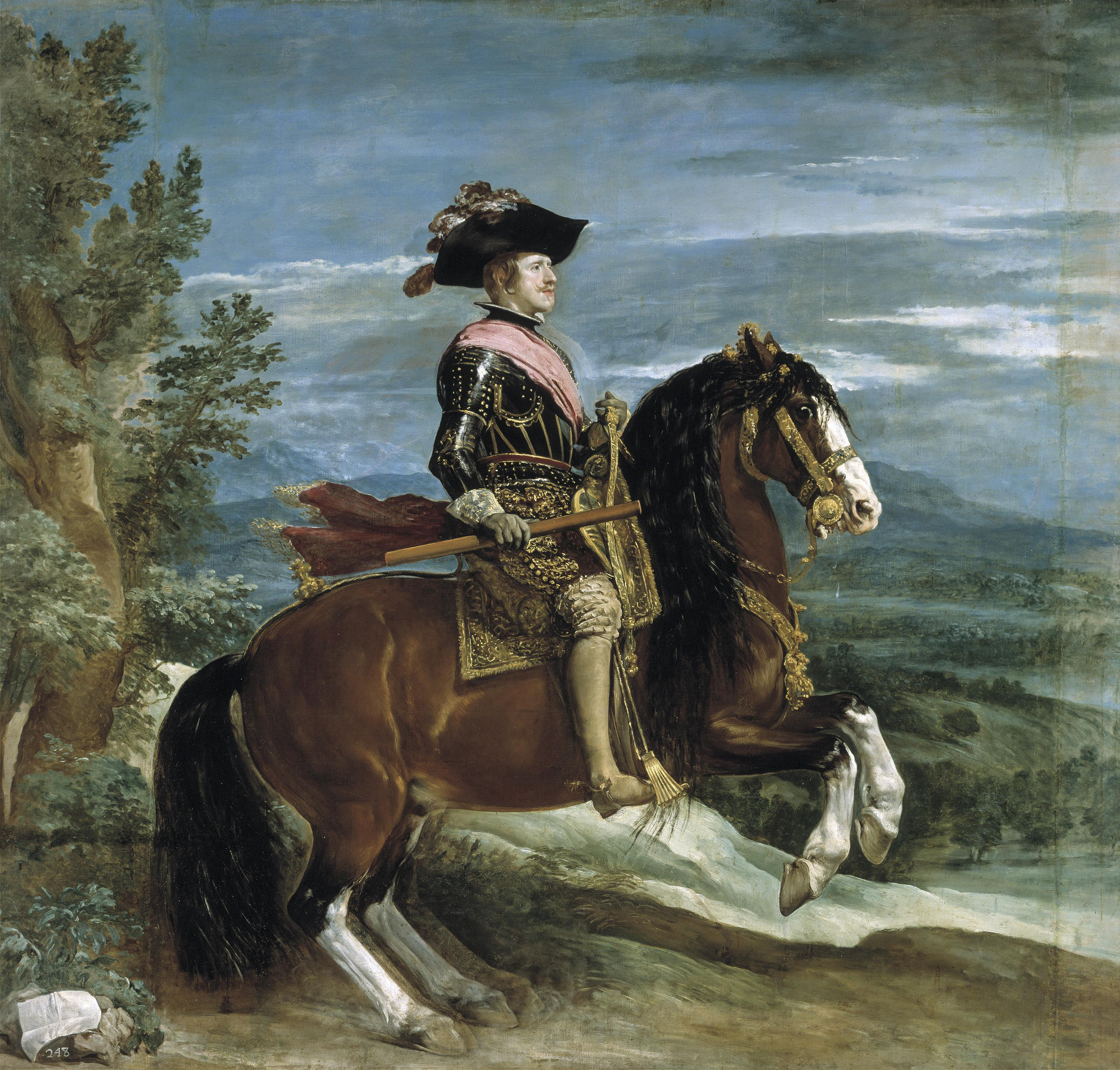
Remember that any mistakes made with the ink must be ameliorated–you cannot just cover them with paint.  Why?  Because over time, oil paint becomes translucent and your mistakes will begin to show through.  The Italians call this “pentimenti,” meaning “the emergence of earlier mistakes that have been painted over.”  Take a look at Velázquez’s horse that now has five legs.

Velázquez_-_Felipe_IV_(Museo_del_Prado,_1634-35)

Here are additional steps in the process:

PaintingProcessStep7

PaintingProcessStep8

PaintingProcessStep9

PaintingProcessStep10

PaintingProcessStep11

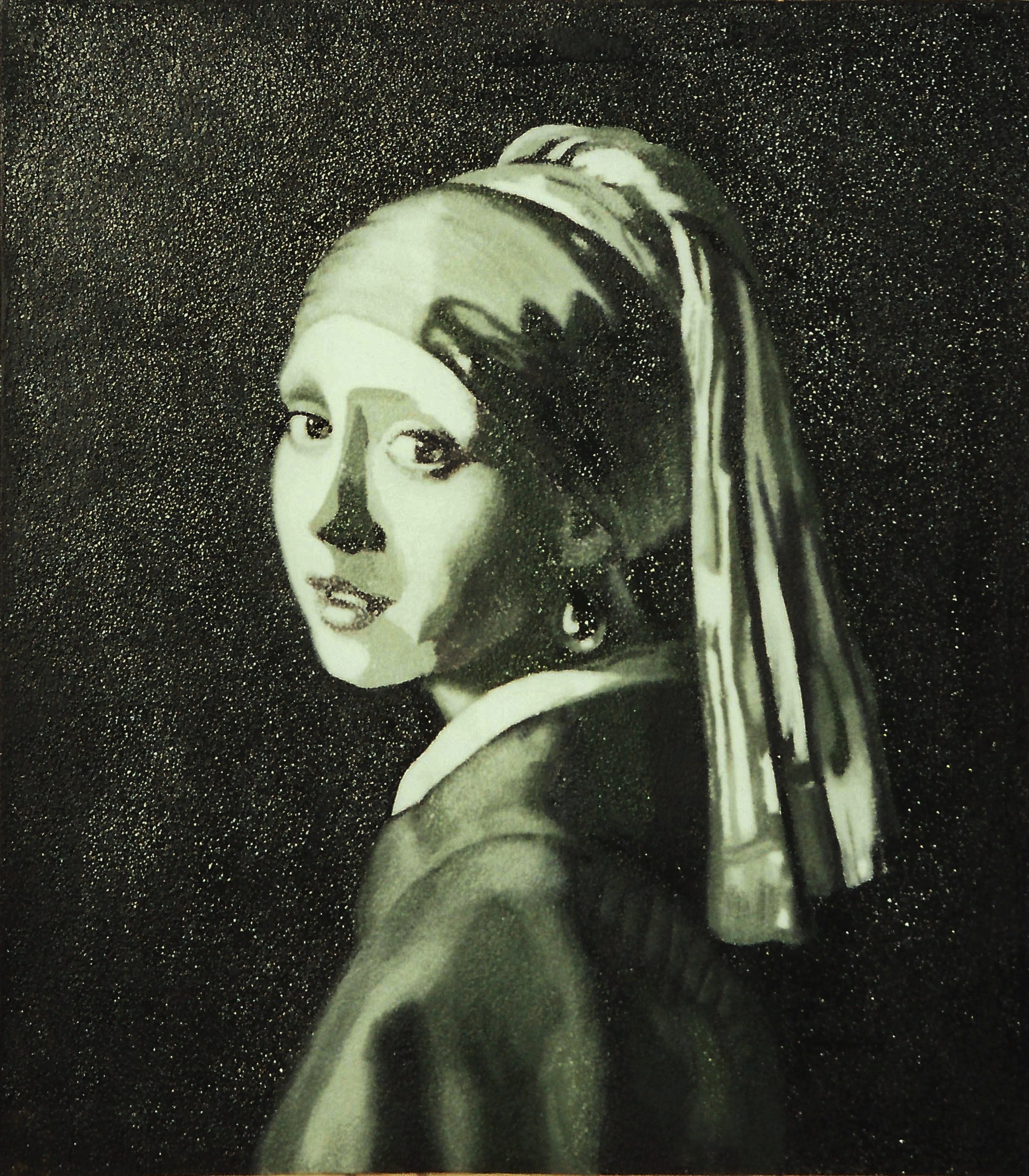
This is the completed verdaccio underpainting, ready for color:

PaintingProcessStep13

All the best,

Marsha

P. S.  Just a note to let you know of an upcoming workshop

Hello, readers. The Arizona Renaissance Art Guild is hosting a one-week workshop with Maestro Frank Covino, art teacher extraordinaire. If you will be in the Phoenix area on April 6-10, 2015, we would like to invite you to attend and make some new painting friends.  The cost for the week is $695.  Respond to this post if you are interested.  We still have two spaces available.