ART OF THE MASTERS Workshop Wonders!

Hello, Artists,

We thought you might want to see some of the work just completed at our first Art of the Masters workshop last week in Gilbert, Arizona.  Karen and I were so proud of our students’ success thus far.  Here are some pictures:

P1110751

Shelly H.  in early stages of drawing At the Fountain, after William-Adolphe Bouguereau, 1897

P1110754

Shelley B. drawing The Laundress, after Jean-Baptiste Greuze, 1761

P1110760

Teachers Marsha Gilliam (in the mirror) and Karen Schmeiser, with student Shelly H.

P1110794

Completed charcoal drawing~

P1110795

Completed drawing with partial verdaccio underpainting~

Below are the students’ drawings alongside actual paintings by Greuze and Bouguereau.  When completed, students’ works will look like these original works, and Shelley and Shelly will have learned much about seeing, drawing and painting during this process of copying the Masters:

P1110792GreuzeTheLaundress1761

P1110788BouguereauAtTheFountain1897

We hope you enjoyed seeing some student work, and hope you will be able to join us for our next event.  Where else can new artists get a five-day workshop with two teachers for $489?  We are in this to perpetuate the systems and processes of the Old Masters, and are planning another workshop in the fall, to be announced.

YOU CAN CAN CAN do this too,

Marsha and Karen 🙂

CARESSING A FOOT

I just completed this commission, The Apotheosis of Love, on the occasion of a wedding, and my patrons loved it.  It went on a plane to Boston:

PaintingMarshasTheApotheosisOfLoveGlazedCompletedRtchdP1110668

Here it is, framed, with brass title:

PaintingMarshasTheApotheosisOfLoveFramedGlazedCompletedRtchdP1110668

I especially addressed the front foot–I studied the subtle shadows that make it work–or not.  In the first foot picture below, the toes, nails, and veins still need completion, but the most important area that needed altering was on the top front.  It was just slightly too dark–not even half a value–but what a huge difference it made when I lightened it ever-so-slightly!  I am attaching a “before and after,” with the original model, just so you can see what I mean.  Here is the model:

PaintingRefApotheosisFeet

Here, the top front half looks flattened and scooped like a spoon because its value is too dark, even though I followed the model:

ApotheosisFeetStillNeedCompletedToesNailsVeinsCoveredWflesh

and here is the corrected version:

ApotheosisFeetCompleted

Yes, the overall tone of the pictures are different because one was taken at night, but it is the VALUE difference that counts.  The foot, with toes, nails, and veins, is completed in the second picture.  I changed nothing on the drawing itself.  Just the slight value change is all that mattered.

I will eventually come up with a step-by-step to share, but even then, it is mostly just a lot of work, time, and careful observation, stepping back six feet and comparing it to the model, squinting, looking at it through a mirror–you have to pull out all the tricks!  And even when you think you’ve nailed the drawing and the underpainting, the slightest color shift matters, even when the color values you are applying match the value of the underpainting perfectly.

Regarding the importance of slight color shifts, I have a theory that I can find no information about.  Perhaps it already has a name, but I am going to call it something like “How Color Shifts Value Perception.” I wonder if anyone else has observed this phenomenon?  Have you? It would probably be a boring topic for anyone but an artist.

I’m designing another painting that has a tight time limit for completion.  My Aunt Goldie will be 95 years old  in July, and I want to do a painting of her, quilting, since she has been an award-winning quilter all her life.  I have the references, we’re picking up the precut board tomorrow, and I’m doing a square format (24″ x 24″).  This is one of those rare occasions when traditional formats will not work, due to the length of the quilt frame in relation to her body.  I hope to have the drawing finished by the end of next week.   I’ll post it when I can.  There is only one hand showing in the reference, complete with thimble and needle, so it won’t be a good candidate this time for my step-by-step model.

Giclée prints from The Apotheosis of Love will be available soon, and I will write more on its conception in a later post.

Best wishes to you,

Marsha

PAINTING WHITE TO PLEASE THE HUMAN EYE

Since Aristotle was the first person we know of that gave serious, objective thought to the rainbow and rainbow color theory, it behooves us as artists to contemplate it as well. This instruction is written as though the artist is new to the concepts of painting in spectrum white color, and approaching the process for the first time. Thus, I apologize in advance if what follows seems overly simplistic, but these details may prove helpful to some.

Firstly, two important points should be mentioned here:

1) When mixing the greyscale, this is how to get a true, neutral set of greys; otherwise, they will tend toward blue: adding just the barest touch of raw umber to the black pile of paint on your palette is important. Preferably use mars black, as it is generally less blue than ivory black. Then lighten a small bit of it to check that you have not added too much umber—this will make it look dirty if you have, and you do not want the whole pile polluted.

2) Although the tube colors for white spectrum are customary for the purposes of demonstration, they are still somewhat flexible. For example, you may find that you have manganese violet in your paint box but not cobalt violet; or you may find that your garment is in a warmer light setting and you would prefer using a violet commensurate with that. It is okay.

It Always Goes Back To Values

However, despite guides and formulae, you must still understand why you are choosing to paint with spectrum white, and be able to determine your darkest and lightest values in the three situations/conditions outlined below: *Light, Shadow, and Sunset. After determining the situation, you look at the garment and think like this: “My darkest dark is a value 3 so, since purple is first on the rainbow spectrum (following their order) and comes out of the tube at value 1, I will lighten my purple with white until it is a value 3. Then, I can tint some grey with it, which should result in a purple-ish white value 3. The next color in the spectrum is ultramarine, so I will lighten that color to a value 4, and then mix it with a value 4 grey,” and so on, up the spectrum.

Remember that, ultimately, we don’t want the whites on our paintings to be white, but we want to portray a colorful rainbow spectrum that viewers perceive as white, thereby adding an almost otherworldly glow and sparkle. However, avoid excessive color in the greyscale.  We want the viewer to remark, “What a vibrant white dress!” not, “Look at all the colors in that dress—what is that supposed to be?”

Paint Mixing

SpectrumWhitePaletteP1110237

Situation 1:  Here are the Munsell/rainbow spectrum colors in the light, by name, from dark to light, and their oil paint equivalents:

  • (*1) Purple —Cobalt Violet (or Dioxazine Purple, or Ultramarine Blue+Alizarin Crimson Perm.)
  • (*1) Purple-Blue —Ultramarine Blue
  • (*3 or 4) Blue —Cerulean Blue (or Phthalo Blue+Phthalo Green)
  • (*1) Blue-Green —Viridian Green (or Phthalo Green)
  • (*5) Green —Cadmium Green (or Hansa Yellow+Viridian)
  • (*8) Yellow-Green —Phthalo Yellow Green (or extra Hansa Yellow+Viridian)
  • (*9) Yellow —Cadmium Yellow Lt.
  • (*7) Yellow-Red —Cadmium Orange
  • (*4 1/2) Red —Napthol Red Lt.
  • (*1) Red-Purple —Alizarin Crimson Permanent (or Phthalo Rose)
                –Titanium White
                –Mars Black

*numbers indicate the value of the color, directly out of the paint tube

Situation 2:  The oil paint colors to use for spectrum white in shadow, dark to light, are:

  • Alizarin Crimson Permanent (or Phthalo Rose)
  • Cobalt Violet (or Dioxazine Purple, or Ultramarine Blue+Alizarin Crimson Perm.)
  • Ultramarine Blue
  • Cerulean Blue (or a mixture of Phthalo Blue+Phthalo Green)

Situation 3:  Finally, although it may seem strange to start in the middle of the spectrum with Cerulean as the darkest value, the list still follows the spectrum order. The oil paint colors to use for sunsets, seascapes, or snow, dark to light, are:

  • Cerulean Blue (or a mixture of Phthalo Blue+Phthalo Green)
  • Ultramarine Blue
  • Cobalt Violet (or Dioxazine Purple, or Ultramarine Blue+Alizarin Crimson Perm.)
  • Alizarin Crimson Permanent (or Phthalo Rose)
  • Napthol Red Lt.
  • Cadmium Orange
  • Cadmium Yellow Lt.

Here is the resulting color chart, and the explanation of each row of the chart:

PaintingSpectrumWhiteColorChart        

Situation 1
Row 1, Greyscale, V3-9
Row 2, each color lightened to match respective grey values
Row 3, the result of mixing greys with respective color values
Situation 2
Row 2, lightened to match grey values 5-8
Row 3, the result of mixing greys with respective color values
Situation 3
Row 2, each color lightened to match respective grey values from row 1
Row 3, the result of mixing greys with respective color values

A note here—Sometimes you will need half-steps in your values, so keep in mind that just because you have only 4 colors to use for shadows (for example), does not mean you necessarily have only 4 values to address in your white shadows. You may have 5 or more values in your shadows, so you simply spread these four colors to a broader value range, commensurate with the needs of your painting. The same holds true for the other two situations outlined above.

We must also keep in mind the concept of “reflected light” as it relates to white objects and how they will be affected. Everything that is near your white object or garment, whether it is an apple or a curtain, will be reflected somewhere in that white object or garment, so a way to handle those reflected lights might be to gently glaze the reflected light color on top of the painted spectrum white object after it dries. Of course, the handling of this will be very painting-specific, and the way you accomplish it for one painting, might not be the same for the next, but it is something to keep in mind.

Now What? Analyze which situation applies to your painting, then paint it from dark to light using these instructions.  In a previous post, I have painted a quick example on the use of spectrum white that might be a useful reference.

*A big “thank you” goes to Charlene Higley for differentiating and fine-tuning these three conditions.

FRANK COVINO, LONG-TIME FRIEND AND MENTOR, HAS PASSED

Covino Portrait1P1070431PaintingWorkshopCovinoFrank4-2015

Dear Artists and Friends,

It is with ineffable sadness in our hearts, that I must report this news.  Our friend and long-time art teacher and mentor, Maestro Frank Covino, passed away suddenly on Tuesday, February 16, 2016, after being pronounced “cleared of cancer” just last week.

If I may use a bold simile, his loss feels like looking up at the mountains in Sugarbush, where Frank worked hard to build the home he loved, and seeing that the grandest of summits has disappeared from our sight.

Here is a note from his wife, Barbara Covino, that you will all want to read:

Subject: It is with a deep abiding sorrow in my heart that I write this letter…forgive the delay but it has taken time to believe this is true…

Beloved friends and family , one and all,

After two days of profoundest shock, and countless tears I realize I must write you.  It is with a heavy, heavy heart that i must inform you that dear Frank has passed away unexpectedly on Tuesday night, February 16th.  It was quick and he did not suffer–a death we would all prefer–but he had been progressing so well, it was a gut-wrenching shock that still is unbelievable.

I truly cannot imagine a world, or a life without him…32 years of happiness and adventure.  Life was never boring with him!!! What an amazing talent, a brilliant man with a wealth of knowledge, a gentle and sensitive man who had to excel in everything he did, and was thus an inspiration to all who knew him.  He encouraged others to strive for excellence and to believe in themselves, giving them the tools to create a positive reality in their lives, whether it be art or health.  We all can repeat that golden maxim: IT’S NEVER TOO LATE TO AMELIORATE! Wise encouraging words, those.

But he was more than the sum of his parts; he was a genuine force of nature, a real Renaissance man, but above all else, he had a kind heart and a very great soul. We all loved him so; there will never be another Frank.  But I know it is now time for each and every one of us who was touched by his life, to take that spark and pass it on.  He gave us wings and it is time for us to fly…Make him proud!!!

I am too choked up to continue writing.  God Bless each and every one of you who had a place in his heart…family, friends, students….He loved you all sincerely and without guile….

We are in the process of collaborating with the family and planning both a smaller family funeral as well as a larger set of celebrations of his life and legacy open to all who loved him–one in Vermont and one on Long island.  As soon as the Covino south clan and Mark and Jennifer and I hammer out the details, I will email you all, soon as can be done.

We are going to give that wonderful man a send off he won’t soon forget!!!

Love and blessings , Barbara Covino

PS: PLEASE FORWARD THIS to everyone you can think of. It has grown into a cast of hundreds, and forgive the delay but it has taken time to believe this is true.

RAINBOW HUES

We have already “hammered away” at the importance of Value, so this is a good time to introduce the set of terms devised by Munsell, that help us discuss and reproduce color:

Hue–the name of a specific color as it appears in the color spectrum.
Value–the specific darkness or lightness of a color.
Chroma–the specific intensity (brightness or dullness) of a color.

Color_Wheel_Finished_Website1

Here, we will address “hue.” Although there are many varied color wheel designs, Munsell incorporates ten basic hues that come from the color of light as seen through a prism, or the rainbow spectrum. By shaping them in a circle, they become the color wheel. They are:

red-purple, red, yellow-red, yellow, yellow-green, green, blue-green, blue, blue-purple, purple

Every color falls into one of these ten basic HUE categories, or possibly between two of them, where reside the interhues.

Most artists have had at least one important teacher. Mine was/is Frank Covino. He designated tube names and value numbers for Munsell’s ten hues.

At first, you may be tempted to gloss over this list, but imagine going to the store and selecting the most useful green, red, or yellow, and then assigning its value as you go, all the while keeping in mind how the colors will all interact, and choosing those that work best together in the largest variety of situations–methinks not the easiest of tasks.  This work has been done for you, here:

Red-purple is Alizarin Crimson, which is a value 1 tube color.
Red is Cadmium Red Light, which is a value 5 tube color.
Yellow-red is Cadmium Orange, a value 7.
Yellow is Cadmium Yellow Light, a value 9.
Yellow-green is Pthalo Yellow Green, value 8.
Green is Cadmium Green, value 1.
Blue-green is Viridian Green, value 1.
Blue is Cerulean Blue, value 3 or 4 (depending on the brand).
Purple-blue is Ultramarine Blue, value 1.
Purple is Cobalt Violet, value 1.

These tube colors should visually disappear when placed on corresponding value numbers in the value chart (Don’t forget to squint, as discussed in the last post.).  If they look like freckles instead of disappearing, you know you either have them in the wrong place, or your value chart is not correct.  That’s why we use the Covino Palette–those values are already prepared for you to start using at once, without a lot of fumbling about.

Follow my blog to get the latest post sent to you.

All the best,

Marsha

PART 7, CLASSICAL ACADEMIC APPROACH, MIXING VERDACCIO

Before you begin your verdaccio underpainting, make sure you have completed everything you want to accomplish with India ink, charcoal, and gesso and/or gelatin in bas relief, so that your rendering looks as perfect as it can.  This functions as your value map for the underpainting, and if it is perfect, nearly everything at Value 5 and under can be quickly glazed, rather than painted.  Of course, the need for the perfect underpainting is that glazes are transparent, and everything will show through!

Look closely at the enlarged version of this drawing; can you see the areas where it seems to be especially white? Those are the places where, if you could run your fingers over the board, you feel the bas relief of the gesso that has been built up only in the areas you want to advance, to give the painting extra dimension.  Pretend you are a sculptor and pay special attention to areas like jewelry, headwear, the forehead, nose bone and tip, shoulders near the viewer, lower lip,  muscle structure, illuminated areas of dark garments, fabric folds that are closest to the viewer, and anything else you want to advance.  Make sure you smooth those built up edges so they blend smoothly into the board surface–you don’t want them looking pasted on.  You should not see the physical edges of the build up:

P1060404

P1060407

Mixing verdaccio in nine values is the next step. Here is where you will make your life so-o-o much easier if you have purchased Frank Covino’s Controlled Palette.

PaletteFront

Before mixing any paint on the Controlled Palette, coat it lightly with olive oil.

To mix verdaccio:

*Put 2, 8″ strips of chromium oxide green on Value 2
*Put 1, 8″ strip of mars black on Value 2
(= 3 strips total on Value 2)
Mix together thoroughly for a “Value 2 verdaccio.”
Value 1 is comprised of equal parts of Value 2 with Mars Black.
Values 3 – 9 are made by the addition of Flake White to Value 2, then 3, etc. (aka a “color string”).

Then cover it with Saran Wrap (the most non-porous wrap in my tests) and put it in the freezer until you’re ready to paint. Even better is to buy multiples of the three colors and some empty tubes, and tube your mixtures. That way, you won’t have to mix it again for a year or more.

Follow my blog to get the latest post sent to you.

All the best,

Marsha

P. S.  Just a note to let you know of an upcoming workshop

Hello, readers. The Arizona Renaissance Art Guild is hosting a one-week workshop with Maestro Frank Covino, art teacher extraordinaire. If you will be in the Phoenix area on April 6-10, 2015, we would like to invite you to attend and make some new painting friends.  The cost for the week is $695.  Respond to this post if you are interested.  We still have two spaces available.

PART 6, CLASSICAL ACADEMIC APPROACH, CHARCOAL DRAWING AND INDIA INK

Kind Readers,

My sincerest apologies for the extended hiatus since my last post. There has been a long illness in my family that required my full attention, but gratefully, the outcome was positive. Thanks to some dear art friends inspiring me today to start posting again, I am doing this one especially for them. I’ll try to make it up to you all in this post by adding additional pictures of the process for you to at least see where we’re going. I’ll comment on them as needed in later posts. Feel free to posit your questions or comments as well.

A few more points to make about handling the marble gesso before we go on with the process~~Remember that you must smooth the edges of each successive application of gesso either with your finger while it’s wet, or with  sandpaper (about 100 grit) after it’s dry.  It is easiest to do it with your finger, followed by the sandpaper only if necessary.  Some illuminated areas you may want to sculpt, in addition to those mentioned in Part 5, are clothing (especially folds) , the nose bridge and tip, the forehead, the forward shoulder, the forward knee, and the part of the lower lip in the light.

At this stage, remove the gridded acetate cartoon, and render a complete charcoal study by referring to the grayscale printout of the artwork reference. It’s best to start with the easiest squares or triangles, piece by piece, then progress to the others as you gain more confidence.  Use a tortillion to really blend and push the charcoal into the gessoed surface.  You can always lay the grid back on to check your drawing if you lose your place or make a mistake.  Repair mistakes on your drawing with a kneaded eraser, or scrape it carefully with an exacto knife or single-edged razor blade.  Periodically, take the drawing outside and spray it with fixative as you progress and are sure it’s correct.  As you continue with the rendering, keep asking yourself, “What value is it on my reference?”  Then place that value on your surface.  If the values are right, it will look like the form when you’re finished.

PaintingProcessStep3

PaintingProcessStep4

PaintingProcessStep5

When your drawing is complete, take it outside with a final coat of fixative, sprayed rather liberally. Be careful with this stuff–it’s toxic (see the label).  The photo below shows the wet fixative reflecting on the lens.  At this point, put the fixative away.  It will not be used again for the duration of this painting and, for the sake of archivability, you do not want to accidentally mix it up with the retouch varnish.

PaintingProcessStep6

As far as India ink is concerned, inking can be done at any stage of the drawing.  I personally like to do it after I have applied the gesso or gelatin and have refined my cartoon into a full-value detailed charcoal drawing.  Use a very fine brush and keep some water handy.  It’s very difficult to remove dried India ink, and it dries very quickly.  Or, if you prefer, you can use the greyscale prefilled Faber-Castell Pitt brand India ink brush pens.

For example, in the charcoal drawing above, I have inked the entire background, the edge of the upper eyelid, the edge of the iris, the deepest recesses of the nose hole, the crease of the eyelid, and the pupils of the eye.  Ink only the areas that are either black, or value 1.

Regarding the pupils, always make sure that the one farthest from the viewer is slightly lighter than the closest one.  Even though the naked eye cannot really see this difference, you must nevertheless paint with aerial perspective rules in mind, whether it’s visible in the photo or not.  Aerial perspective rules say that dark-valued objects become lighter and grayer in recession.  Thus, the pupil farthest from the viewer will be ever-so-slightly lighter.  The converse rule is that light-valued objects appear darker and grayer in recession.  Keep these rules in mind with any painting because you cannot trust what you see in the photograph.

Some other areas to consider inking are the center edge of the lower lip, where the lower lid touches the iris, and the very thin line between the lips.

When inking, refer to the grayscale printout of the Old Master artwork you are duplicating.  Ask yourself, “Where are the black areas located on this painting?”  As you identify them, no matter how small, that’s where you put ink.  Ink everything that is receiving no light.  Forget what object you are painting and just look for values, remembering to refer to the photo and not your acetate sketch.

Remember that any mistakes made with the ink must be ameliorated–you cannot just cover them with paint.  Why?  Because over time, oil paint becomes translucent and your mistakes will begin to show through.  The Italians call this “pentimenti,” meaning “the emergence of earlier mistakes that have been painted over.”  Take a look at Velázquez’s horse that now has five legs.

Velázquez_-_Felipe_IV_(Museo_del_Prado,_1634-35)

Here are additional steps in the process:

PaintingProcessStep7

PaintingProcessStep8

PaintingProcessStep9

PaintingProcessStep10

PaintingProcessStep11

This is the completed verdaccio underpainting, ready for color:

PaintingProcessStep13

All the best,

Marsha

P. S.  Just a note to let you know of an upcoming workshop

Hello, readers. The Arizona Renaissance Art Guild is hosting a one-week workshop with Maestro Frank Covino, art teacher extraordinaire. If you will be in the Phoenix area on April 6-10, 2015, we would like to invite you to attend and make some new painting friends.  The cost for the week is $695.  Respond to this post if you are interested.  We still have two spaces available.

PART 5, CLASSICAL ACADEMIC APPROACH, MARBLE GESSO

Did you complete your cartoon transfer yet? (See Part 4)  Keep in mind that working from a photo is not a lifetime sentence–it is a great beginning and learning tool, becoming simply reference material later on as you gain skill and begin to build a morgue of artist references.

At this stage, you should have transferred what is in each acetate grid section, box by box, triangle by triangle, to each identical grid section of your painting panel.  If you begin to think about your drawing as specific objects, turn the panel and acetate upside down and continue.  This way, it helps you to stay in the abstract and be more objective.

PaintingProcessStep2

Are the acetate and panel drawings exactly the same?  When the acetate tracing and the panel look exactly identical, you can either erase most of your grid lines, or just leave them in case you need refer to them later at some point during the charcoal drawing and underpainting.  I usually just leave them.  If your drawing has been accurately reproduced, spray it with fixative so it won’t disappear on you.  Remember that the Old Masters taught and used this same grid method to execute extremely accurate drawings, so you are in the best of company.

Now, it’s time to move on to the marble dust gesso and gelatin padding, and inking of the drawing.  Your surface should look sculpted when complete, but only to the degree of the Golden Mean.  In other words, you should aim for about thirty-three percent or less, or sixty-six percent or more of your surface area “sculpted,” but never 50-50.  Of course, this will generally be applied in areas throughout, so you will have to guess the aggregate amount.  Also, make sure you emphasize the illuminated, higher-value areas only, areas you want to advance.  The lighter the area, the more gesso or gelatin you can add.  Darker-valued areas should remain smooth and recessional.

If you plan to add any gesso or gelatin for textures, do it now during the drawing/charcoal/inking stage. Remember that the process of sculpturing your work with the marbled gesso is completely optional.  I don’t do it for every painting, but whenever I do, I never regret having the additional dimension that oil paint alone can simply not provide.

Here is an example of Rubens’ Roman charity painting, “Cimon and Pero,” where I extensively padded on the marble dust gesso to varying degrees on the man’s muscles in the light.  You can see why it is so important to study your anatomy and know the shapes of the musculature.  On the daughter, I added extra gesso to the face, breast, forward arm and hand, and on the dress folds, only on areas of light and those nearest the viewer.  Gelatin was added to stone areas only.  It is finely granulated, totally permanent and used just as it is, right out of the box.  It can be used in gesso or mixed directly in the paint, and creates a more crude surface–perfect for things like rocks, stone and bark:

Colony Website Pics1 020

If you zoom it on your computer, you can actually see where I have added marble gesso (those areas appear whiter) on this painting in progress of Titian‘s “Venus at her Toilet.”   I have built up gesso on the pearls, hair, face, the sternocleidomastoid, the breasts, abdomen, hip, arms, hands, jewelry, the angel and wings, and spent a great deal of time on the tiny trimwork of her wrap.  It’s an amazing tactile experience to literally feel the shapes as you run your hand over the painting and yes, it takes time, but it is so much worth the effort:

TitianVenus

Remember that not just any old plastic-y gesso works for this–you MUST have quite a bit of marble dust in it AND have a surface with tooth to apply it to.  You can make your own, or buy Bonded Marble Gesso from Frank Covino.  Several other companies are emulating Frank and finally beginning to make it also.

Working on a marbled board allows you to scrape, carve, and shape without ruining your surface.  Just remember that this gesso dries very quickly and becomes quite hard (like marble), so whatever your plan is, you should execute it as soon as the gesso is touch dry.  For instance, when I build a muscle, I keep adding coats with an older bristle brush until it’s the thickness I want.  Then, I sand it thoroughly, paying very special attention to the edges, as soon as the gesso will let me.  If you let it cure and come back a couple of days later, you’ll find it nearly impossible to make the edges smooth–it’s just too hard to work at this point.  Remember that paint will not cover up whatever textural accidents or sloppiness you leave.  The texture will still telescope through the paint, so make sure you are thorough with those edges.

All the best,

Marsha

P. S.  Just a note to remind you of the upcoming workshop

Hello, dear readers.  Here is some information I just sent out to all members of The Arizona Renaissance Art Guild, and I would like to share it with you as well.  We are having a one-week workshop where we intensively work on our paintings for one committed week.  If you will be in the Phoenix area on October 7-11, 2013, we would like to invite you to attend and perhaps make some new painting friends.  Respond to this post if you are interested.

Dear Artists:

Great news!  Karen has confirmed the dates for the Arizona Renaissance Art Guild’s one-week workshop. So, are you ready to paint those gorgeous works of art???

It’s PAINTINGPALOOZA time, one whole week to devote to your Classical painting for about $60 – $85 (total for the week), where we artists help each other make our work better and better.

The workshop is scheduled for the week of October 7 – 11, 2013, at the museum.  Workshop hours each day are from 9:00 a.m. until ?.

Signing up is simple–just send us an email and please include your phone number in case we need to contact you.  We have space for a maximum of 12 people. The more people that sign up, the less the cost!

There is no need for you to send a deposit ahead of time: just RSVP via email to confirm your attendance, and then pay your share when you get there.

And as always, if you see someone who didn’t get this email but who should or wants to be on the mailing list, please feel free to forward this on to them and us so that we will be able to include them in our next mailing.

Call if you have any questions.  Looking forward to hearing from you soon,

Karen and Marsha
Arizona Renaissance Art Guild

PART 4, CLASSICAL ACADEMIC APPROACH, THE CARTOON

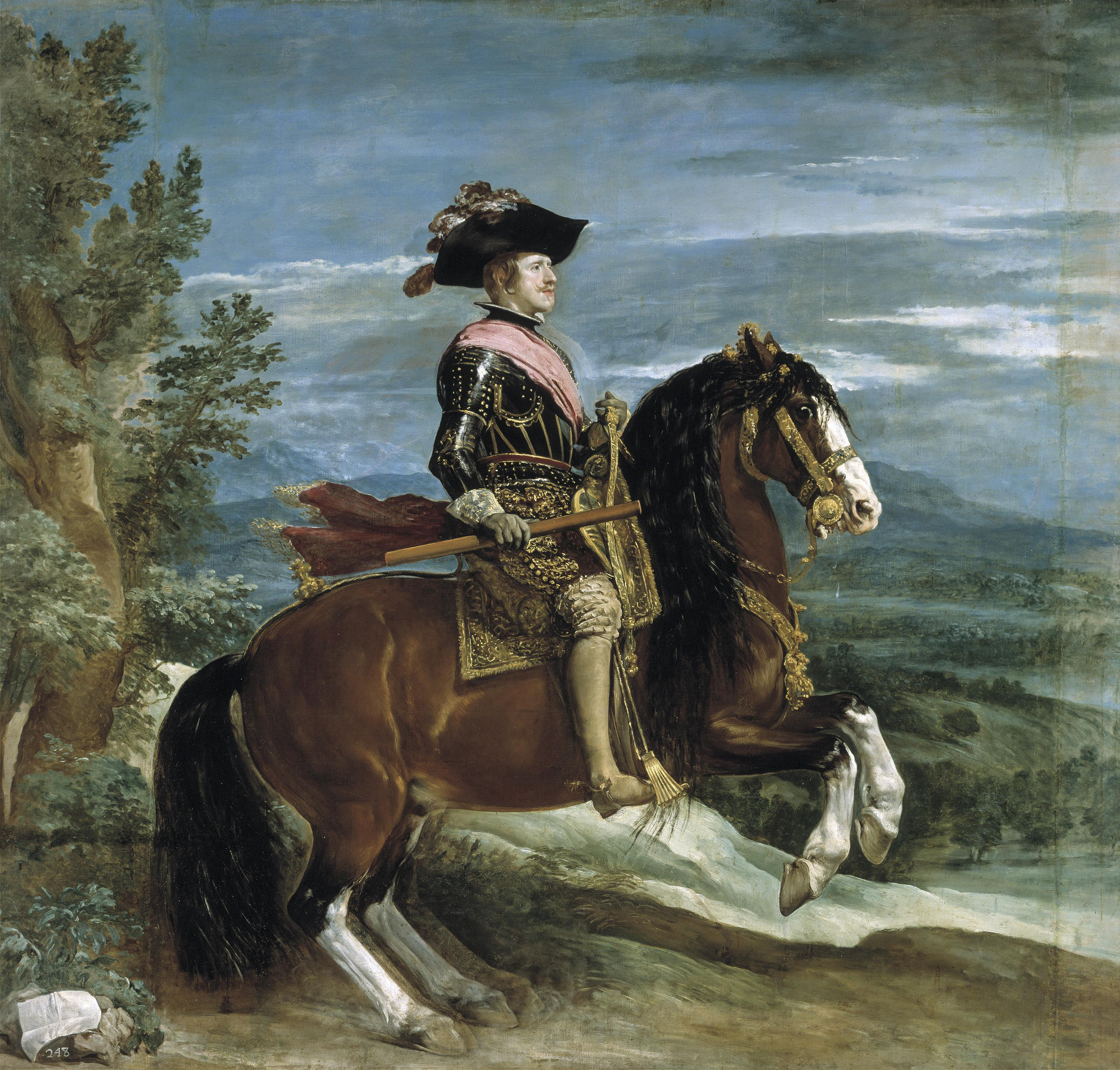
Although you are copying an Old Master and placement has already been decided for you, here are some thoughts to keep in mind in the future when you begin composing your own work:  if you leave a large space above the head, you will signal to the viewer that the person you are depicting is diminutive, whereas, with less space above, you will give the impression of a taller, more imposing figure.  This knowledge is especially useful psychologically when you want to make a woman seem more feminine, or a man more masterful.  For example, you would probably not want to paint a commissioned portrait of a farmer, a CEO, or a king, with a lot of space above their heads.

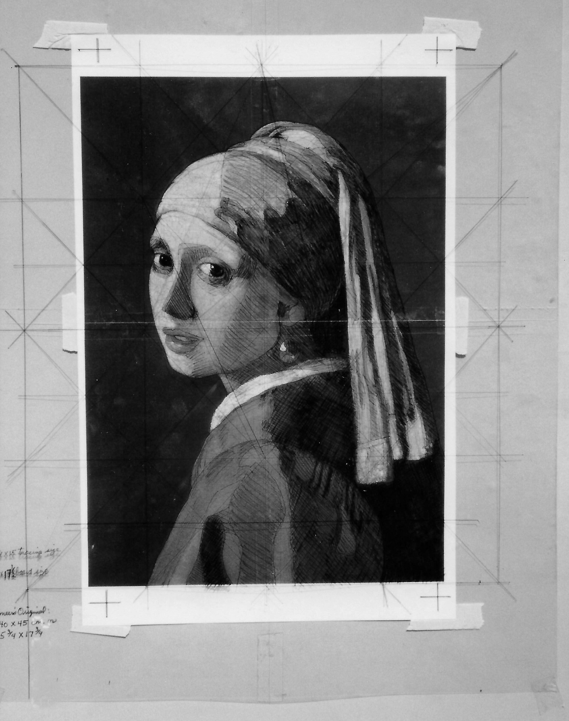
Drawing well requires an extensive understanding of proportion, so to help you get a headstart on drawing and line, we will adopt the OMs’ method of using a graph to facilitate a highly accurate enlargement of your chosen painting.  Then, as you progress in skill and knowledge of the “rules,” you can begin to break them because you will find you need these guidelines progressively less and less.

Now that you have collected your painting supplies and materials, it is time to do an acetate overlay cartoon, or line drawing, over your 8″ X 10″ reference.  Then, you will transfer that same cartoon onto your painting board.    Both the acetate AND the board will be gridded.  Remember those algebraic equation days where what you do to one side of the equation, you do to the other side?  Well, the same idea applies here: what you do to the acetate, you do to the board, no matter how short a guideline may be.

The Cartoon
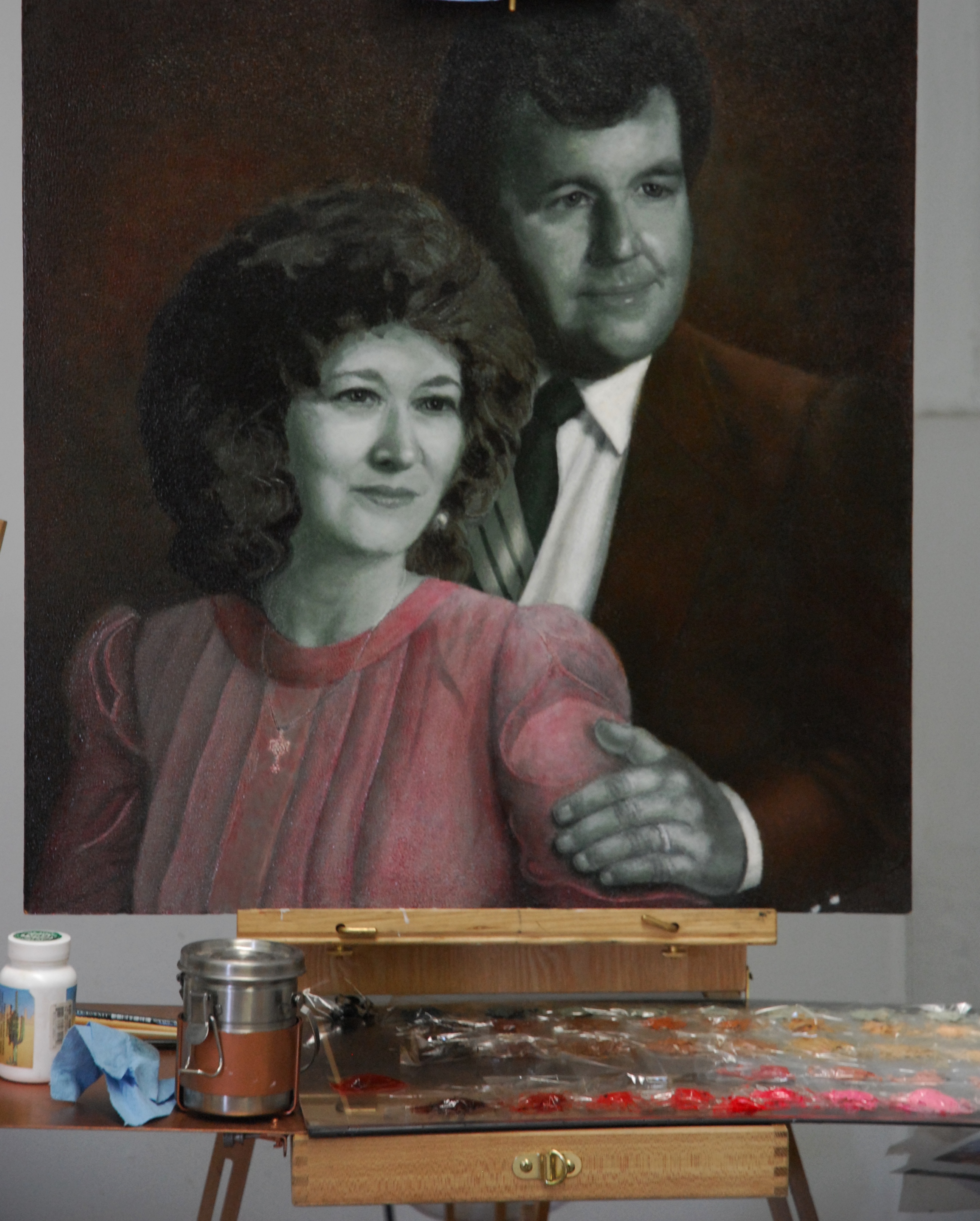
Work from your grayscale reference from the grided transfer and cartoon, through to the rendering stages.  When you “scale up” your reference material to fit your painting surface, the proportions of that reference material must be maintained; otherwise, you will have a final drawing that is out of proportion with perhaps ears too big or fingers too long.  Here is an easy procedure to ensure you get it right.

Procedure for Enlarging Reference While Maintaining Correct Proportion
Let’s say you are working from an 10” X 8” photo reference, and you want to paint it as a 26” X 20”.
1. Divide the long length of your desired enlargement by the long length of your photo reference to get a ratio:

26 ÷ 10 = 2.6″

2. Multiply that ratio by the short length of your photo reference.  This will tell you what your enlargement’s short side should be in order to maintain correct proportion:

2.6 X 8 = 20.8″

Your painting size will be 20.8″ X 26″

In this example, the size you wanted was 26″ X 20″ but the closest you can get is 26″ X 20.8″—so what can you do?  You have a choice at this point of either:

a) increasing your desired painting size to 26″ X 20.8″ (which would leave you with an odd size for framing),
b) rounding down to 26″ X 20″ (more standard size), or
c) decreasing the photo image content by leaving off a small bit of the sides.  This would be a very slight adjustment and probably worth it to be able to maintain a more standard size frame.

The Graph
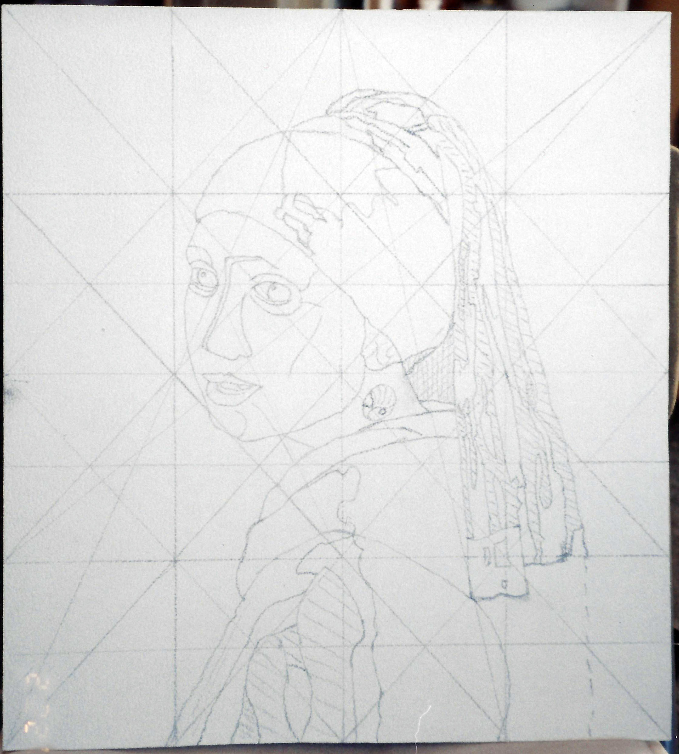
Once you have the correct proportions, use a thin-point red or blue Sharpie and draw a rectangle on the acetate that corresponds proportionately to the size of your board and place it over your drawing.  Use pieces of masking tape to secure each side or corner.

  • Very lightly draw a big “X” on your surface from corner to corner.
  • Draw a cross through the center of the “X.”
  • Connect the cross around to make a diamond.
  • Finally, divide the graph into fourths by adding two horizontal and two vertical lines.

PaintingProcessStep1Grayscale

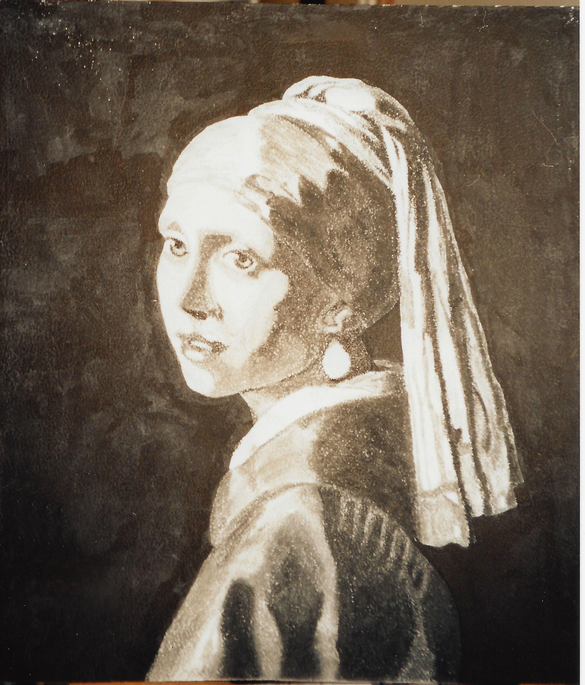
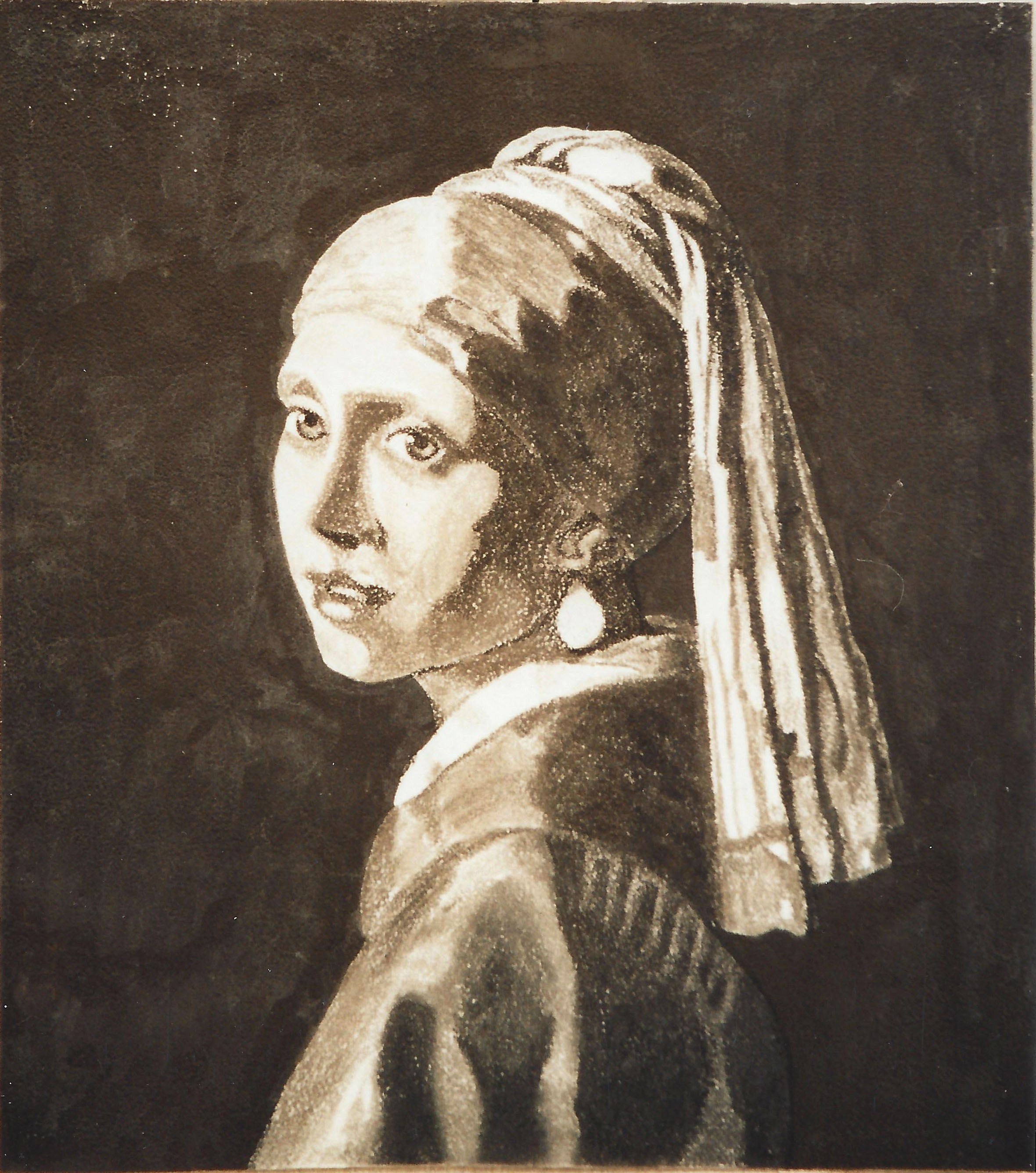
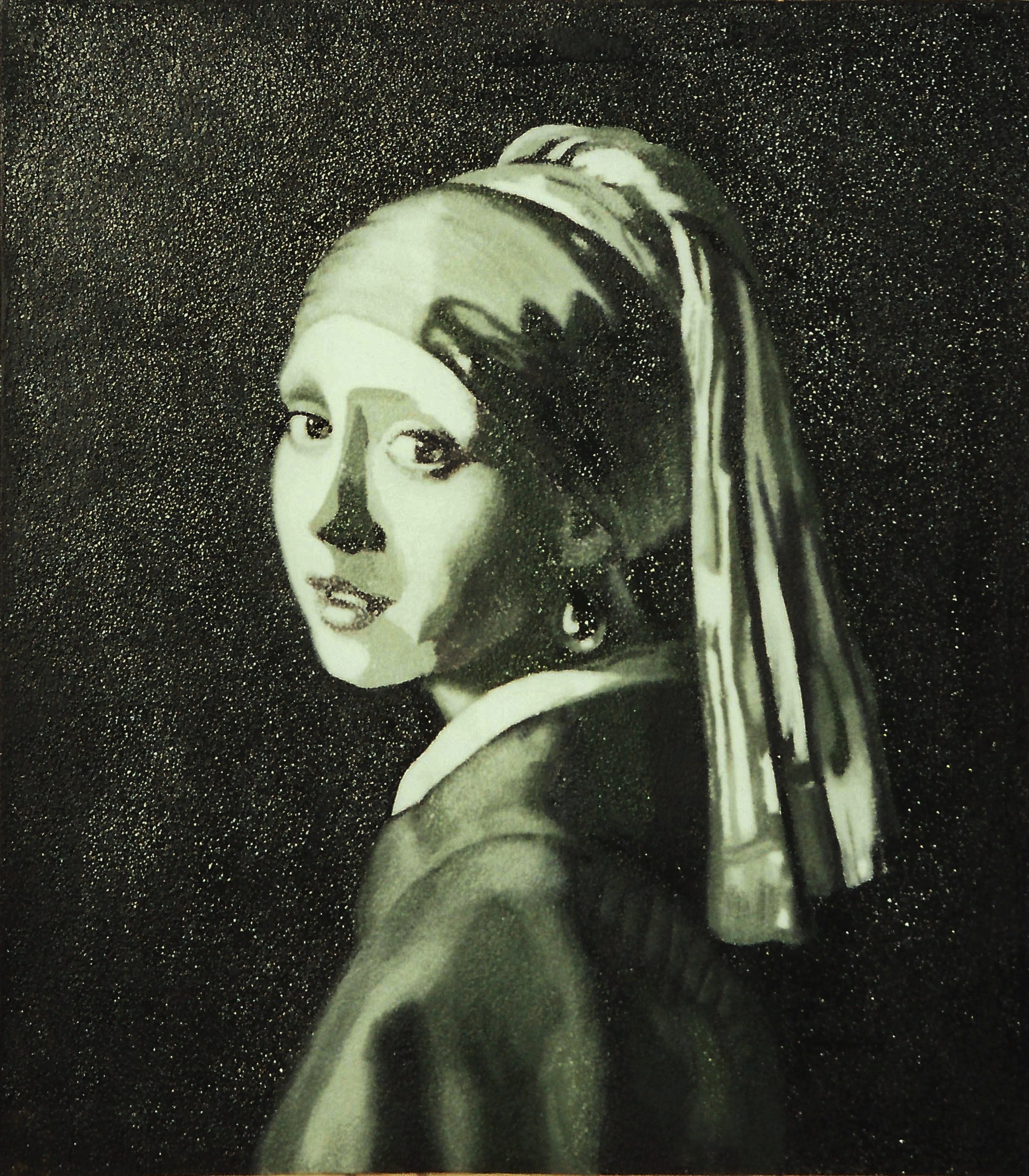
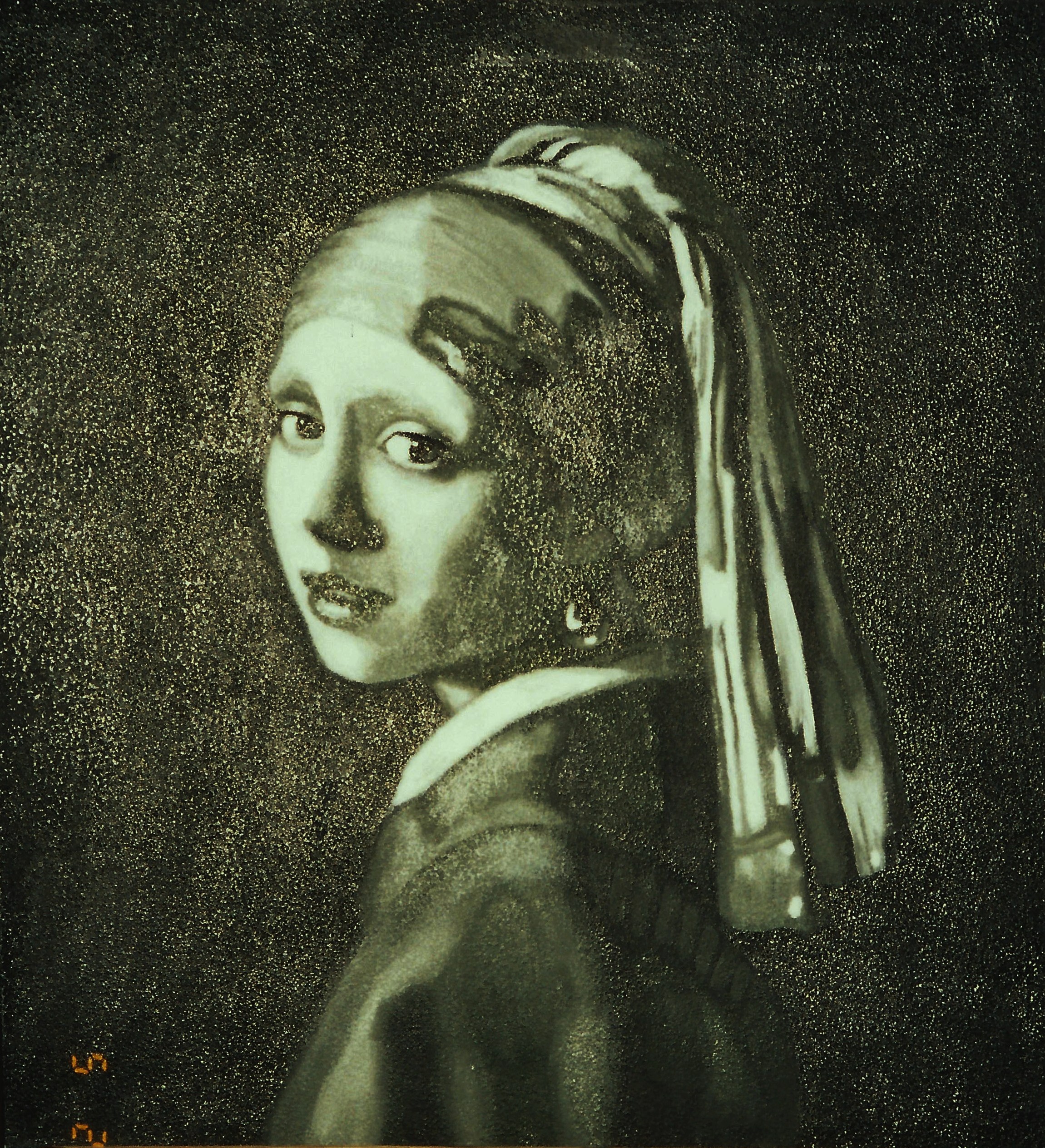
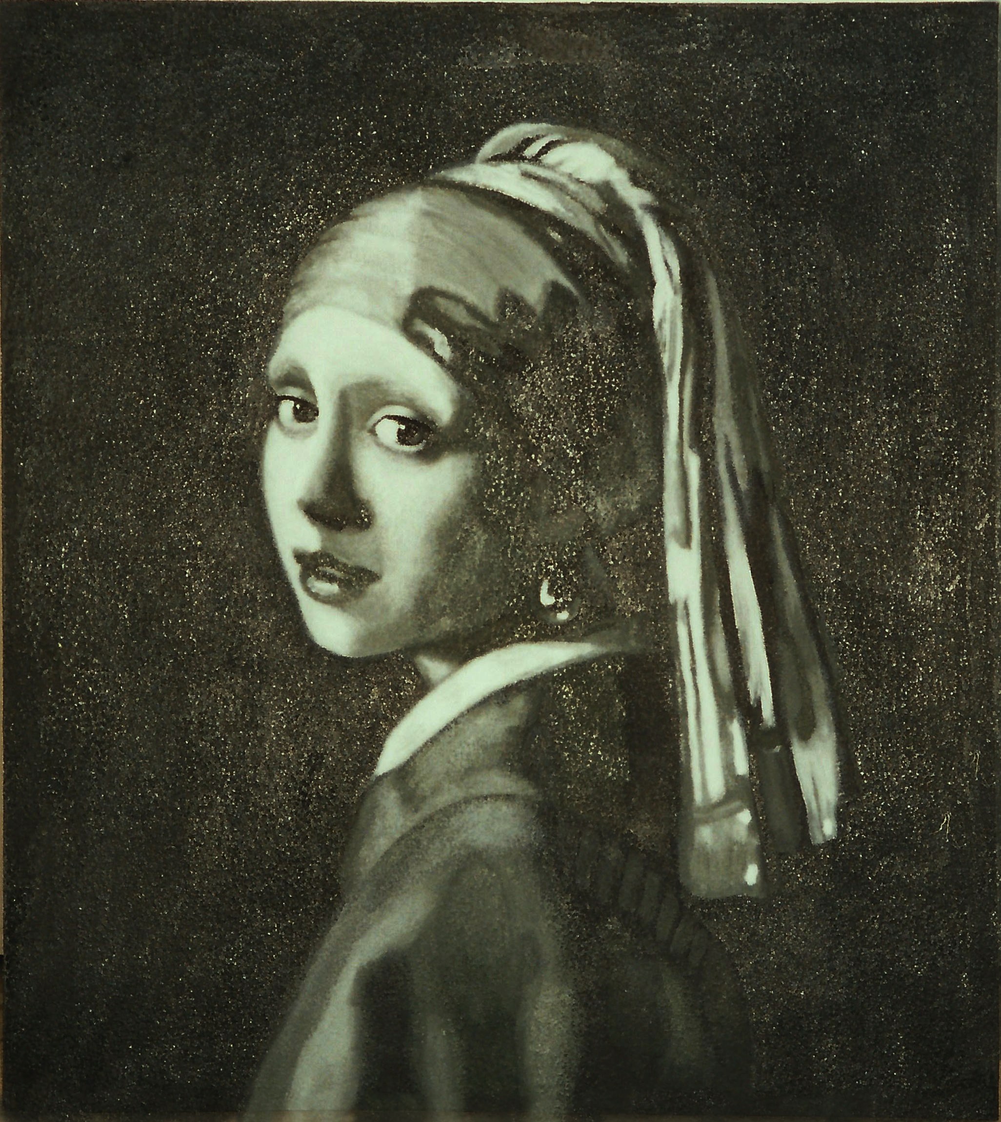
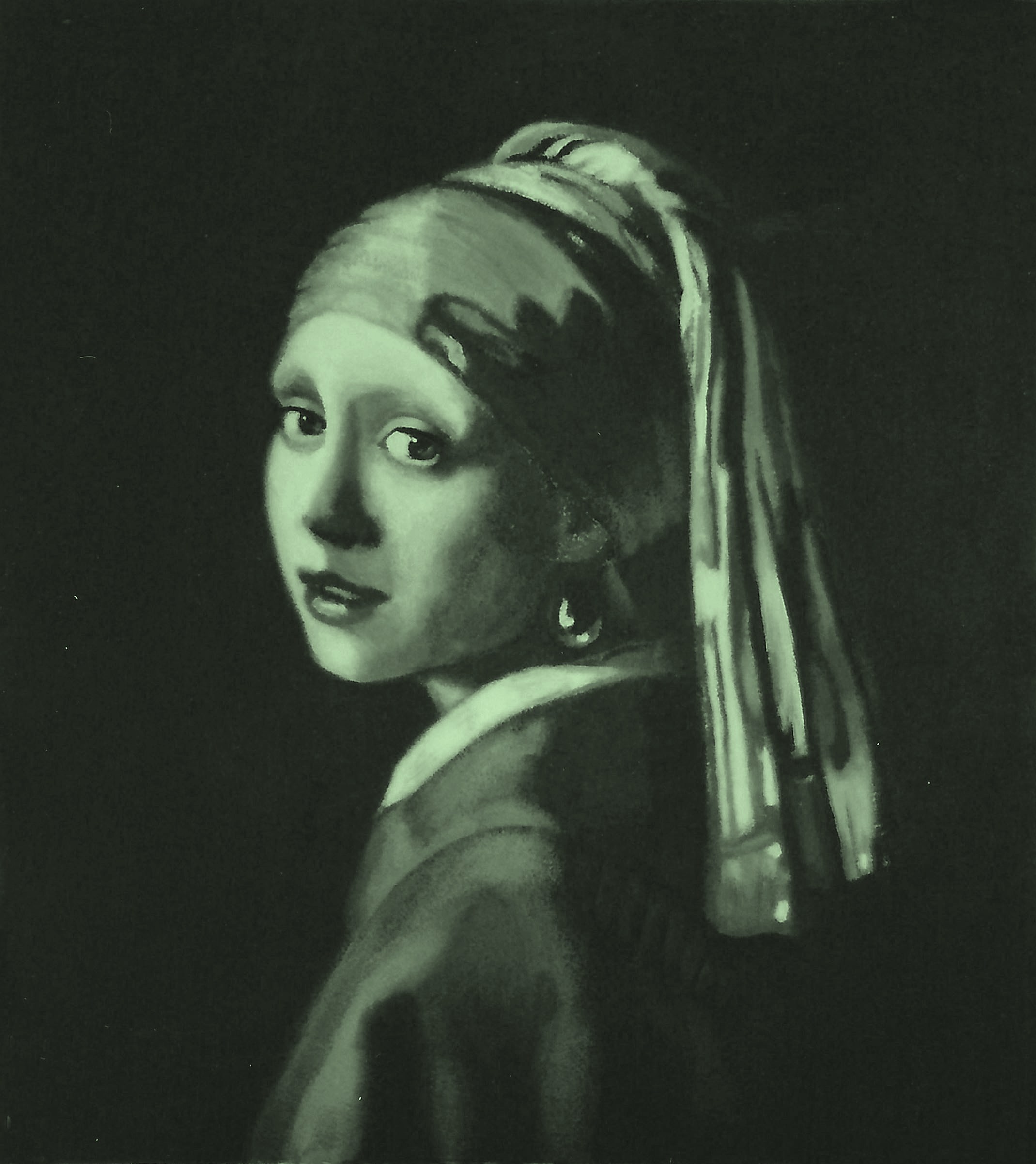
Lay another piece of acetate on top of the grayscale reference and grid.  As with the gridded acetate, also tack this one down with tape.  Trace the figure, including as many detailed features as possible.  You can use dotted lines or denser lines to indicate shadows or clothing folds.  If you make a mistake, remove it with alcohol and a cotton swab, as mistakes made at this stage will only look even more pronounced in your enlargement.  Strive for perfection–it will pay off and save you time later on.

*You can take your cartoon outline further, if you find it helps you, by turning it into a value study.   Do this by continuing to draw on the acetate to create a value study with lines–closer together indicates darker–farther apart creates lighter areas.  When your acetate drawing looks exactly like the reference and you would deem it a good drawing by itself, you are ready to begin transferring it to the painting surface.

On your board, and just as you did on the acetate, draw an “X”, then a cross, then a diamond, then divide it into fourths, both horizontally and vertically.  You can use charcoal or pastel pencils for this.  Do not use graphite because it can telescope through oil paint over time.  You can draw additional lines to aid you, connecting any two points at any angle.  Use as many of these as you need to help encase difficult areas like eyes, nose, and mouth.  Keep in mind that whatever you do to the board, you do to the acetate. Note where I placed my extra lines:

PaintingProcessStep2

We’ll continue with inking and gesso/gelatin buildup in later posts.

All the best,

Marsha

P. S.  Just a note to remind you of the upcoming workshop

Hello, dear readers.  Here is some information I just sent out to all members of The Arizona Renaissance Art Guild, and I would like to share it with you as well.  We are having a one-week workshop where we intensively work on our paintings for one committed week.  If you will be in the Phoenix area on October 7-11, 2013, we would like to invite you to attend and perhaps make some new painting friends.  Respond to this post if you are interested.

Dear Artists:

Great news!  Karen has confirmed the dates for the Arizona Renaissance Art Guild’s one-week workshop. So, are you ready to paint those gorgeous works of art???

It’s PAINTINGPALOOZA time, one whole week to devote to your Classical painting for about $60 – $85 (total for the week), where we artists help each other make our work better and better.

The workshop is scheduled for the week of October 7 – 11, 2013, at the museum.  Workshop hours each day are from 9:00 a.m. until ?.

Signing up is simple–just send us an email and please include your phone number in case we need to contact you.  We have space for a maximum of 12 people. The more people that sign up, the less the cost!

There is no need for you to send a deposit ahead of time: just RSVP via email to confirm your attendance, and then pay your share when you get there.

And as always, if you see someone who didn’t get this email but who should or wants to be on the mailing list, please feel free to forward this on to them and us so that we will be able to include them in our next mailing.

Call if you have any questions.  Looking forward to hearing from you soon,

Karen and Marsha
Arizona Renaissance Art Guild

PART 3, CLASSICAL ACADEMIC APPROACH, THE PALETTE

The other item you will need right away is a 9-value (+black and white) palette.  12″x24″ is the most useable size.  Any smaller and you won’t have enough mixing room; any larger and it gets cumbersome and harder to reach over it.  Making this yourself is an excellent learning experience and begins to train your eye to see nine values in 10% increments, plus black being the absence of light on one end, and white being the absence of dark on the other end (based on the Munsell system).  You will have eleven value strips total.

Frank Covino created this and he calls it the “Controlled Palette.”  As of this writing, I don’t know if he still sells it.  A couple of years ago, he began making it smaller than the one I bought (and love) from him nearly ten years ago, and now I see on his site that it seems to be all a 5th-value gray, similar to Richeson’s Grey Matters palette paper (another excellent tool to provide that extra paint mixing space you sometimes need).  I suggest you contact Frank if you would prefer to buy a palette that is ready to use.  If you find that it is now indeed all gray, I strongly advise you to make it yourself instead.  Your acuity for values will be considerably heightened and, in the long run, you will become a much stronger artist for it.

Here is my palette in use. I still have Saran Wrap (the most non-permeable brand–I have tested this) over the colors. The flesh is still in verdaccio, since it’s always best to remember that “what surrounds the form affects your perception of the form’s values”:

JimAndAlma

Here is what it looks like:

PaletteFront

Front

PaletteBack

Back

You can print this value scale for reference.  Remember, there is a white strip to include at the right end:

PaletteColorChartValues

Supplies needed (all available at Home Depot, Lowes, Ace, etc.):

2 pieces 12″x24″ thin Plexiglas–glass is better for scraping or cleaning if you’re not going to be traveling with it.

1 piece 12″x24″ 1/8″ Masonite

6′ length of 2″ wide gray Duct tape

1 piece of 12″x24″ Contact paper of your choice (wood grain shown)

1 12″x24″printed or painted value scale on lightweight card stock, not paper

Coat one side of Masonite with contact paper, then assemble “sandwich” from the bottom, up, as follows: 3. Masonite (Contact paper on underside), 2. value scale, face up, 1. 1 piece of Plexiglas (or glass) to cover.  Duct tape edges with half the tape width showing on top and half on bottom, long edges first, short edges last.  Palette is complete.  The extra piece of Plexiglas is used on top of the palette to mix paint on and keep the actual palette clean.  When you use it, make sure to very lightly rub it with olive oil before you put the paint on, thereby making it easier to clean.  When the top gets scratched and mangled after many uses, just toss it and get a new top to go over your palette.

Test the measurements of this palette before you make it to ensure it fits in your freezer (adjust, if needed), as that is the way to store your paint for as much as six months.  This saves money because when you mix a flesh palette, for example, you can just use the remaining paint for another portrait.

All the best,

Marsha