Yesterday, I was on the phone trying to explain to a friend, how to paint white objects with the spectrum. Without the visuals it was difficult, so after we hung up, I decided to prepare a quick example for the blog.
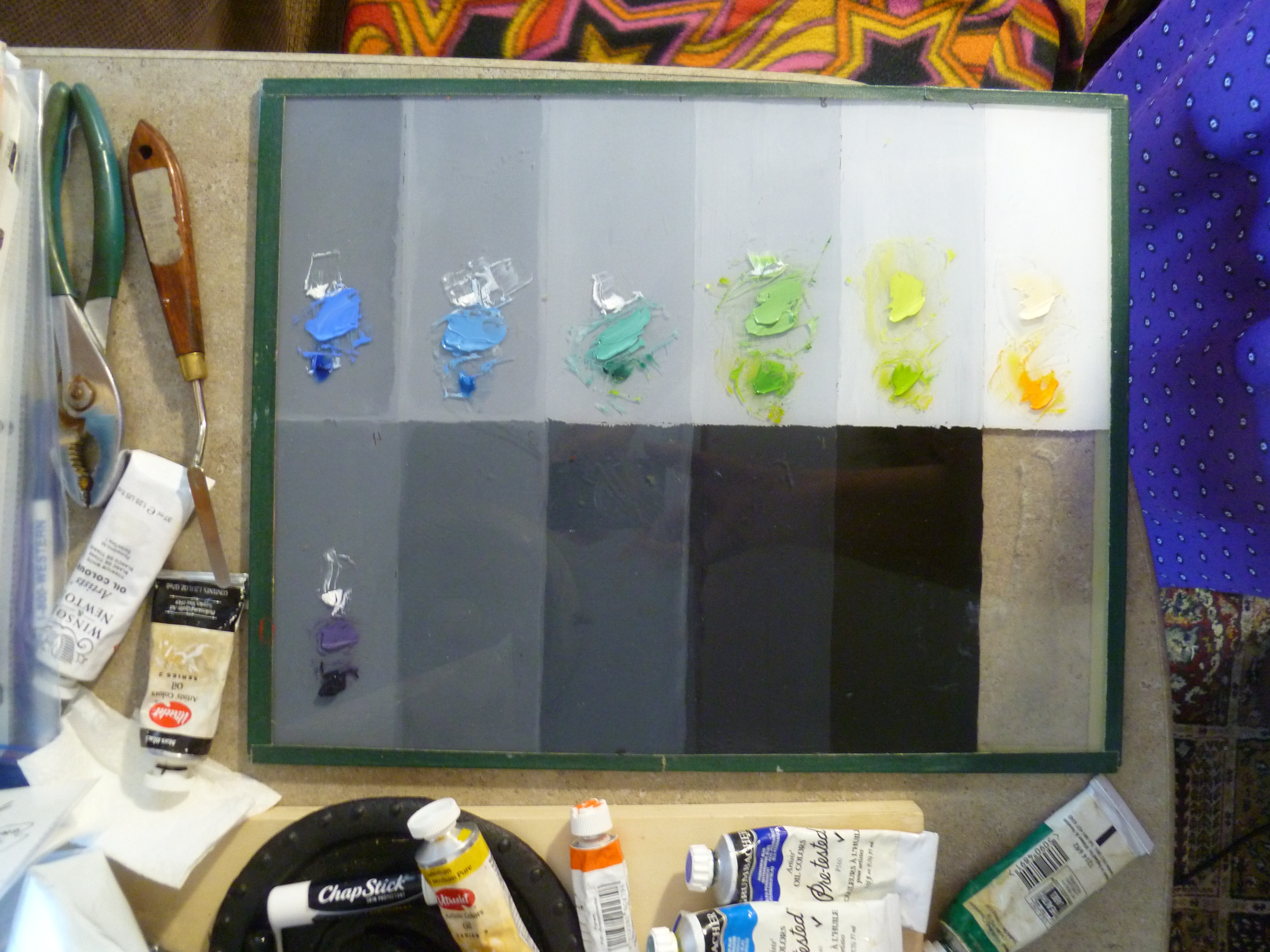
The order of the rainbow spectrum (dark to light) is purple, purple-blue, blue, blue-green, green, yellow-green, yellow, yellow-red, red, and red-purple. In order to match the rainbow’s values and their respective hues, we need to start where the rainbow starts. Using a 9-value scale with value 4 as spectrum purple, we work our way up the value scale from there:
4–Purple (cobalt violet)
5–Purple-Blue (ultramarine)
6–Blue (cerulean)
7–Blue-Green (viridian)
8–Green (hansa yellow plus thalo green)
9–Yellow-Green (hansa yellow plus thalo green)
White–Yellow (cadmium yellow lt.)
White–Yellow-red (cadmium orange)
White–Red (napthol red lt.)
White–Red-Purple (alizarin crimson perm.)
Here is how to think about that: since cobalt violet is a value 1 in the tube, we have to lighten it with white until it is a value 4, then put it in its proper place on the palette. Likewise, ultramarine blue is also value 1 in the tube so we need to lighten it with white until it is a value 5. Next in the spectrum is cerulean blue; it is a value 3 in the tube, so it requires less white to make it a value 6.
Continue working up the rainbow spectrum through value 9 yellow-green, as listed above. The last three hues (not shown–unfortunately, I neglected to photograph those) are simply white with a tint of cadmium orange, then napthol red in the next pile of white, and finally, permanent alizarin crimson in the final white. Here is the palette to this point, sans the YR, R, and RP mixed with white:
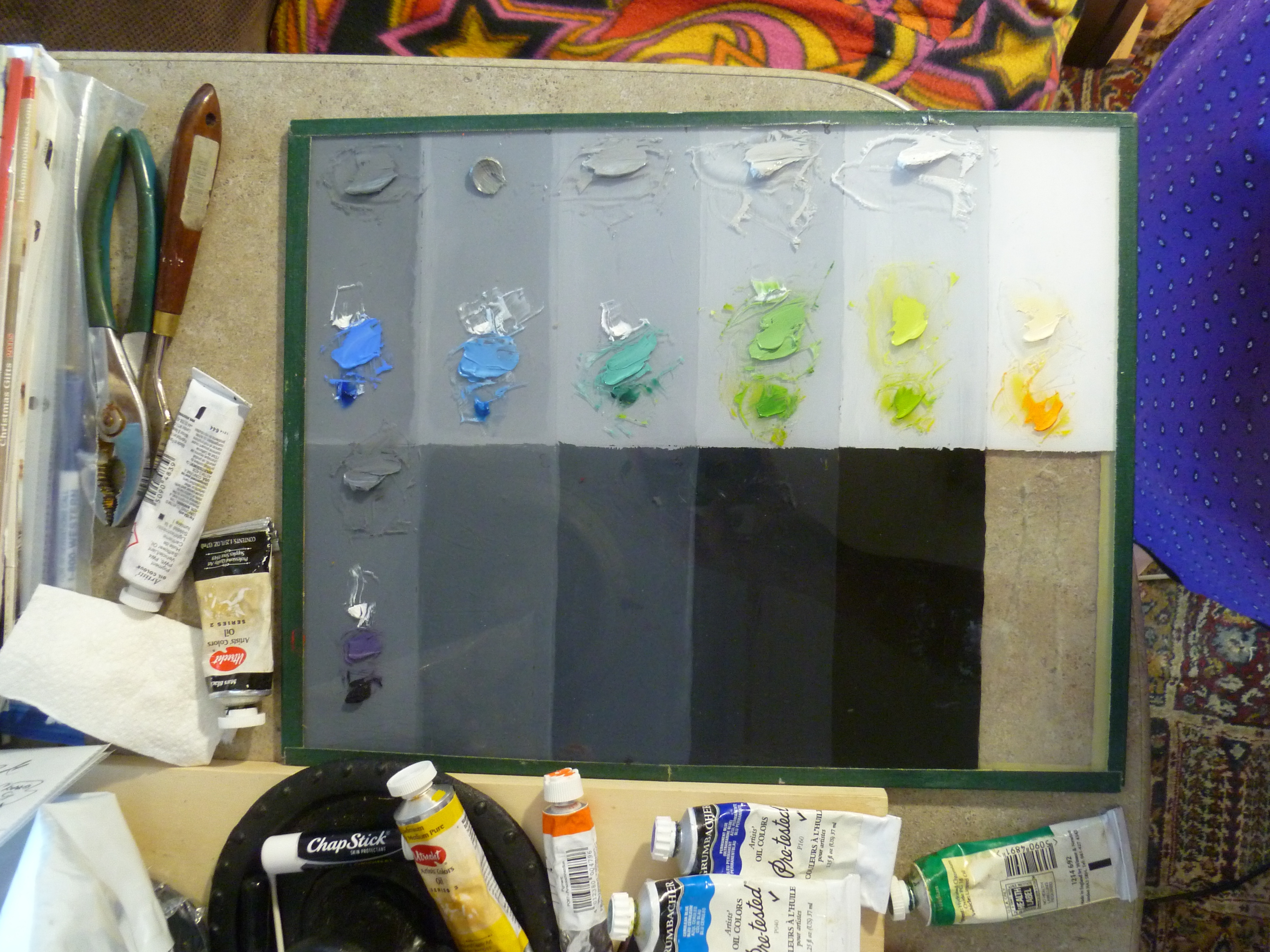
After mixing each hue to its proper value (pictured above), place the corresponding value 4-9 greys, plus 4 piles of white on your palette:
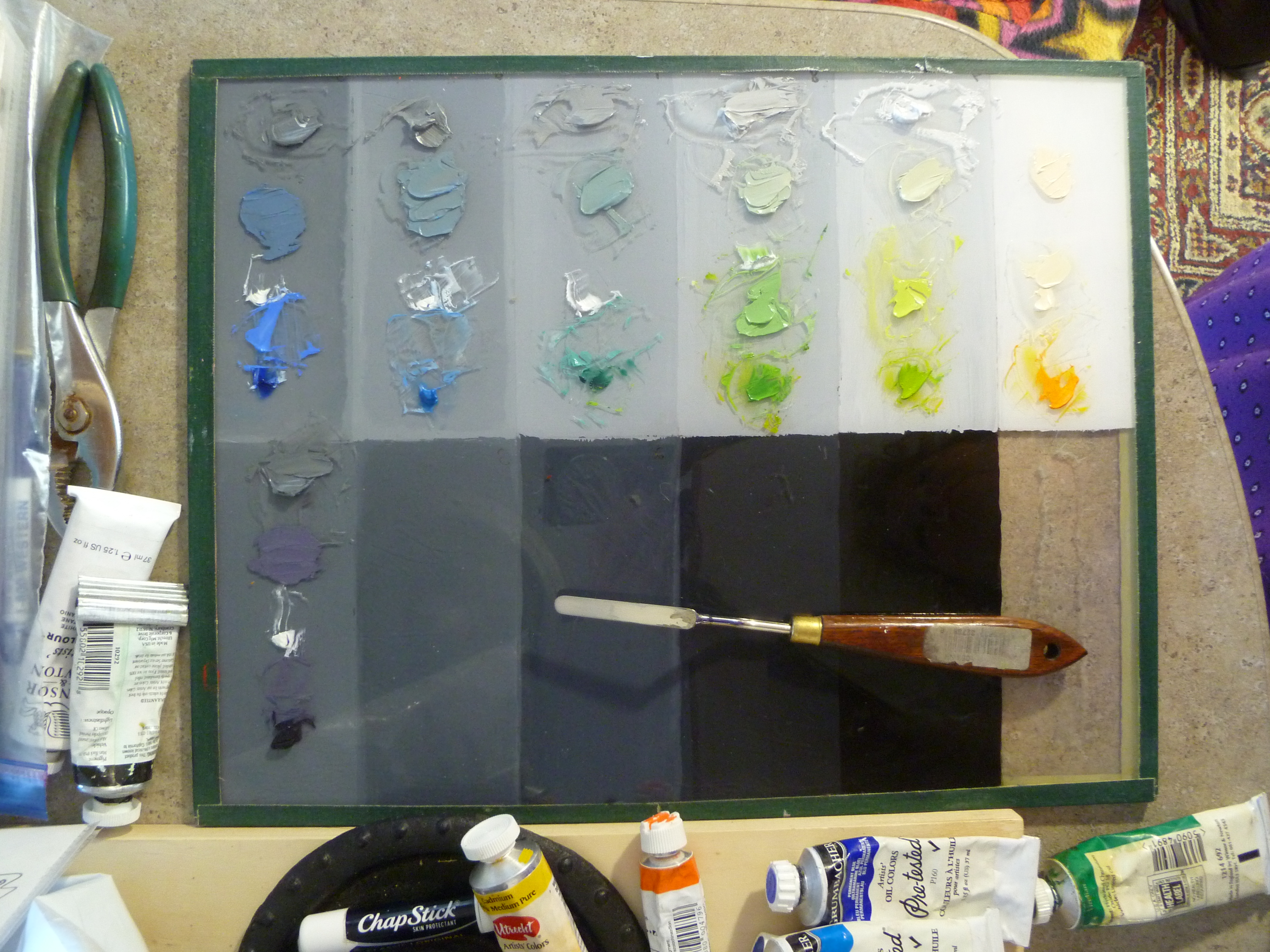
Then tint each of the greys with a just a touch of their corresponding hues:
Preparing a brief palette was all I intended to do when I began, but then I thought, “Why don’t I just do a quick painting of a white object and put the whole project on the blog? Since I only had an hour to spare, I did something easy:

And because my little enameled pitcher looked like it was floating in the air, I mixed together, everything on my value 4 and 5 spaces, and made the table color. Then I marbled the remaining paint together (without values 4 and 5) and spread it with a palette knife for the background of my little painting:
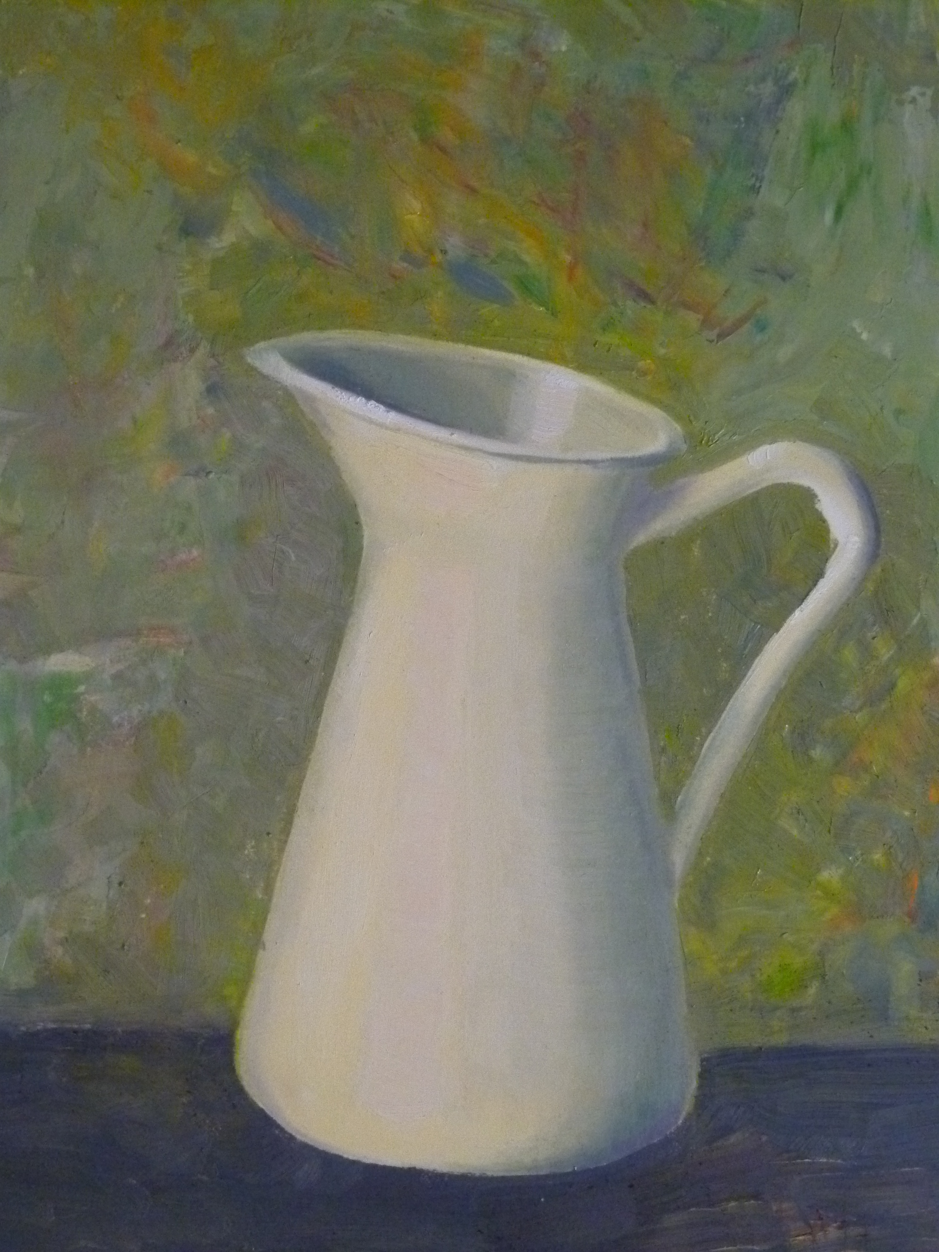
A White Pitcher, 4″ x 6″
Someday, I may give it a single flower and some touch-ups but, for now, this is it. Master painter, Charlene Higley, will be teaching all of us how to mix spectrum whites for light, shadow, and seascapes. Feel free to contact me by posting below, if you would like to attend (free) the 2-3-hour class in March, 2016. It will be held in Gilbert, Arizona.
Karen Schmeiser, another master painter in our Arizona Renaissance Art Guild, has a lot of experience with using the spectrum white palette. She is currently working on this painting. Notice the effect of the subject’s lighting. She has added the color of the candlelight to each of her spectrum values to portray the white garment:


I hope this helps you.
And please don’t forget about Frank Covino’s workshop coming up in Gilbert, Arizona on November 9-13, 2015. We still have space if you want to come. See the post, Workshop Announcement, dated Sept. 27, 2015. Contact me through this blog if you are interested.
Follow my blog to get the latest post sent to you.
All the best,
Marsha
