ART OF THE MASTERS Workshop

Hello, Artists,

gilbertsunnewsarticle6-2016

We are planning a workshop the week of November 14, 2016, which is our only opportunity window for quite a few months. Can you make it? We will also have a Free Prep Day on November 7, a week before the workshop, in order to help you get a wonderful start. The cost for the 5 days is $489.

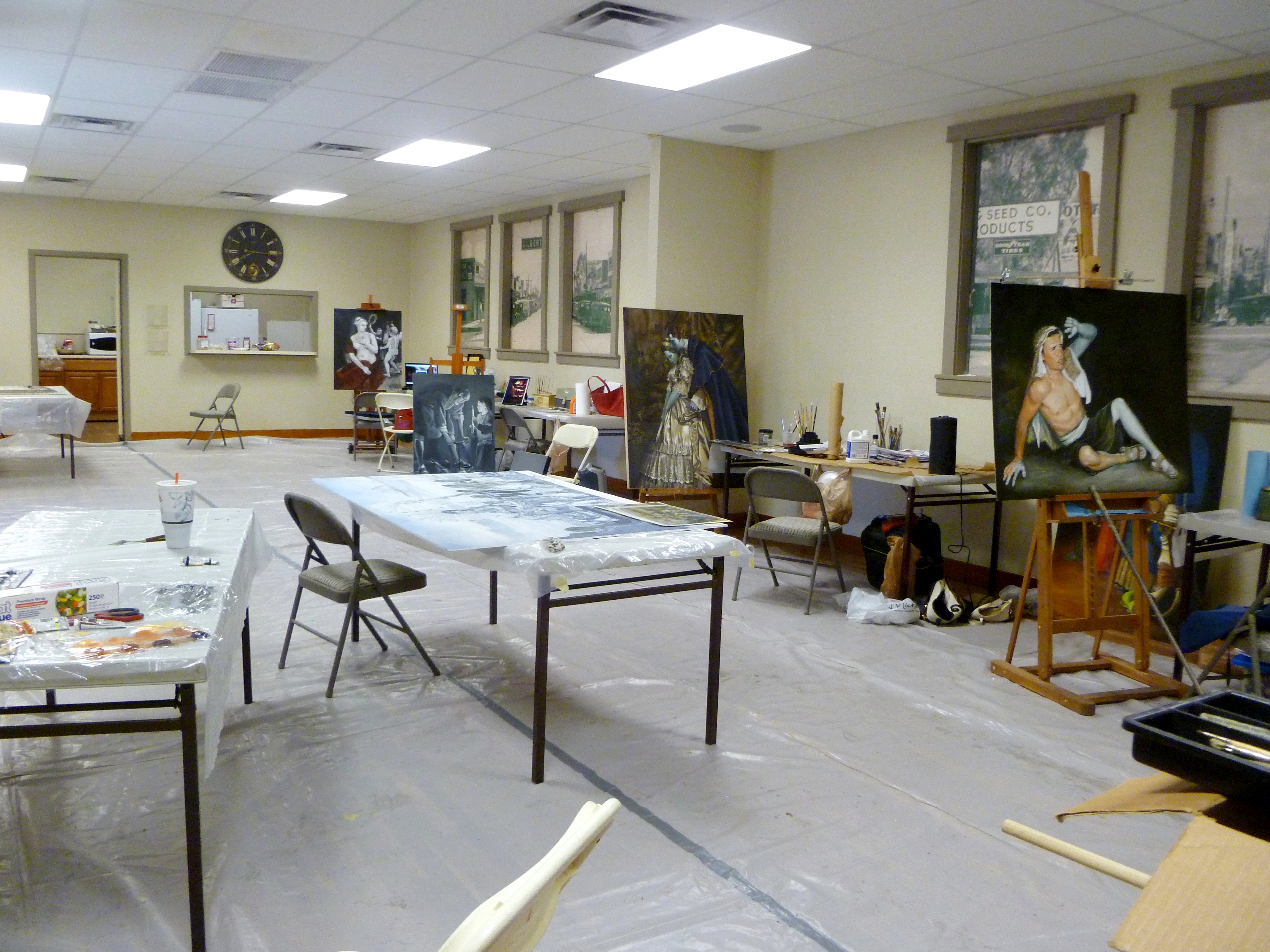
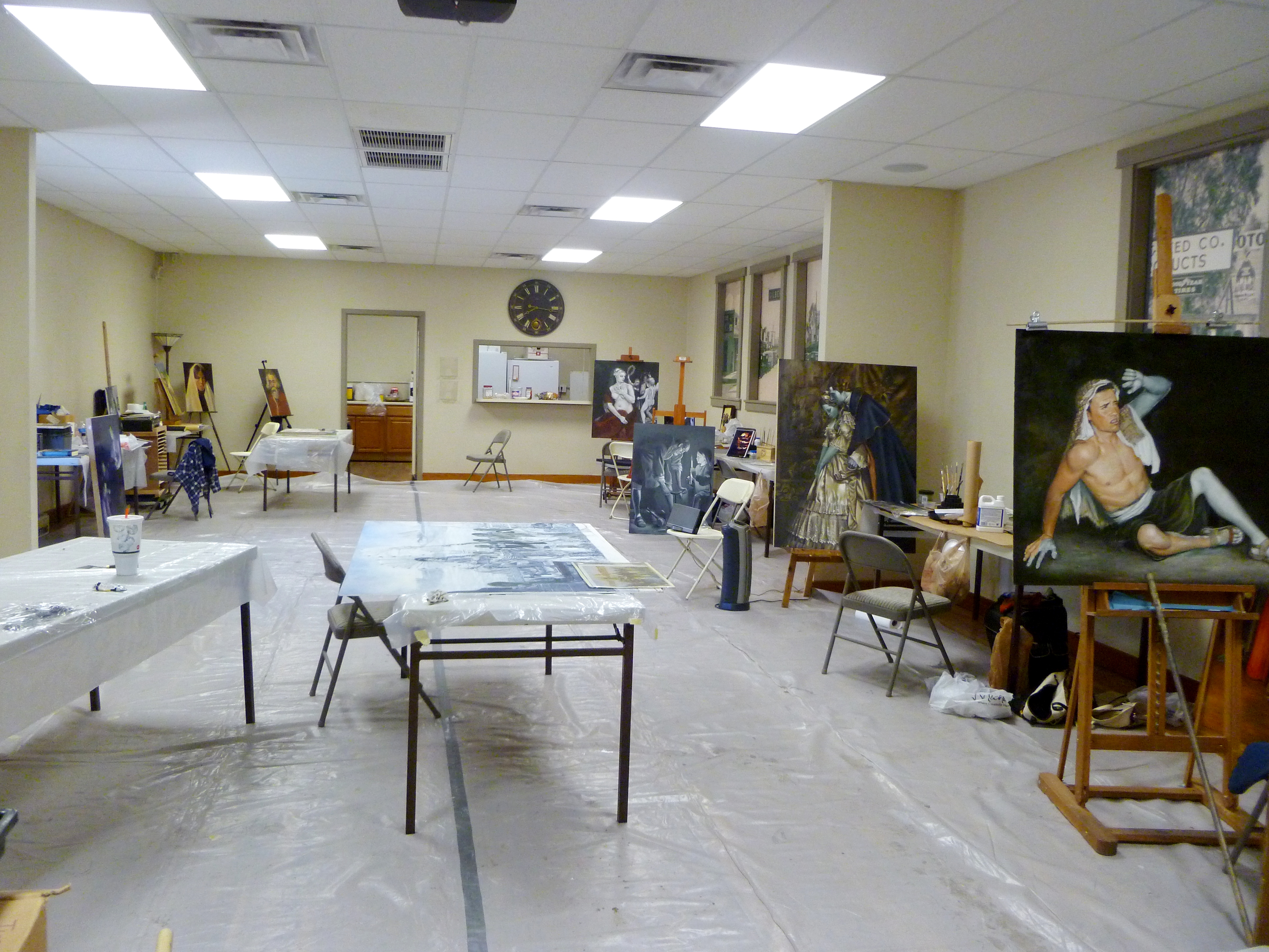
Art of the Masters Workshop
When: Nov. 14-18, 2016
Where:  Gilbert, Arizona
Time: daily, 9:00 – 5:00

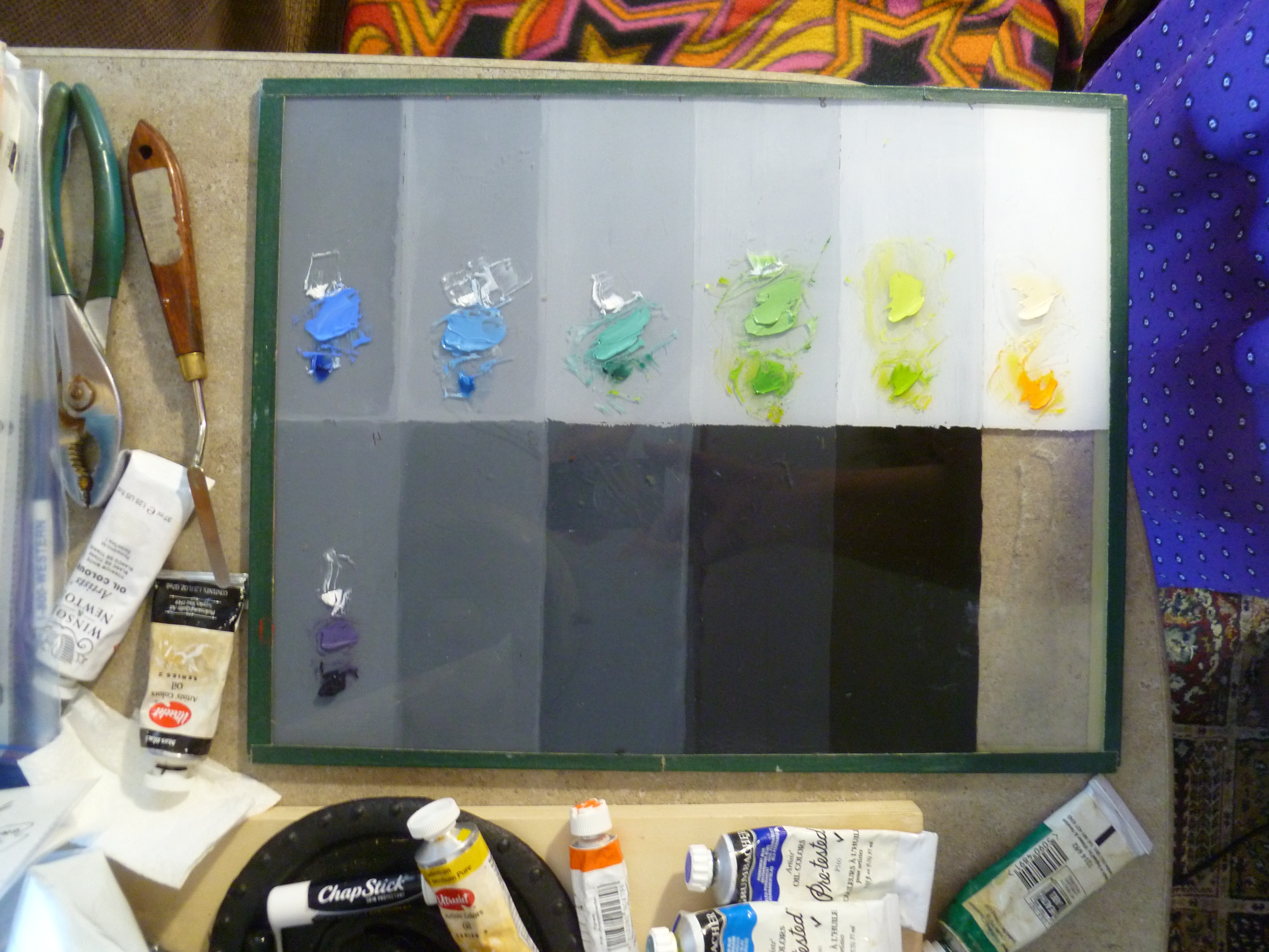
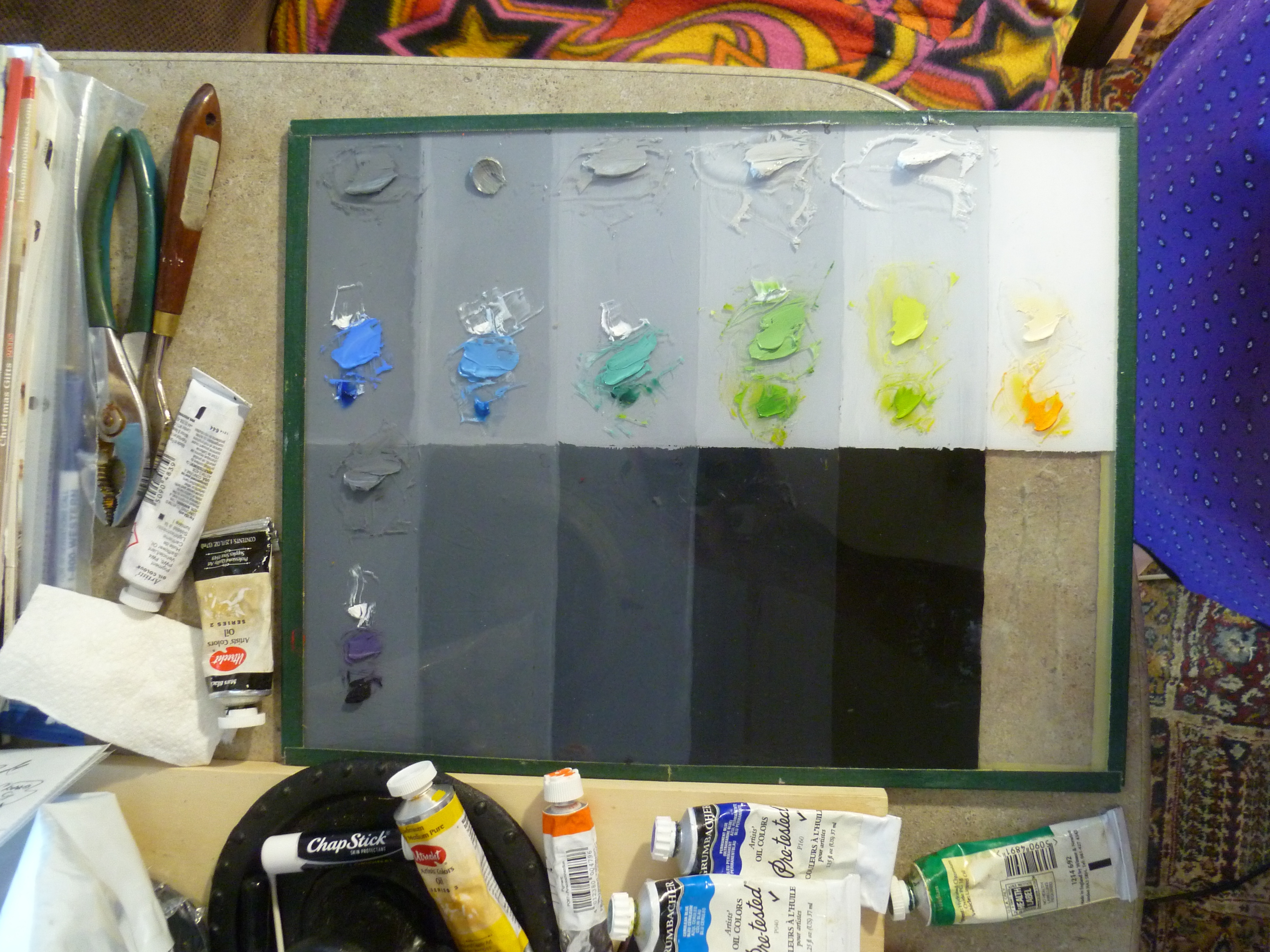
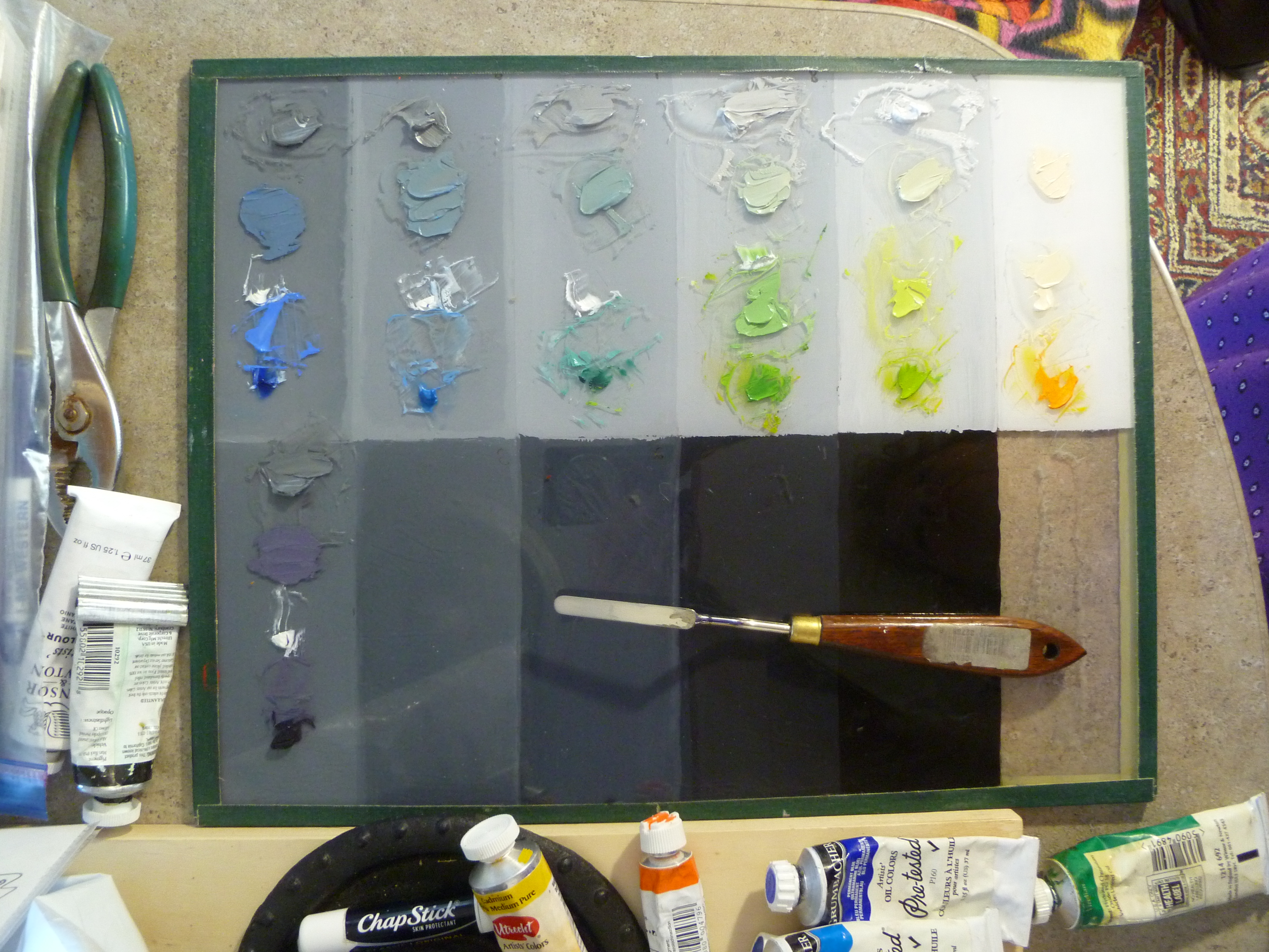
If you feel undecided, maybe now is the time to get off that fence and embrace your true art self. We promise that you will get more step-by-step art instruction in one week with us, than you will get anywhere else, even in workshops that cost more than twice what we charge. We also give you helpful handouts (most art classes don’t) because we want you to be able to remember and continue working on what we’ve taught you. To us, the most important thing is continuing the legacy of the Old Masters, and we are passionate about passing on their wisdom and techniques to others. We would love to have you with us!

And like Maestro Frank Covino always did, we offer $100 off the cost of your tuition for each of your friends that sign up for the class.

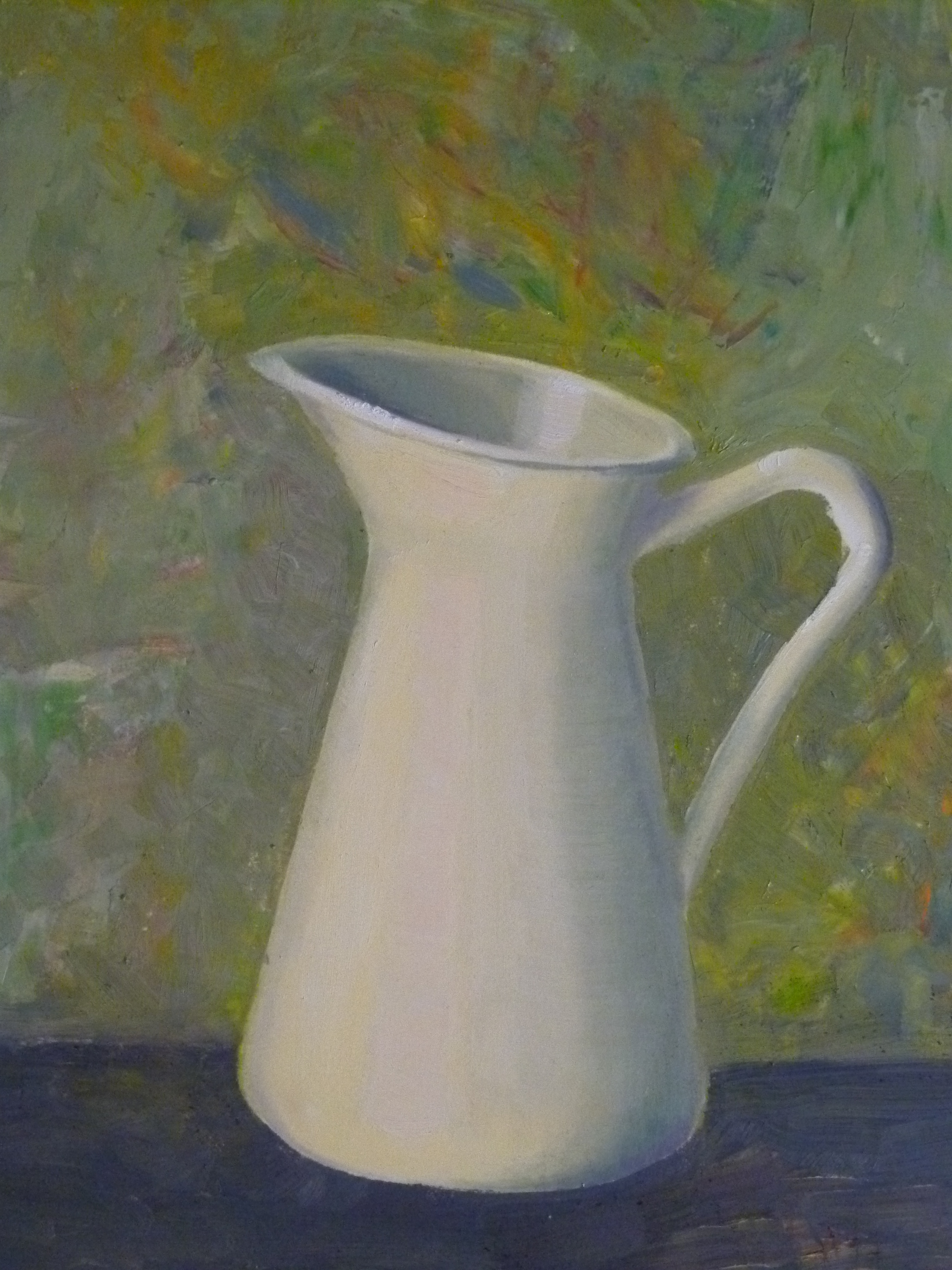
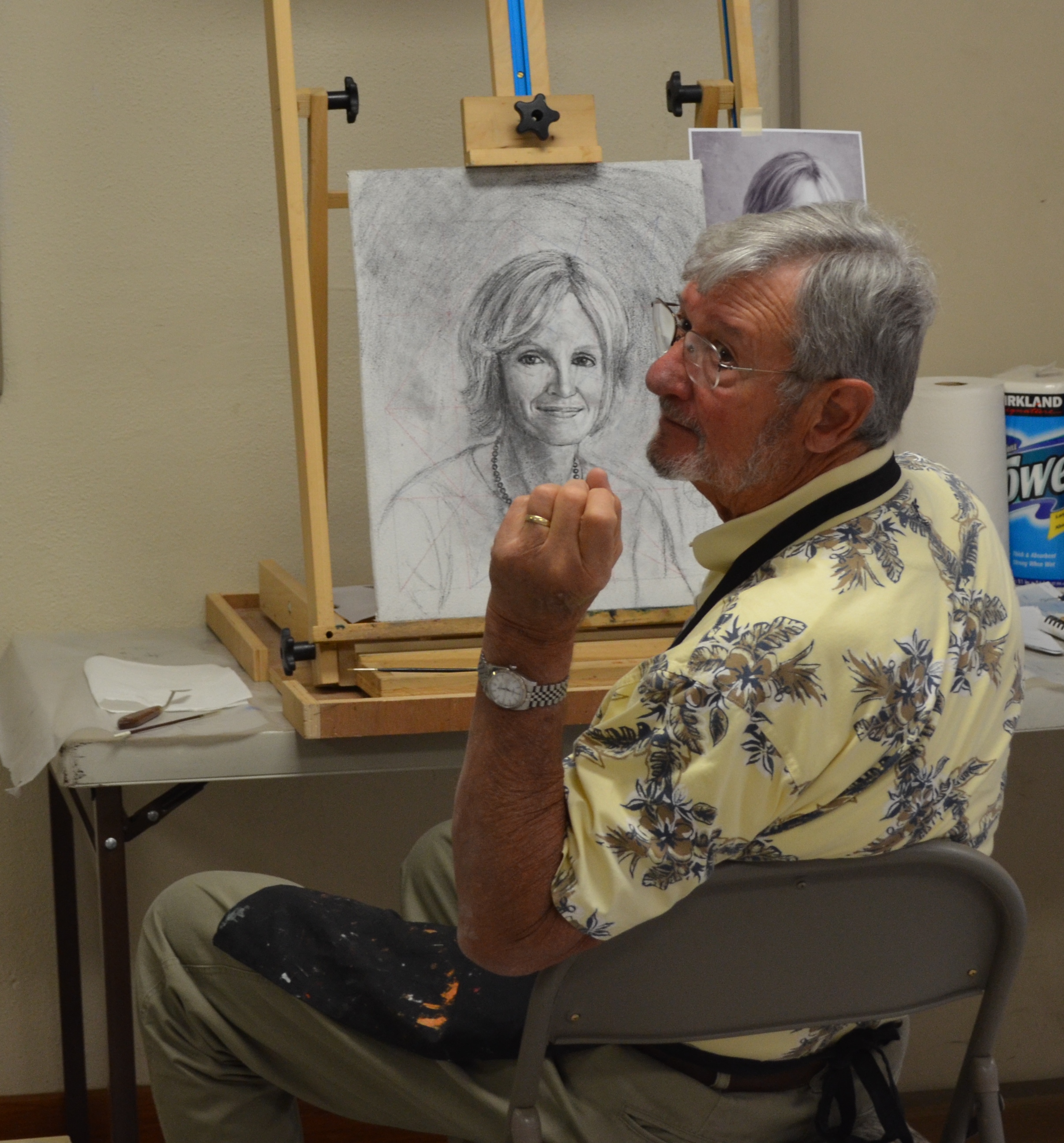
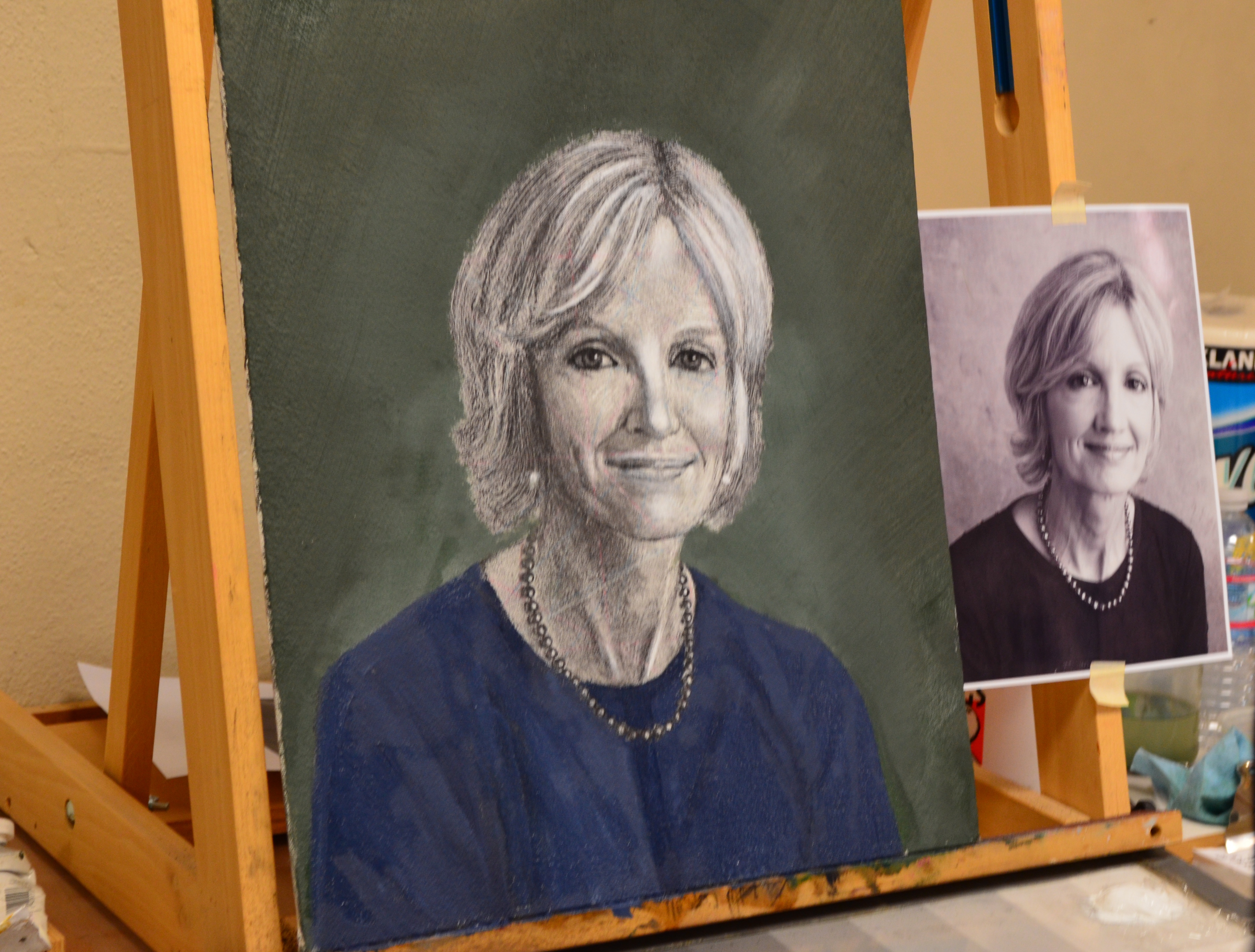
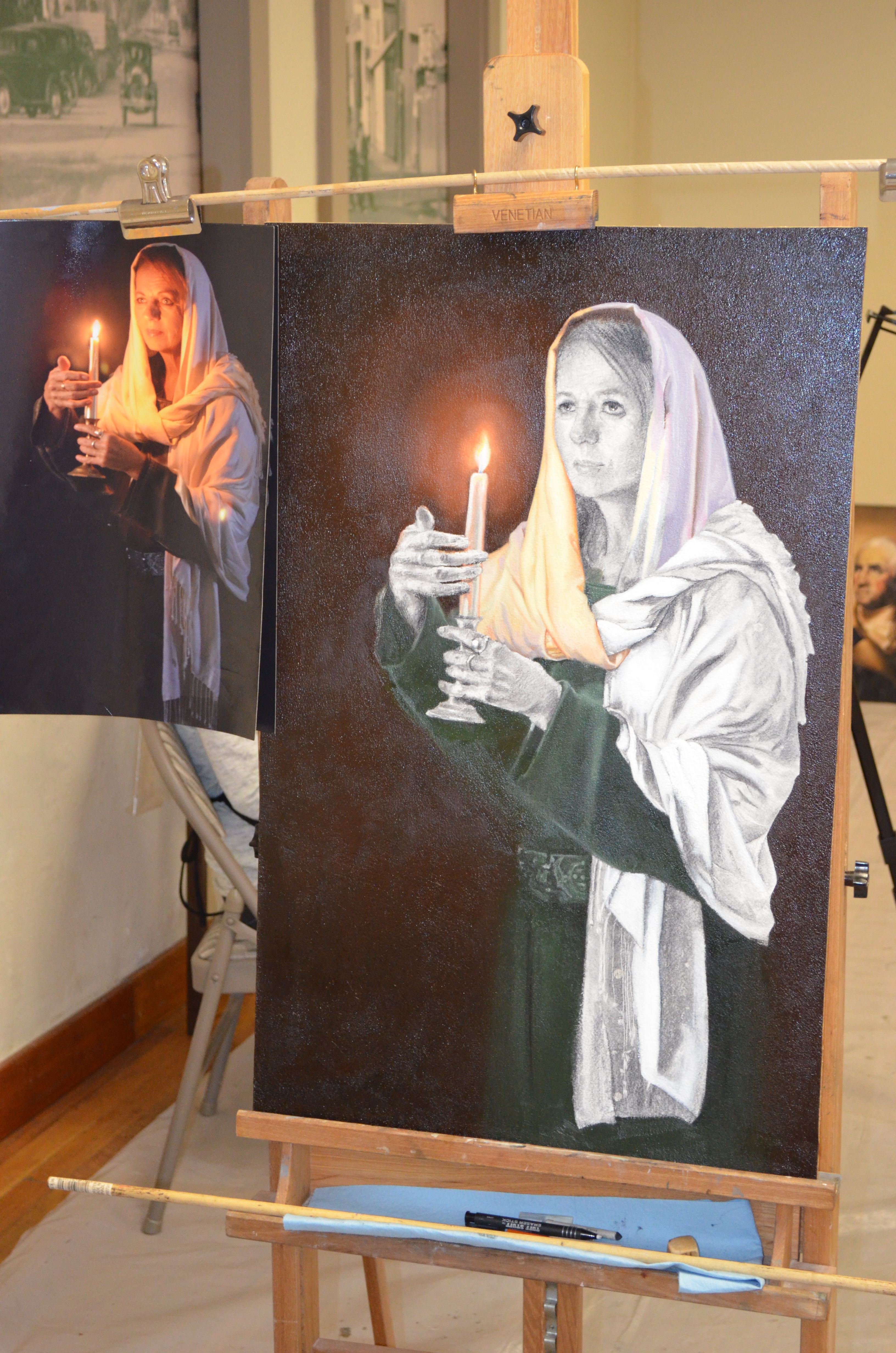
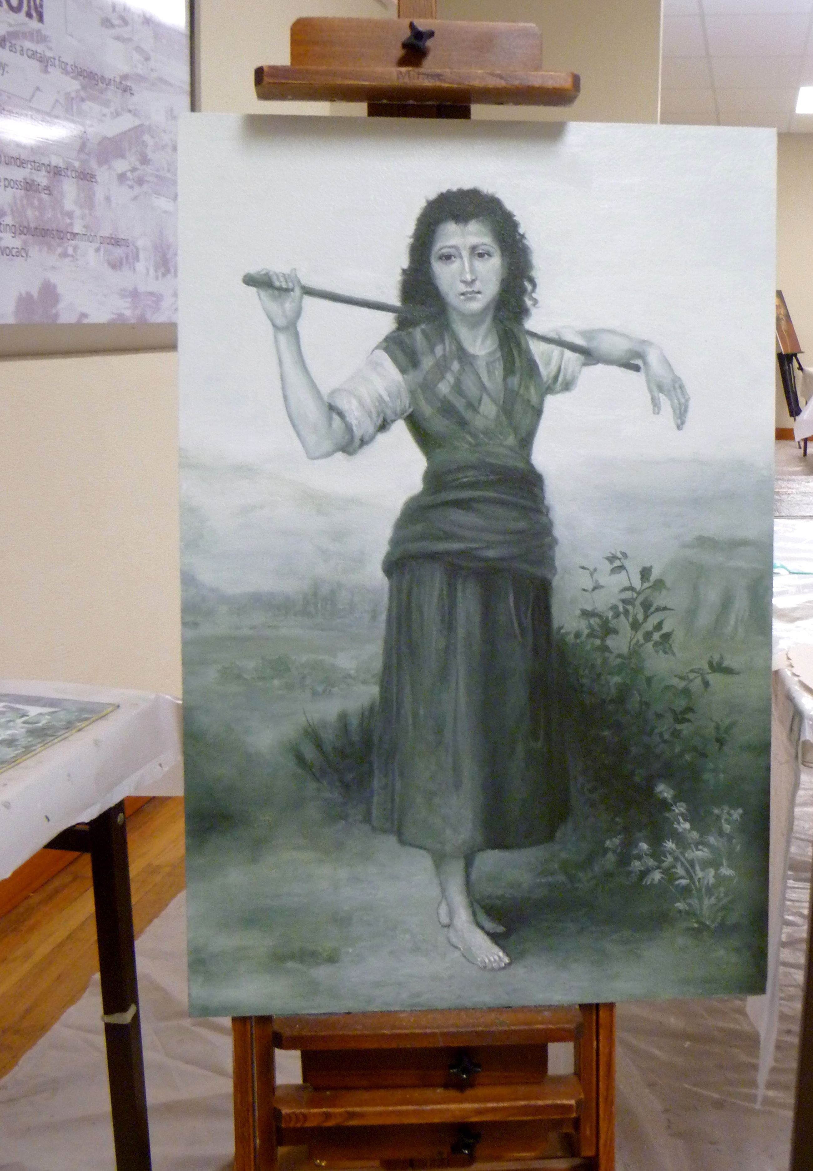
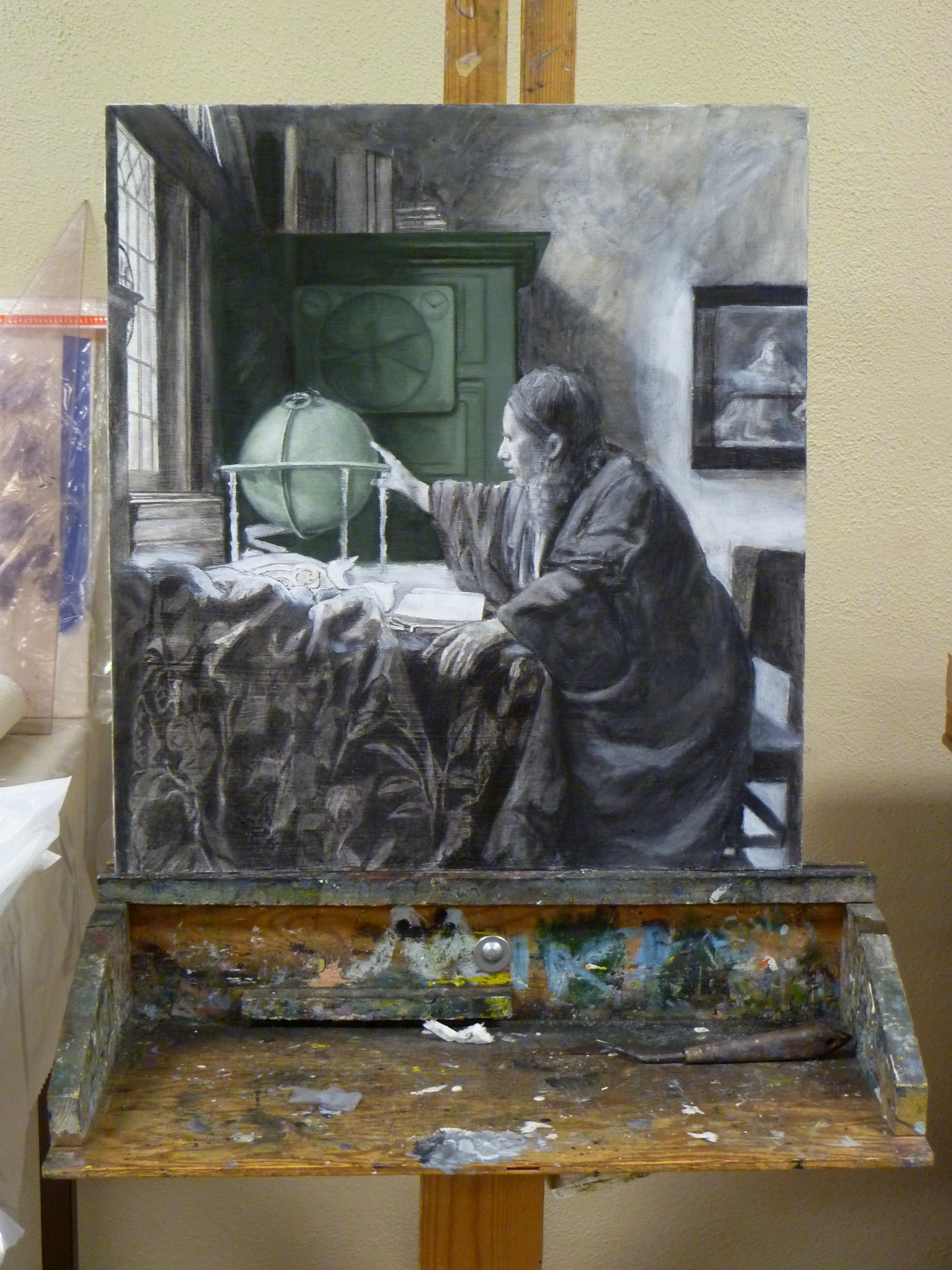
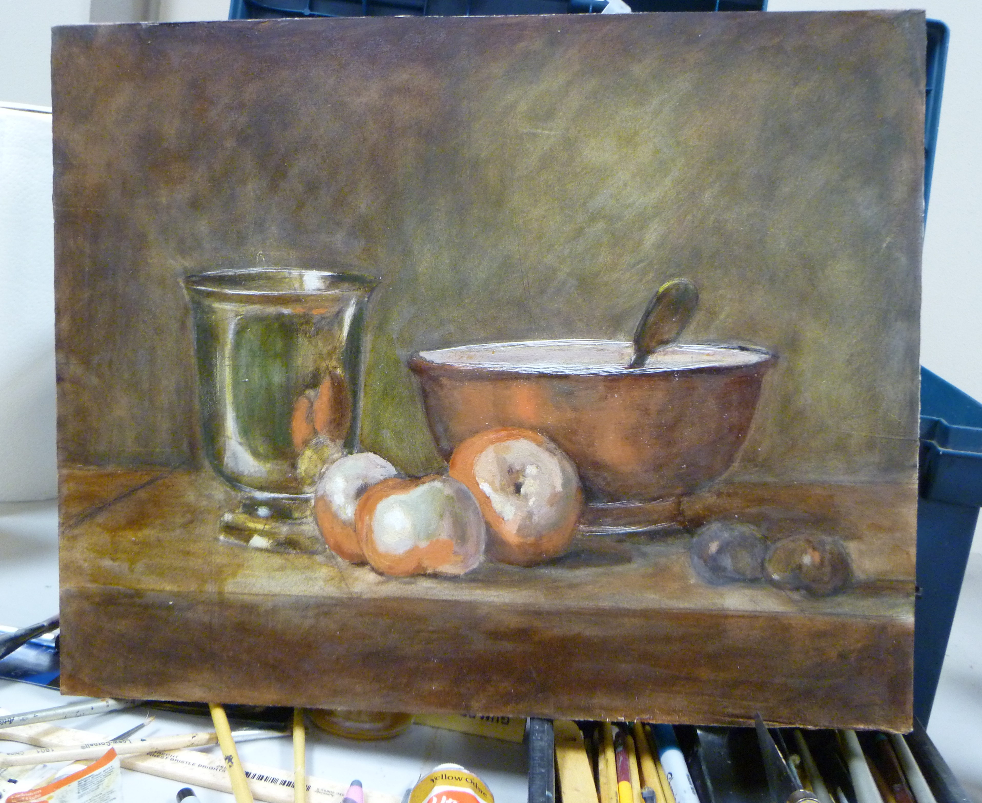
Below is a sample of first-time student drawing (24″ x 30″), in preparation for painting.  Amazing, huh!

P1110792

Here are things needed for the Free Prep Day:

Materials for board preparation, graphing, and drawing:
Ampersand Gessobord brand surface
metal yardstick and ruler
ultra-fine Sharpies, various colors (black, blue, and red are probably enough)
General’s charcoal pencils, soft
kneaded eraser
High quality photo of Old Master painting to work from, printed on 8 1/2”x11” glossy photo paper, one grayscale, one color–Art Renewal Center is an excellent online museum source– https://artrenewal.org/pages/search.php
blending stumps (tortillions)
Exacto knife
spray workable fixative
clear tape
acetate

Other helpful items:
transparent 18” triangle
India ink and sable liner brush
artist’s white tape, removable

Please respond below, and we’ll get right back to you!

Marsha and Karen
Art of the Masters

THE SPIRIT OF FRANK COVINO

CovinoMarshaAndFrankPhoto2009

Hello Artists,

The spirit of Frank Covino visited me this morning and I wound up with white paint on the back of my hand, that had transferred to the sink and countertop before I realized it.  I searched all over but couldn’t find the source, and was blaming the cats for perhaps stealing a tube of my paint–so I was frantically looking for that as well–don’t need any mentally challenged lead-white-eater kitties in my life.

My husband found the source on the underside of a shelf wire in the refrigerator, the result of a paint storing fiasco last week.  I thought I had cleaned it up thoroughly, but I guess not.  It’s amazing how far a little dot of paint can travel when you don’t want it to.

Remember how Frank was so good at getting more paint on our painting tables and on himself, than on our canvases? 🙂  So, two days before Karen Schmeiser and I begin our Art of the Masters workshops in Arizona, I’m guessing Frank stopped by this morning on his Memorial Celebration Day to remind me to loosen up and not be so picky about making a mess with paint.

Frank will always live on in all our hearts and memories of him.  Will you please share below, some of your memories with the rest of us?

Peace.

EXAMPLE OF HOW TO PAINT OBJECTS WITH SPECTRUM WHITES

Yesterday, I was on the phone trying to explain to a friend, how to paint white objects with the spectrum. Without the visuals it was difficult, so after we hung up, I decided to prepare a quick example for the blog.

The order of the rainbow spectrum (dark to light) is purple, purple-blue, blue, blue-green, green, yellow-green, yellow, yellow-red, red, and red-purple.  In order to match the rainbow’s values and their respective hues, we need to start where the rainbow starts. Using a 9-value scale with value 4 as spectrum purple, we work our way up the value scale from there:

4–Purple (cobalt violet)

5–Purple-Blue (ultramarine)

6–Blue (cerulean)

7–Blue-Green (viridian)

8–Green (hansa yellow plus thalo green)

9–Yellow-Green (hansa yellow plus thalo green)

White–Yellow (cadmium yellow lt.)

White–Yellow-red (cadmium orange)

White–Red (napthol red lt.)

White–Red-Purple (alizarin crimson perm.)

Here is how to think about that: since cobalt violet is a value 1 in the tube, we have to lighten it with white until it is a value 4, then put it in its proper place on the palette.  Likewise, ultramarine blue is also value 1 in the tube so we need to lighten it with white until it is a value 5.  Next in the spectrum is cerulean blue; it is a value 3 in the tube, so it requires less white to make it a value 6.

Continue working up the rainbow spectrum through value 9 yellow-green,  as listed above. The last three hues (not shown–unfortunately, I neglected to photograph those) are simply white with a tint of cadmium orange, then napthol red in the next pile of white, and finally, permanent alizarin crimson in the final white.  Here is the palette to this point, sans the YR, R, and RP mixed with white:
P1100611

After mixing each hue to its proper value (pictured above), place the corresponding value 4-9 greys, plus 4 piles of white on your palette:
P1100612
Then tint each of the greys with a just a touch of their corresponding hues:
P1100616

Preparing a brief palette was all I intended to do when I began, but then I thought, “Why don’t I just do a quick painting of a white object and put the whole project on the blog? Since I only had an hour to spare, I did something easy:

P1100620

And because my little enameled pitcher looked like it was floating in the air, I mixed together, everything on my value 4 and 5 spaces, and made the table color. Then I marbled the remaining paint together (without values 4 and 5) and spread it with a palette knife for the background of my little painting:
P1100622
A White Pitcher, 4″ x 6″

Someday, I may give it a single flower and some touch-ups but, for now, this is it.  Master painter, Charlene Higley, will be teaching all of us how to mix spectrum whites for light, shadow, and seascapes.  Feel free to contact me by posting below, if you would like to attend (free) the 2-3-hour class in March, 2016.  It will be held in Gilbert, Arizona.

Karen Schmeiser, another master painter in our Arizona Renaissance Art Guild, has a lot of experience with using the spectrum white palette.  She is currently working on this painting.  Notice the effect of the subject’s lighting.  She has added the color of the candlelight to each of her spectrum values to portray the white garment:

Karen

Karen1

I hope this helps you.

And please don’t forget about Frank Covino’s workshop coming up in Gilbert, Arizona on November 9-13, 2015.  We still have space if you want to come.  See the post, Workshop Announcement, dated Sept. 27, 2015.  Contact me through this blog if you are interested.

Follow my blog to get the latest post sent to you.

All the best,
Marsha

WORKSHOP ANNOUNCEMENT!

Dear Artists,

The Frank Covino Workshop is seven weeks away. This may seem pointed, but…

We never know if this is the last chance we will have of being taught by one of the world’s greatest master teachers of oil painting in the manner of the Old Masters. In October, Frank will be in his mid-eighties and his traveling might be curtailed at any time. When we are with him, I think we sometimes take his presence for granted, but in this next workshop, as much as possible, we should hang on his every word, watch what he does at each workstation, audio-record what he says, take thorough notes, and ask good questions.

Have you priced workshops lately? There is no big-name artist today holding a serious workshop for less than $1,000 (Frank’s is $695), and a big name, does not a great teacher make. I have forked out my money for this, first hand, and I can tell you, Frank is one of the few “greats” alive today that can actually TEACH others how to paint. They may be wonderful painters themselves, but they frequently can’t convey their knowledge to students. Thus, you come away learning less than a tenth of what you would learn spending one week (and a lot less money) with Frank. That’s like getting 10 half-days VS. just 1 half-day, $300 cheaper.

I apologize if this sounds a bit like a sales pitch, but it isn’t–I have to pay the same amount as you do, plus do some of the behind the scenes prep work. It’s just that to avail ourselves of the joy of this knowledge while Frank is still with us, is such a privilege. There is nothing else like giving pleasure to our family and friends through our art–that wonderful feeling of giving a painting or a giclee’ to someone you love, and seeing their smiles and pride when they hang it on their wall. It would be terrible to look back and think, “If only I had taken his class when I could have…now it’s too late.”

Here is a sample of what you can learn to do at Frank’s workshop:
PaintingWorkshopCovino4-2015Bouguereau
Here are the details–

What: Frank Covino Workshop
When: November 9-13, 2015
Where: Gilbert, Arizona

A $200 deposit is due on Oct. 9, three weeks from now.

There will be space for a maximum of 12 people.

Frank is offering a special treat–If you sign up a new student, you AND the student each get $100 off the tuition (only 2 given per workshop).

Keep your tunnel vision set toward Frank’s instructions, and you will be creating exquisite paintings this year that will still be around 300 years from now, because they will be so good that anyone who owns them, will not part with them! Remember, it’s better to spend a few weeks creating one work of significant art, than painting 10 quick ones that will end up in garage sales and bought for the frames they’re in (I’ve done this many times–have you?).

If any readers out there would like to join this workshop or have any questions, just comment below, and we will be in touch.

Follow my blog to get the latest post sent to you.

All the best,
The Arizona Renaissance Art Guild

PAINTINGS FROM A WORKSHOP

The Arizona Renaissance Art Guild had a workshop with Frank Covino in April this year, 2015, and since we plan on another one later this November, I thought I would post these paintings for everyone to see some of the processes and quality of work generated.  Keep in mind that all of them are in different stages of completion.  Some were just begun by new students in the workshop, and some are the result of weeks of work by seasoned artists.

Whether you are someone who has always wanted to paint but never had the time, or whether you are a seasoned artist wanting to learn different techniques, you are welcome to join our workshop in November.  Stay tuned.  As soon as I get definite dates, I’ll let you know.  Enjoy the photos:

PaintingWorkshopCovino4-2015Charlene1

Work in progress, by Charlene Higley

PaintingWorkshopCovino4-2015Charlene

PaintingWorkshopCovino4-2015

PaintingWorkshopCovino4-2015Bouguereau

PaintingWorkshopCovino4-2015Bill

PaintingWorkshopCovino4-2015Bill1

PaintingWorkshopCovino4-2015Glori

Work in progress, by Glori Robison

PaintingWorkshopCovino4-2015Glori1

PaintinWorkshopCovino4-2015Pat

Work in progress, by Pat McKinley

PaintingWorkshopCovino4-2015Pat1

PaintingWorkshopCovino4-2015Cheri

Work in progress, by Cheri Stucke

PaintingWorkshopCovino4-2015Cheri1

PaintingWorshopCovino4-2015Barb

Work in progress, by Barb Franelli

PaintinWorkshopCovino4-2015Karen

Work in progress, by Karen Schmeiser

PaintingWorkshopCovino4-2015Karen1

PaintingWorkshopCovino4-2015Karen2

PaintingWorkshopCovino4-2015Karen3

PaintingWorkshopCovino4-2015Karen4

PaintingWorkshopCovino4-2015RickFarmworker

PaintingWorkshopCovino4-2015Rick

PaintingWorkshopCovino4-2015Sariah

by Sariah Clonts

PaintingWorkshopCovinoFrank4-2015

Frank Covino, Modern Master and Teacher Extraordinaire

Follow my blog to get the latest post sent to you.

All the best,

Marsha


WORTH REPEATING

This subject was addressed a long time ago, but it is so critically important that it bears repeating. Of course, it’s about values because, without a thorough understanding of them, you cannot create significant paintings.

Many teachers assume that we all know what “value” in paintings means, so they don’t really elaborate and tell us HOW to see them. The concept is easy to understand when we’re talking about a greyscale, but extrapolate that to color, especially the various colors juxtaposed together to make a painting, and the values concept becomes murky.

You can make an entire painting a monochromatic green or even pink and, as long as those pinks have correct values, your painting will “read” and make sense to the viewer no matter what color you make it. Value is simply how dark or how light that color is.

Yes, but so what? Where’s the “how?” Well, first you have to learn to squint enough at something until the color disappears and you are left with a percentage of light. What amount do you see? Make your own value scale and go around your house placing it next to various objects; squint to make the color disappear so that you can just see the value of the object and not the color. This is a great way to train your eye.

Here is a value scale you can print, showing values 1-9 with the addition of black (which is the absence of light) and white. The lowest value is 1, or 10 % light; the next is 2, or 20% light and so on, up to value 9 at 90%, with white being 100% light:

value scale

When making a painting, values aren’t actual light, of course, but values create the illusion of dark and light in varying degrees (shadows and highlights). Value deals with the lightness or darkness of a color.

Here is part of Bouguereau’s Vendangeuse (The Grape Picker) in color:
Vendangeuse (The Grape Picker)BouguereauCropped
And here it is in greyscale, showing just the range of lights and darks (aka “values”):

Vendangeuse (The Grape Picker)BouguereauGrayscale

And here is the pink version:

Vendangeuse (The Grape Picker)BouguereauGrayscale

So, even in pink values, we still see the little girl, instead of a Botox Babe.

When we do a value-scale underpainting, we are separating the problems of seeing values in one hue vs. seeing those values in juxtapositions of many colors (hues). This makes the painting much easier to execute, and more accurate, because now you have a process.

And that’s why I say you must know how to see value because value analysis and then value duplication is the basis of all perception. It is the common denominator for the replication of all things, whether landscapes, still lifes, or portraits.

Follow my blog to get the latest post sent to you.

All the best,

Marsha


PART 7, CLASSICAL ACADEMIC APPROACH, MIXING VERDACCIO

Before you begin your verdaccio underpainting, make sure you have completed everything you want to accomplish with India ink, charcoal, and gesso and/or gelatin in bas relief, so that your rendering looks as perfect as it can.  This functions as your value map for the underpainting, and if it is perfect, nearly everything at Value 5 and under can be quickly glazed, rather than painted.  Of course, the need for the perfect underpainting is that glazes are transparent, and everything will show through!

Look closely at the enlarged version of this drawing; can you see the areas where it seems to be especially white? Those are the places where, if you could run your fingers over the board, you feel the bas relief of the gesso that has been built up only in the areas you want to advance, to give the painting extra dimension.  Pretend you are a sculptor and pay special attention to areas like jewelry, headwear, the forehead, nose bone and tip, shoulders near the viewer, lower lip,  muscle structure, illuminated areas of dark garments, fabric folds that are closest to the viewer, and anything else you want to advance.  Make sure you smooth those built up edges so they blend smoothly into the board surface–you don’t want them looking pasted on.  You should not see the physical edges of the build up:

P1060404

P1060407

Mixing verdaccio in nine values is the next step. Here is where you will make your life so-o-o much easier if you have purchased Frank Covino’s Controlled Palette.

PaletteFront

Before mixing any paint on the Controlled Palette, coat it lightly with olive oil.

To mix verdaccio:

*Put 2, 8″ strips of chromium oxide green on Value 2
*Put 1, 8″ strip of mars black on Value 2
(= 3 strips total on Value 2)
Mix together thoroughly for a “Value 2 verdaccio.”
Value 1 is comprised of equal parts of Value 2 with Mars Black.
Values 3 – 9 are made by the addition of Flake White to Value 2, then 3, etc. (aka a “color string”).

Then cover it with Saran Wrap (the most non-porous wrap in my tests) and put it in the freezer until you’re ready to paint. Even better is to buy multiples of the three colors and some empty tubes, and tube your mixtures. That way, you won’t have to mix it again for a year or more.

Follow my blog to get the latest post sent to you.

All the best,

Marsha

P. S.  Just a note to let you know of an upcoming workshop

Hello, readers. The Arizona Renaissance Art Guild is hosting a one-week workshop with Maestro Frank Covino, art teacher extraordinaire. If you will be in the Phoenix area on April 6-10, 2015, we would like to invite you to attend and make some new painting friends.  The cost for the week is $695.  Respond to this post if you are interested.  We still have two spaces available.

ARIZONA RENAISSANCE ART GUILD REMINDER

I just want to remind you all that the Arizona Renaissance Art Guild will get together to paint all day from 9:00 – 5:00, this coming Saturday, July 20th, 2013.  If you are in the Phoenix Metro area and are interested in visiting, finding out more, or possibly joining our guild, please let me know through this blog.  It’s free, and you won’t find a friendlier, more helpful group of people to paint with.   ~Marsha

FROM THE WORKSHOP OF THE ARIZONA RENAISSANCE ART GUILD

The Taos Society of Artists had about six to ten members, the Hudson River School up to twenty-five.  Our Arizona Renaissance Art Guild is small, with eight to twelve members, so if we’re talking about numbers, the Guild is in good company.  Who knows what history’s retrospective look at us will be….

Anyway, I’m back from the workshop, having had the most grueling week of fun ever!  We literally painted from morning until night, sometimes as late as midnight, only to begin again the next morning around eight a.m.  If we had had some bunk beds and a shower, I think we might have just stayed at the museum. The Gilbert Museum is a wonderful place for us to work and they have been so very gracious to us over the last eight or ten years, especially the museum’s director, who always goes out of her way to make sure the facility is top notch.

Some of us copied the Old Masters, and some did original works.  And speaking of retrospectives, I will be providing individual pictorial ones on some of our artists at a later date, but I just want to give you a photographic overview of the work we did this past week, and the environment we work in.  Some of the unusual colors you may see are underpaintings designed for specific effects later on.  Also, keep in mind these photos are just snapshots.  We all know what a picture is worth, so here it goes:

P1070451

P1070379

P1070443

P1070448

P1070385

P1070438

P1070440

P1070383

P1070445

P1070442

P1070422

P1070423

P1070424

P1070431

In related news, I got a new easel. I used a French easel until I wore it out, so I bought a new, more robust travel easel.  After much research, I settled on the “Belmont” by Jack Richeson.  It can support the larger size boards I often work on, can tilt forward for pastels, and lay flat for oil glazing or watercolor. Yes, other easels can do all this as well, but this one is special in important respects: it is made of renewable lyptus wood AND it’s on wheels so I can use it for a sort of hand truck when loading my supplies after a workshop (Of course, never put heavier things on it–it’s not really a hand truck, after all :-)).  I got it from Madison Art Supply who had the best price at the time.  They provided quick delivery, too.

What sold me on this particular easel is that another of our members had one, and one day, he showed me how easy and FAST it was to set up and take down.  I was amazed and “sold” at the same time.  The fact that it was from Richeson was a plus, because their company is at the top when it comes to customer service.  They will make sure you are happy with your purchase, especially if you have a problem.  And in this case, I did have a problem: the bottom tray didn’t grip well enough and wanted to drift downward (over the course of hours of painting) and I had to readjust it periodically.  It wasn’t an urgent problem, but I called them about it anyway.  They sent me another tray and made sure it got to me by the second day of the workshop!  These people are incredible so consider Jack Richeson brand the next time you need art supplies.

The Arizona Renaissance Art Guild does one-week workshop intensives three times per year, and in addition, we get together to paint all day on the third Saturday of every month.  If you are in the Phoenix Metro area and are interested in finding out more or possibly joining our colony, please let me know through this blog.  ~Marsha