CARESSING A FOOT

I just completed this commission, The Apotheosis of Love, on the occasion of a wedding, and my patrons loved it.  It went on a plane to Boston:

PaintingMarshasTheApotheosisOfLoveGlazedCompletedRtchdP1110668

Here it is, framed, with brass title:

PaintingMarshasTheApotheosisOfLoveFramedGlazedCompletedRtchdP1110668

I especially addressed the front foot–I studied the subtle shadows that make it work–or not.  In the first foot picture below, the toes, nails, and veins still need completion, but the most important area that needed altering was on the top front.  It was just slightly too dark–not even half a value–but what a huge difference it made when I lightened it ever-so-slightly!  I am attaching a “before and after,” with the original model, just so you can see what I mean.  Here is the model:

PaintingRefApotheosisFeet

Here, the top front half looks flattened and scooped like a spoon because its value is too dark, even though I followed the model:

ApotheosisFeetStillNeedCompletedToesNailsVeinsCoveredWflesh

and here is the corrected version:

ApotheosisFeetCompleted

Yes, the overall tone of the pictures are different because one was taken at night, but it is the VALUE difference that counts.  The foot, with toes, nails, and veins, is completed in the second picture.  I changed nothing on the drawing itself.  Just the slight value change is all that mattered.

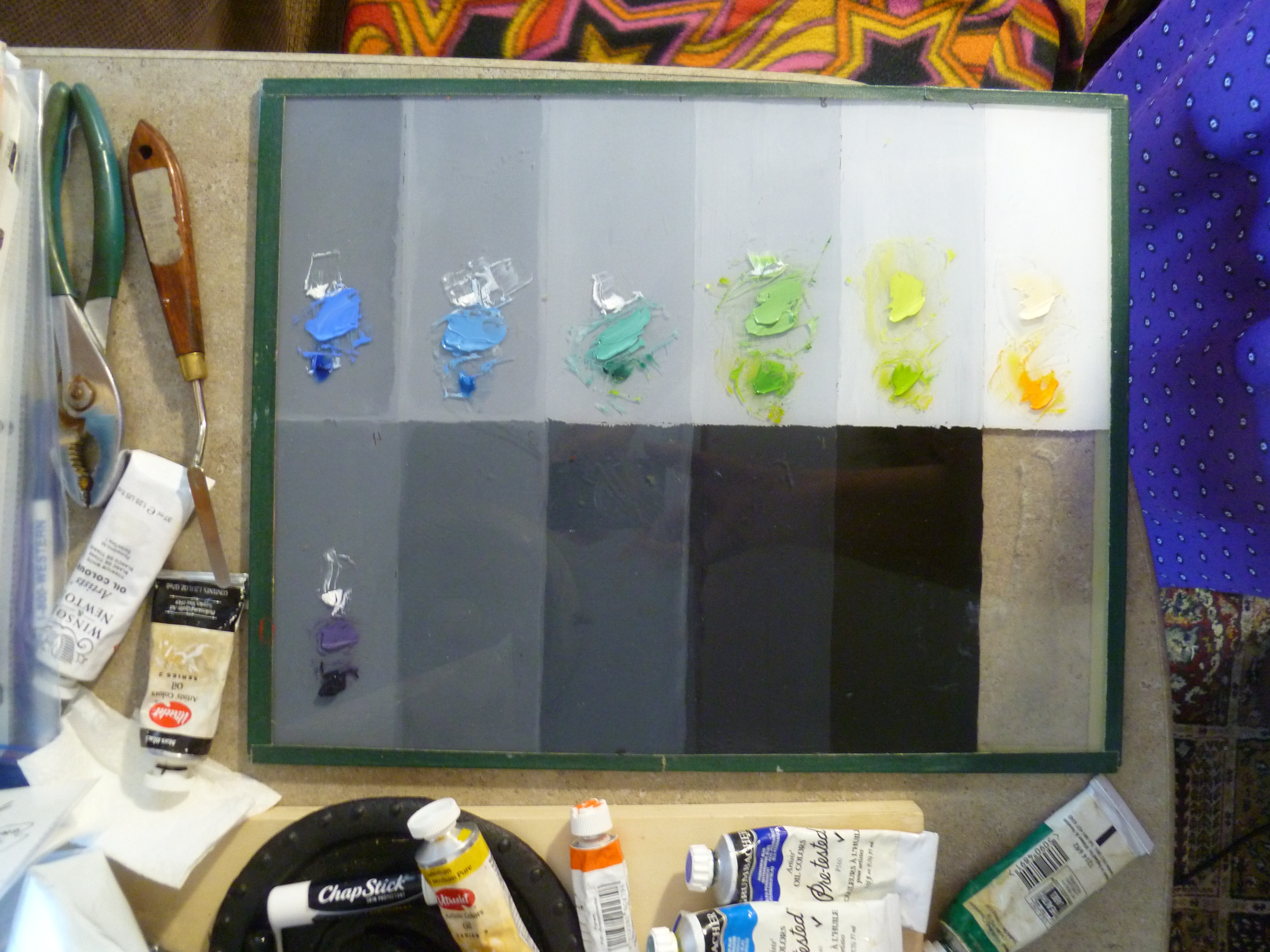
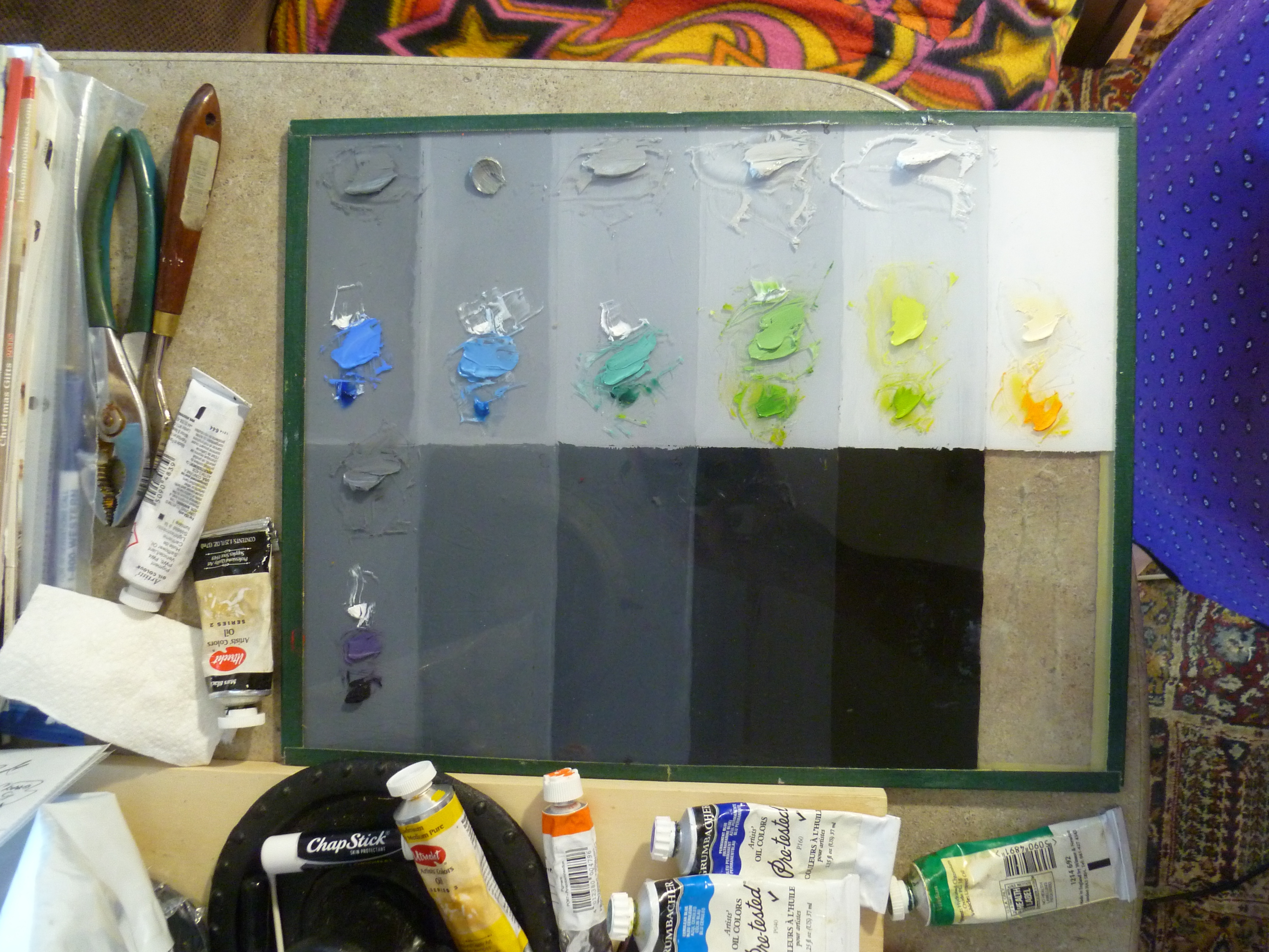
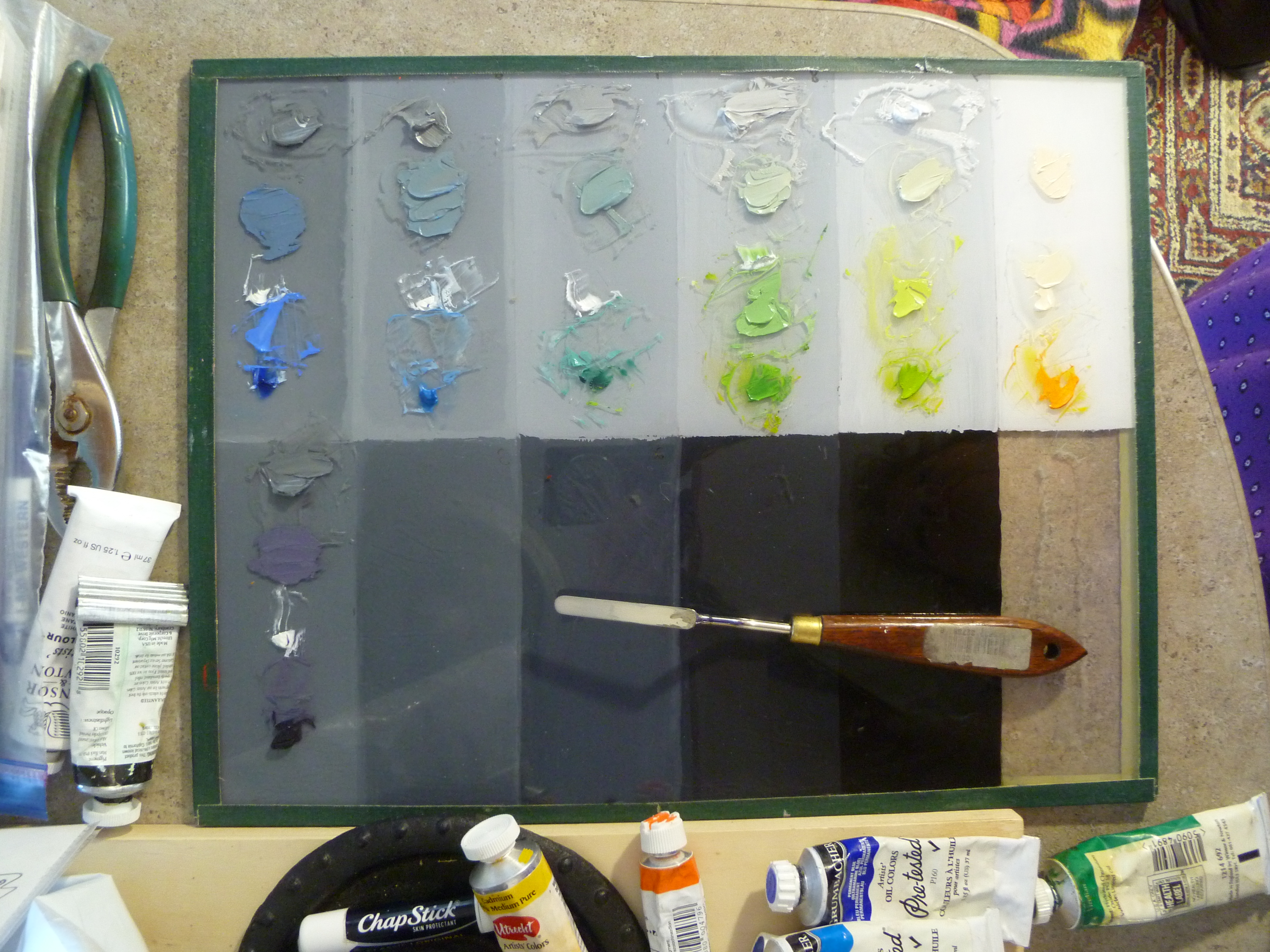
I will eventually come up with a step-by-step to share, but even then, it is mostly just a lot of work, time, and careful observation, stepping back six feet and comparing it to the model, squinting, looking at it through a mirror–you have to pull out all the tricks!  And even when you think you’ve nailed the drawing and the underpainting, the slightest color shift matters, even when the color values you are applying match the value of the underpainting perfectly.

Regarding the importance of slight color shifts, I have a theory that I can find no information about.  Perhaps it already has a name, but I am going to call it something like “How Color Shifts Value Perception.” I wonder if anyone else has observed this phenomenon?  Have you? It would probably be a boring topic for anyone but an artist.

I’m designing another painting that has a tight time limit for completion.  My Aunt Goldie will be 95 years old  in July, and I want to do a painting of her, quilting, since she has been an award-winning quilter all her life.  I have the references, we’re picking up the precut board tomorrow, and I’m doing a square format (24″ x 24″).  This is one of those rare occasions when traditional formats will not work, due to the length of the quilt frame in relation to her body.  I hope to have the drawing finished by the end of next week.   I’ll post it when I can.  There is only one hand showing in the reference, complete with thimble and needle, so it won’t be a good candidate this time for my step-by-step model.

Giclée prints from The Apotheosis of Love will be available soon, and I will write more on its conception in a later post.

Best wishes to you,

Marsha

FRANK COVINO, LONG-TIME FRIEND AND MENTOR, HAS PASSED

Covino Portrait1P1070431PaintingWorkshopCovinoFrank4-2015

Dear Artists and Friends,

It is with ineffable sadness in our hearts, that I must report this news.  Our friend and long-time art teacher and mentor, Maestro Frank Covino, passed away suddenly on Tuesday, February 16, 2016, after being pronounced “cleared of cancer” just last week.

If I may use a bold simile, his loss feels like looking up at the mountains in Sugarbush, where Frank worked hard to build the home he loved, and seeing that the grandest of summits has disappeared from our sight.

Here is a note from his wife, Barbara Covino, that you will all want to read:

Subject: It is with a deep abiding sorrow in my heart that I write this letter…forgive the delay but it has taken time to believe this is true…

Beloved friends and family , one and all,

After two days of profoundest shock, and countless tears I realize I must write you.  It is with a heavy, heavy heart that i must inform you that dear Frank has passed away unexpectedly on Tuesday night, February 16th.  It was quick and he did not suffer–a death we would all prefer–but he had been progressing so well, it was a gut-wrenching shock that still is unbelievable.

I truly cannot imagine a world, or a life without him…32 years of happiness and adventure.  Life was never boring with him!!! What an amazing talent, a brilliant man with a wealth of knowledge, a gentle and sensitive man who had to excel in everything he did, and was thus an inspiration to all who knew him.  He encouraged others to strive for excellence and to believe in themselves, giving them the tools to create a positive reality in their lives, whether it be art or health.  We all can repeat that golden maxim: IT’S NEVER TOO LATE TO AMELIORATE! Wise encouraging words, those.

But he was more than the sum of his parts; he was a genuine force of nature, a real Renaissance man, but above all else, he had a kind heart and a very great soul. We all loved him so; there will never be another Frank.  But I know it is now time for each and every one of us who was touched by his life, to take that spark and pass it on.  He gave us wings and it is time for us to fly…Make him proud!!!

I am too choked up to continue writing.  God Bless each and every one of you who had a place in his heart…family, friends, students….He loved you all sincerely and without guile….

We are in the process of collaborating with the family and planning both a smaller family funeral as well as a larger set of celebrations of his life and legacy open to all who loved him–one in Vermont and one on Long island.  As soon as the Covino south clan and Mark and Jennifer and I hammer out the details, I will email you all, soon as can be done.

We are going to give that wonderful man a send off he won’t soon forget!!!

Love and blessings , Barbara Covino

PS: PLEASE FORWARD THIS to everyone you can think of. It has grown into a cast of hundreds, and forgive the delay but it has taken time to believe this is true.

EXAMPLE OF HOW TO PAINT OBJECTS WITH SPECTRUM WHITES

Yesterday, I was on the phone trying to explain to a friend, how to paint white objects with the spectrum. Without the visuals it was difficult, so after we hung up, I decided to prepare a quick example for the blog.

The order of the rainbow spectrum (dark to light) is purple, purple-blue, blue, blue-green, green, yellow-green, yellow, yellow-red, red, and red-purple.  In order to match the rainbow’s values and their respective hues, we need to start where the rainbow starts. Using a 9-value scale with value 4 as spectrum purple, we work our way up the value scale from there:

4–Purple (cobalt violet)

5–Purple-Blue (ultramarine)

6–Blue (cerulean)

7–Blue-Green (viridian)

8–Green (hansa yellow plus thalo green)

9–Yellow-Green (hansa yellow plus thalo green)

White–Yellow (cadmium yellow lt.)

White–Yellow-red (cadmium orange)

White–Red (napthol red lt.)

White–Red-Purple (alizarin crimson perm.)

Here is how to think about that: since cobalt violet is a value 1 in the tube, we have to lighten it with white until it is a value 4, then put it in its proper place on the palette.  Likewise, ultramarine blue is also value 1 in the tube so we need to lighten it with white until it is a value 5.  Next in the spectrum is cerulean blue; it is a value 3 in the tube, so it requires less white to make it a value 6.

Continue working up the rainbow spectrum through value 9 yellow-green,  as listed above. The last three hues (not shown–unfortunately, I neglected to photograph those) are simply white with a tint of cadmium orange, then napthol red in the next pile of white, and finally, permanent alizarin crimson in the final white.  Here is the palette to this point, sans the YR, R, and RP mixed with white:
P1100611

After mixing each hue to its proper value (pictured above), place the corresponding value 4-9 greys, plus 4 piles of white on your palette:
P1100612
Then tint each of the greys with a just a touch of their corresponding hues:
P1100616

Preparing a brief palette was all I intended to do when I began, but then I thought, “Why don’t I just do a quick painting of a white object and put the whole project on the blog? Since I only had an hour to spare, I did something easy:

P1100620

And because my little enameled pitcher looked like it was floating in the air, I mixed together, everything on my value 4 and 5 spaces, and made the table color. Then I marbled the remaining paint together (without values 4 and 5) and spread it with a palette knife for the background of my little painting:
P1100622
A White Pitcher, 4″ x 6″

Someday, I may give it a single flower and some touch-ups but, for now, this is it.  Master painter, Charlene Higley, will be teaching all of us how to mix spectrum whites for light, shadow, and seascapes.  Feel free to contact me by posting below, if you would like to attend (free) the 2-3-hour class in March, 2016.  It will be held in Gilbert, Arizona.

Karen Schmeiser, another master painter in our Arizona Renaissance Art Guild, has a lot of experience with using the spectrum white palette.  She is currently working on this painting.  Notice the effect of the subject’s lighting.  She has added the color of the candlelight to each of her spectrum values to portray the white garment:

Karen

Karen1

I hope this helps you.

And please don’t forget about Frank Covino’s workshop coming up in Gilbert, Arizona on November 9-13, 2015.  We still have space if you want to come.  See the post, Workshop Announcement, dated Sept. 27, 2015.  Contact me through this blog if you are interested.

Follow my blog to get the latest post sent to you.

All the best,
Marsha

RAINBOW HUES

We have already “hammered away” at the importance of Value, so this is a good time to introduce the set of terms devised by Munsell, that help us discuss and reproduce color:

Hue–the name of a specific color as it appears in the color spectrum.
Value–the specific darkness or lightness of a color.
Chroma–the specific intensity (brightness or dullness) of a color.

Color_Wheel_Finished_Website1

Here, we will address “hue.” Although there are many varied color wheel designs, Munsell incorporates ten basic hues that come from the color of light as seen through a prism, or the rainbow spectrum. By shaping them in a circle, they become the color wheel. They are:

red-purple, red, yellow-red, yellow, yellow-green, green, blue-green, blue, blue-purple, purple

Every color falls into one of these ten basic HUE categories, or possibly between two of them, where reside the interhues.

Most artists have had at least one important teacher. Mine was/is Frank Covino. He designated tube names and value numbers for Munsell’s ten hues.

At first, you may be tempted to gloss over this list, but imagine going to the store and selecting the most useful green, red, or yellow, and then assigning its value as you go, all the while keeping in mind how the colors will all interact, and choosing those that work best together in the largest variety of situations–methinks not the easiest of tasks.  This work has been done for you, here:

Red-purple is Alizarin Crimson, which is a value 1 tube color.
Red is Cadmium Red Light, which is a value 5 tube color.
Yellow-red is Cadmium Orange, a value 7.
Yellow is Cadmium Yellow Light, a value 9.
Yellow-green is Pthalo Yellow Green, value 8.
Green is Cadmium Green, value 1.
Blue-green is Viridian Green, value 1.
Blue is Cerulean Blue, value 3 or 4 (depending on the brand).
Purple-blue is Ultramarine Blue, value 1.
Purple is Cobalt Violet, value 1.

These tube colors should visually disappear when placed on corresponding value numbers in the value chart (Don’t forget to squint, as discussed in the last post.).  If they look like freckles instead of disappearing, you know you either have them in the wrong place, or your value chart is not correct.  That’s why we use the Covino Palette–those values are already prepared for you to start using at once, without a lot of fumbling about.

Follow my blog to get the latest post sent to you.

All the best,

Marsha