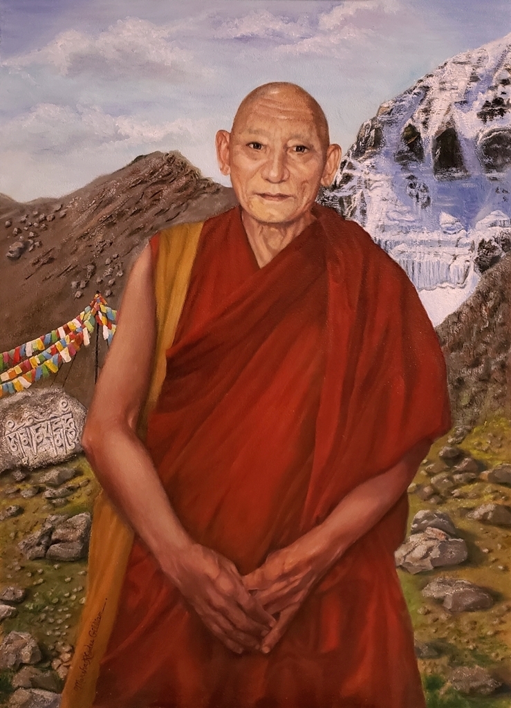
Palden Gyatso, Glorious Ocean

Hello, Everyone,
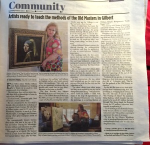
I’m excited to let you know that an article about my recently completed painting of Palden Gyatso, Glorious Ocean, has just been published in the East Valley Tribune by writer and reporter, Srianthi Perera.

PaldenGyatsoGloriousOceanCopyResized1JPG

This painting and the story of how it came about is close to my heart, and I am so glad to share it with you. The paper is also packed with other stories that are of interest, no matter where you live. You can pick up a free copy at newsstands in downtown Gilbert or at the Gilbert Museum on the SW corner of Elliot and Gilbert Rd., and you can also read the story online, page 11, at:
https://issuu.com/timespub/docs/evt_0609_southeast_book/1?e=8633901/70436667

Wishing you a fantastic summer,
Marsha Rhodes Gilliam

https://savetibet.org/palden-gyatso-tibetan-monk-who-was-tortured-and-jailed-for-33-years-passes-away/

ART OF THE MASTERS Workshop

Hello, Artists,

gilbertsunnewsarticle6-2016

We are planning a workshop the week of November 14, 2016, which is our only opportunity window for quite a few months. Can you make it? We will also have a Free Prep Day on November 7, a week before the workshop, in order to help you get a wonderful start. The cost for the 5 days is $489.

Art of the Masters Workshop
When: Nov. 14-18, 2016
Where:  Gilbert, Arizona
Time: daily, 9:00 – 5:00

If you feel undecided, maybe now is the time to get off that fence and embrace your true art self. We promise that you will get more step-by-step art instruction in one week with us, than you will get anywhere else, even in workshops that cost more than twice what we charge. We also give you helpful handouts (most art classes don’t) because we want you to be able to remember and continue working on what we’ve taught you. To us, the most important thing is continuing the legacy of the Old Masters, and we are passionate about passing on their wisdom and techniques to others. We would love to have you with us!

And like Maestro Frank Covino always did, we offer $100 off the cost of your tuition for each of your friends that sign up for the class.

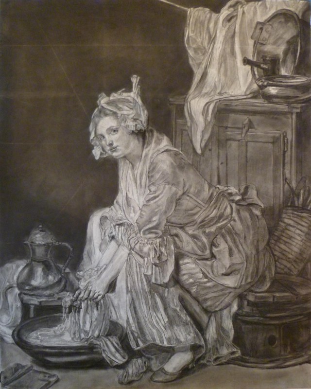
Below is a sample of first-time student drawing (24″ x 30″), in preparation for painting.  Amazing, huh!

P1110792

Here are things needed for the Free Prep Day:

Materials for board preparation, graphing, and drawing:
Ampersand Gessobord brand surface
metal yardstick and ruler
ultra-fine Sharpies, various colors (black, blue, and red are probably enough)
General’s charcoal pencils, soft
kneaded eraser
High quality photo of Old Master painting to work from, printed on 8 1/2”x11” glossy photo paper, one grayscale, one color–Art Renewal Center is an excellent online museum source– https://artrenewal.org/pages/search.php
blending stumps (tortillions)
Exacto knife
spray workable fixative
clear tape
acetate

Other helpful items:
transparent 18” triangle
India ink and sable liner brush
artist’s white tape, removable

Please respond below, and we’ll get right back to you!

Marsha and Karen
Art of the Masters

ART OF THE MASTERS WORKSHOP

ANNOUNCEMENTArt of the Masters classical oil painting workshop, plus free additional day.

Karen Schmeiser and I are carrying on Maestro Frank Covino’s legacy by teaching workshops here in the Phoenix Metro. It was an important decision for us, and since each of us have studied with Frank for over twelve years and we both love teaching, we honor his memory by doing our part to assure that these Old Master techniques do not get lost.

  • Learn to paint like the Old Masters.
  • Receive the expertise of two instructors (Marsha Gilliam and Karen Schmeiser) as you learn the methods of the Old Masters in a 5-day workshop, June 27-July 1, 2016 Open to artists of all levels.  Get more instruction for your money.
  • Cost: $489.  If you check the prices of art workshops these days, you will find they cost nearly twice as much.  A supply list will be provided upon registration.
  • Also included at no extra charge is a free preparation day on June 20, 2016, to help you properly begin your drawing on your painting panel.

YOU can do this! The three most important things to bring with you are your patience, your determination, and an accepting mind.  Here are examples of what you can expect to achieve:

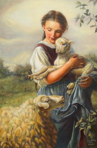
First painting by Karen Schmeiser:

KarenTheShepherdessBouguereau

Copy of The Shepherdess, 1866, after Johann Baptist Hofner

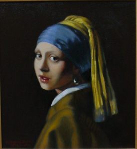
First painting by Marsha Gilliam:

MVC-004F

Copy of Girl with a Pearl Earring, 1665, after Johannes Vermeer

The author and associate editor of the East Valley Tribune, Srianthi Perera, recently published this article about our upcoming workshop, and there is also an article about it just released in The Gilbert Sun News  https://issuu.com/timespub/docs/gsn_june_2016_issue:

MarshaNewspaperArticleEastValleyTribune5-29-16

We hope you will join us–it was a life-changing experience for us, and we hope it will be for you, too.

Sincerely,

Marsha and Karen

PAINTING WORKSHOP IS COMING UP

Hello, Artists~~

The author and associate editor of the East Valley Tribune, Srianthi Perera, just published an eloquent article today about our upcoming workshop.  Karen and I wanted to share it with you:

MarshaNewspaperArticleEastValleyTribune5-29-16

  • Learn to paint like the Old Masters.
  • Receive the expertise of two instructors (Marsha Gilliam and Karen Schmeiser) as you learn the methods of the Old Masters in a 5-day workshop, June 27-July 1, 2016.  Open to artists of all levels.  Get more instruction for your money.
  • Cost: $489.  If you check the prices of art workshops these days, you will find they cost nearly twice as much.

YOU can do this too,

Marsha and Karen

WE’RE STARTING TO TEACH WORKSHOPS–ALL LEVELS ARE WELCOME

ANNOUNCEMENTArt of the Masters oil painting workshop and Open House!!!

  • Learn to paint like the Old Masters.
  • Receive the expertise of two instructors (Marsha Gilliam and Karen Schmeiser) as you learn the methods of the Old Masters in a 5-day workshop, June 27-July 1, 2016.  Open to artists of all levels.  Get more instruction for your money.
  • Interested students are invited to an Open House, May 31, 7:00-8:00 p.m., where you will sign up for the upcoming workshop, receive needed info, and actually see painted models of what you will be creating. Light refreshments will be served.
  • Please RSVP for the Open House (see contact form below).

The three most important things to bring with you are your patience, your determination, and an accepting mind.

Karen Schmeiser and I have decided to carry on Frank Covino’s legacy by teaching workshops here in the Phoenix Metro. It was a big decision for us , but we feel that, since each of us have studied with Frank for over twelve years and we both love teaching, we owe it to him to assure that these Old Master techniques do not get lost.  Here is an example of what you can expect to achieve:

First painting by Karen Schmeiser:

KarenTheShepherdessBouguereau

First painting by Marsha Gilliam:

MVC-004F

YOU can do this too!

All the best to you,

Marsha

CARESSING A FOOT

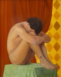
I just completed this commission, The Apotheosis of Love, on the occasion of a wedding, and my patrons loved it.  It went on a plane to Boston:

PaintingMarshasTheApotheosisOfLoveGlazedCompletedRtchdP1110668

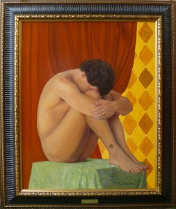
Here it is, framed, with brass title:

PaintingMarshasTheApotheosisOfLoveFramedGlazedCompletedRtchdP1110668

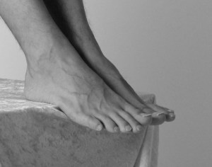
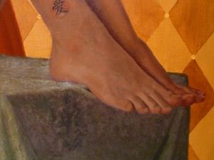
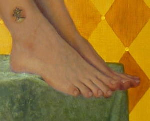
I especially addressed the front foot–I studied the subtle shadows that make it work–or not.  In the first foot picture below, the toes, nails, and veins still need completion, but the most important area that needed altering was on the top front.  It was just slightly too dark–not even half a value–but what a huge difference it made when I lightened it ever-so-slightly!  I am attaching a “before and after,” with the original model, just so you can see what I mean.  Here is the model:

PaintingRefApotheosisFeet

Here, the top front half looks flattened and scooped like a spoon because its value is too dark, even though I followed the model:

ApotheosisFeetStillNeedCompletedToesNailsVeinsCoveredWflesh

and here is the corrected version:

ApotheosisFeetCompleted

Yes, the overall tone of the pictures are different because one was taken at night, but it is the VALUE difference that counts.  The foot, with toes, nails, and veins, is completed in the second picture.  I changed nothing on the drawing itself.  Just the slight value change is all that mattered.

I will eventually come up with a step-by-step to share, but even then, it is mostly just a lot of work, time, and careful observation, stepping back six feet and comparing it to the model, squinting, looking at it through a mirror–you have to pull out all the tricks!  And even when you think you’ve nailed the drawing and the underpainting, the slightest color shift matters, even when the color values you are applying match the value of the underpainting perfectly.

Regarding the importance of slight color shifts, I have a theory that I can find no information about.  Perhaps it already has a name, but I am going to call it something like “How Color Shifts Value Perception.” I wonder if anyone else has observed this phenomenon?  Have you? It would probably be a boring topic for anyone but an artist.

I’m designing another painting that has a tight time limit for completion.  My Aunt Goldie will be 95 years old  in July, and I want to do a painting of her, quilting, since she has been an award-winning quilter all her life.  I have the references, we’re picking up the precut board tomorrow, and I’m doing a square format (24″ x 24″).  This is one of those rare occasions when traditional formats will not work, due to the length of the quilt frame in relation to her body.  I hope to have the drawing finished by the end of next week.   I’ll post it when I can.  There is only one hand showing in the reference, complete with thimble and needle, so it won’t be a good candidate this time for my step-by-step model.

Giclée prints from The Apotheosis of Love will be available soon, and I will write more on its conception in a later post.

Best wishes to you,

Marsha

FRANK COVINO, LONG-TIME FRIEND AND MENTOR, HAS PASSED

Covino Portrait1P1070431PaintingWorkshopCovinoFrank4-2015

Dear Artists and Friends,

It is with ineffable sadness in our hearts, that I must report this news.  Our friend and long-time art teacher and mentor, Maestro Frank Covino, passed away suddenly on Tuesday, February 16, 2016, after being pronounced “cleared of cancer” just last week.

If I may use a bold simile, his loss feels like looking up at the mountains in Sugarbush, where Frank worked hard to build the home he loved, and seeing that the grandest of summits has disappeared from our sight.

Here is a note from his wife, Barbara Covino, that you will all want to read:

Subject: It is with a deep abiding sorrow in my heart that I write this letter…forgive the delay but it has taken time to believe this is true…

Beloved friends and family , one and all,

After two days of profoundest shock, and countless tears I realize I must write you.  It is with a heavy, heavy heart that i must inform you that dear Frank has passed away unexpectedly on Tuesday night, February 16th.  It was quick and he did not suffer–a death we would all prefer–but he had been progressing so well, it was a gut-wrenching shock that still is unbelievable.

I truly cannot imagine a world, or a life without him…32 years of happiness and adventure.  Life was never boring with him!!! What an amazing talent, a brilliant man with a wealth of knowledge, a gentle and sensitive man who had to excel in everything he did, and was thus an inspiration to all who knew him.  He encouraged others to strive for excellence and to believe in themselves, giving them the tools to create a positive reality in their lives, whether it be art or health.  We all can repeat that golden maxim: IT’S NEVER TOO LATE TO AMELIORATE! Wise encouraging words, those.

But he was more than the sum of his parts; he was a genuine force of nature, a real Renaissance man, but above all else, he had a kind heart and a very great soul. We all loved him so; there will never be another Frank.  But I know it is now time for each and every one of us who was touched by his life, to take that spark and pass it on.  He gave us wings and it is time for us to fly…Make him proud!!!

I am too choked up to continue writing.  God Bless each and every one of you who had a place in his heart…family, friends, students….He loved you all sincerely and without guile….

We are in the process of collaborating with the family and planning both a smaller family funeral as well as a larger set of celebrations of his life and legacy open to all who loved him–one in Vermont and one on Long island.  As soon as the Covino south clan and Mark and Jennifer and I hammer out the details, I will email you all, soon as can be done.

We are going to give that wonderful man a send off he won’t soon forget!!!

Love and blessings , Barbara Covino

PS: PLEASE FORWARD THIS to everyone you can think of. It has grown into a cast of hundreds, and forgive the delay but it has taken time to believe this is true.

RAINBOW HUES

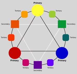
We have already “hammered away” at the importance of Value, so this is a good time to introduce the set of terms devised by Munsell, that help us discuss and reproduce color:

Hue–the name of a specific color as it appears in the color spectrum.
Value–the specific darkness or lightness of a color.
Chroma–the specific intensity (brightness or dullness) of a color.

Color_Wheel_Finished_Website1

Here, we will address “hue.” Although there are many varied color wheel designs, Munsell incorporates ten basic hues that come from the color of light as seen through a prism, or the rainbow spectrum. By shaping them in a circle, they become the color wheel. They are:

red-purple, red, yellow-red, yellow, yellow-green, green, blue-green, blue, blue-purple, purple

Every color falls into one of these ten basic HUE categories, or possibly between two of them, where reside the interhues.

Most artists have had at least one important teacher. Mine was/is Frank Covino. He designated tube names and value numbers for Munsell’s ten hues.

At first, you may be tempted to gloss over this list, but imagine going to the store and selecting the most useful green, red, or yellow, and then assigning its value as you go, all the while keeping in mind how the colors will all interact, and choosing those that work best together in the largest variety of situations–methinks not the easiest of tasks.  This work has been done for you, here:

Red-purple is Alizarin Crimson, which is a value 1 tube color.
Red is Cadmium Red Light, which is a value 5 tube color.
Yellow-red is Cadmium Orange, a value 7.
Yellow is Cadmium Yellow Light, a value 9.
Yellow-green is Pthalo Yellow Green, value 8.
Green is Cadmium Green, value 1.
Blue-green is Viridian Green, value 1.
Blue is Cerulean Blue, value 3 or 4 (depending on the brand).
Purple-blue is Ultramarine Blue, value 1.
Purple is Cobalt Violet, value 1.

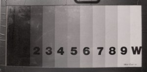
These tube colors should visually disappear when placed on corresponding value numbers in the value chart (Don’t forget to squint, as discussed in the last post.).  If they look like freckles instead of disappearing, you know you either have them in the wrong place, or your value chart is not correct.  That’s why we use the Covino Palette–those values are already prepared for you to start using at once, without a lot of fumbling about.

Follow my blog to get the latest post sent to you.

All the best,

Marsha

PART 3, CLASSICAL ACADEMIC APPROACH, THE PALETTE

The other item you will need right away is a 9-value (+black and white) palette.  12″x24″ is the most useable size.  Any smaller and you won’t have enough mixing room; any larger and it gets cumbersome and harder to reach over it.  Making this yourself is an excellent learning experience and begins to train your eye to see nine values in 10% increments, plus black being the absence of light on one end, and white being the absence of dark on the other end (based on the Munsell system).  You will have eleven value strips total.

Frank Covino created this and he calls it the “Controlled Palette.”  As of this writing, I don’t know if he still sells it.  A couple of years ago, he began making it smaller than the one I bought (and love) from him nearly ten years ago, and now I see on his site that it seems to be all a 5th-value gray, similar to Richeson’s Grey Matters palette paper (another excellent tool to provide that extra paint mixing space you sometimes need).  I suggest you contact Frank if you would prefer to buy a palette that is ready to use.  If you find that it is now indeed all gray, I strongly advise you to make it yourself instead.  Your acuity for values will be considerably heightened and, in the long run, you will become a much stronger artist for it.

Here is my palette in use. I still have Saran Wrap (the most non-permeable brand–I have tested this) over the colors. The flesh is still in verdaccio, since it’s always best to remember that “what surrounds the form affects your perception of the form’s values”:

JimAndAlma

Here is what it looks like:

PaletteFront

Front

PaletteBack

Back

You can print this value scale for reference.  Remember, there is a white strip to include at the right end:

PaletteColorChartValues

Supplies needed (all available at Home Depot, Lowes, Ace, etc.):

2 pieces 12″x24″ thin Plexiglas–glass is better for scraping or cleaning if you’re not going to be traveling with it.

1 piece 12″x24″ 1/8″ Masonite

6′ length of 2″ wide gray Duct tape

1 piece of 12″x24″ Contact paper of your choice (wood grain shown)

1 12″x24″printed or painted value scale on lightweight card stock, not paper

Coat one side of Masonite with contact paper, then assemble “sandwich” from the bottom, up, as follows: 3. Masonite (Contact paper on underside), 2. value scale, face up, 1. 1 piece of Plexiglas (or glass) to cover.  Duct tape edges with half the tape width showing on top and half on bottom, long edges first, short edges last.  Palette is complete.  The extra piece of Plexiglas is used on top of the palette to mix paint on and keep the actual palette clean.  When you use it, make sure to very lightly rub it with olive oil before you put the paint on, thereby making it easier to clean.  When the top gets scratched and mangled after many uses, just toss it and get a new top to go over your palette.

Test the measurements of this palette before you make it to ensure it fits in your freezer (adjust, if needed), as that is the way to store your paint for as much as six months.  This saves money because when you mix a flesh palette, for example, you can just use the remaining paint for another portrait.

All the best,

Marsha

PART 1, CLASSICAL ACADEMIC APPROACH–GET ARTSERIOUS

Artserious–a linguistic invention–so, it’s time to get artserious, begin at the beginning, and learn the classical academic painting process alluded to in this prior post.

As the Dalai Lama says, “Know the rules well so you can learn to break them effectively.” This is probably one of the most important reasons to have classical training and, although it is best received in person, teacher-student, I hope to help you through some of the same processes online that I teach my private students.  (If you are in the Phoenix Metro and want one-on-one lessons, contact me through this blog.)

In coming weeks, I will discuss the following: materials, design, compositional unity, applying the Golden Mean, Munsell’s color system and hue, value, and intensity, seven basic color schemes, aerial perspective, the cartoon, accurate enlargement/graphing and transferring to panel, gessoing masonite board, inking the drawing, sculpting with gesso for bas relief, the charcoal study, underpainting, mixing a flesh palette, and colored oil glazes.

It is a lengthy syllabus, but I hope you will profit from the instruction in some way.

Creating fine art is very much a science; therefore, you should come to this training with an open mind and put your previous painting experience on hold for awhile so that you can see with fresh eyes.  This is not quick art, but I promise you that with proper instruction and following the process outlined, along with self-discipline, persistence, and  patience, you can achieve the high degree of quality in your painting you have hoped for.  It is better to spend weeks on one excellent painting that can be considered significant art, than to spend a couple of hurried days on a piece that will end up in the trash.

Keep in mind there are preliminaries we will skip for now and come back to later, as I am sure you want to get to the actual creation of a portrait.  Beginning with how to get an accurate drawing, our ultimate purpose here is to get an excellent likeness and end up with a high quality, Renaissance-style classical academic painting that will never find itself in a garage sale.  You will be copying an Old Master oil portrait of your choice–you can paint family AFTER you have learned the basics and “mastered the Masters.”

Your first assignment:  Choose an Old Master portrait that you love.  Keep the goal in mind; you are learning the process here, so you will want to choose a picture that is not too complex, has clearly delineated eyes, nose, mouth, hair, clothing, and a simpler background.

I will be using Vermeer’s Girl with a Pearl Earring.

Make sure your reference is very high resolution, and high quality.  Two superb online sources are the Getty Museum or Art Renewal Center.  You should never undermine your efforts by beginning with inferior reference, as I have seen students who, despite admonition, try this and give up in frustration.

Print the reference on glossy photo paper, as it shows detail much better than other surfaces.  Print one in grayscale and one in color, ledger size if possible, otherwise 8 1/2″ x 11″.  You can put them on a flash drive or CD and have it printed at FedX or any print shop.  It is helpful to save the references on your computer desktop as well, for quick access.  I use my computer to enlarge certain small areas as I go along and need to get a closer look.  The computer, however, will not replace your printouts in this process.

Some Masters to consider for our purposes are (in no particular order):  Titian, Caravaggio, Rubens, Rembrandt, Velasquez, David, Vermeer, Gerome, Godward, Leighton, Alma-Tadema, and Bouguereau are all excellent artists from which to learn, although there are so many more.
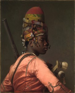
GeromeBlackBashi-Bazouk1869-26x32
Jean Leon Gerome, Black Bashi-bazouk, 1869, 26×32″
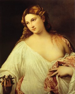
TitianFlora1515-22x31
Titian, Flora, 1515

Here are the materials you will need for the process:

Oil Painting Materials:
references
pens/pencils
extra-fine permanent markers(Sharpies), black, blue, green, red
acetate
General’s charcoal pencils
vine charcoal
blending stumps (tortillions)
metal yardstick
metal 18” ruler
transparent triangle, 18”
kneaded eraser
India ink and liner sable brush
spray workable fixative
Exacto knife
clear tape
artist’s white tape
Golden acrylic matte medium
Masonite or hardwood board
sandpaper very rough #40-60, very smooth #100-200
natural sponge
Knox Gelatin
paint roller for application of gesso
retouch varnish
Liquin
turpentine for brush cleaning
olive oil for brushes, cleaning hands, oiling palette
leak proof turpentine container
easel
plastic wrap
blue paper towels
mahl stick
notebook
palette knives

Brushes:
bright sable #2, 4, 10
flat bristle #2, 4, 10
round sable #1, 8
round bristle #0, 8
mongoose flat #6
mongoose round #0
mongoose filbert #4, 8

Paint:
*titanium white
*flake white
ivory black
mars black
chromium oxide green
pthalo blue
cadmium yellow light
yellow ochre
raw sienna
raw umber
cadmium orange
burnt sienna
burnt umber
cadmium red light
alizarin crimson permanent
cobalt violet
ultramarine violet
French ultramarine blue
cobalt blue
cerulean blue
viridian green
Shiva cadmium green
Grumbacher pthalo yellow green
Winsor and Newton Winsor orange
Indian yellow
napthol red light

*Avoid zinc white (PW4) whenever possible. It is often added to paint colors one would not suspect, such as in titanium white, lead white, and to various other colors to render them more transparent. It is also used as a filler to make them less expensive to manufacture.  Zinc white can make your paintings crack, according to extensive, lengthy studies done with conservators at the National Gallery of Art, Washington.

Also, buy the best quality paint you can afford, as student grade and many professional grades contain excessive aluminum stearate that causes darkening of the paint film over time.  Good commercial brands include professional grades of Utrecht, Williamsburg (both made in the U.S.), Old Holland (Netherlands), and Sennelier (France).  I like the unique textures of handmade paints as well, and buy from colormen like Robert Doak, Michael Harding, and Natural Pigments.

*marble-inclusive gesso
*values palette
*homemade medium

In the next post, we’ll discuss supports, marble-inclusive gesso, and the 9-value (+black and white) palette you will need.