Palden Gyatso, Glorious Ocean

Hello, Everyone,
I’m excited to let you know that an article about my recently completed painting of Palden Gyatso, Glorious Ocean, has just been published in the East Valley Tribune by writer and reporter, Srianthi Perera.

PaldenGyatsoGloriousOceanCopyResized1JPG

This painting and the story of how it came about is close to my heart, and I am so glad to share it with you. The paper is also packed with other stories that are of interest, no matter where you live. You can pick up a free copy at newsstands in downtown Gilbert or at the Gilbert Museum on the SW corner of Elliot and Gilbert Rd., and you can also read the story online, page 11, at:
https://issuu.com/timespub/docs/evt_0609_southeast_book/1?e=8633901/70436667

Wishing you a fantastic summer,
Marsha Rhodes Gilliam

https://savetibet.org/palden-gyatso-tibetan-monk-who-was-tortured-and-jailed-for-33-years-passes-away/

CARESSING A FOOT

I just completed this commission, The Apotheosis of Love, on the occasion of a wedding, and my patrons loved it.  It went on a plane to Boston:

PaintingMarshasTheApotheosisOfLoveGlazedCompletedRtchdP1110668

Here it is, framed, with brass title:

PaintingMarshasTheApotheosisOfLoveFramedGlazedCompletedRtchdP1110668

I especially addressed the front foot–I studied the subtle shadows that make it work–or not.  In the first foot picture below, the toes, nails, and veins still need completion, but the most important area that needed altering was on the top front.  It was just slightly too dark–not even half a value–but what a huge difference it made when I lightened it ever-so-slightly!  I am attaching a “before and after,” with the original model, just so you can see what I mean.  Here is the model:

PaintingRefApotheosisFeet

Here, the top front half looks flattened and scooped like a spoon because its value is too dark, even though I followed the model:

ApotheosisFeetStillNeedCompletedToesNailsVeinsCoveredWflesh

and here is the corrected version:

ApotheosisFeetCompleted

Yes, the overall tone of the pictures are different because one was taken at night, but it is the VALUE difference that counts.  The foot, with toes, nails, and veins, is completed in the second picture.  I changed nothing on the drawing itself.  Just the slight value change is all that mattered.

I will eventually come up with a step-by-step to share, but even then, it is mostly just a lot of work, time, and careful observation, stepping back six feet and comparing it to the model, squinting, looking at it through a mirror–you have to pull out all the tricks!  And even when you think you’ve nailed the drawing and the underpainting, the slightest color shift matters, even when the color values you are applying match the value of the underpainting perfectly.

Regarding the importance of slight color shifts, I have a theory that I can find no information about.  Perhaps it already has a name, but I am going to call it something like “How Color Shifts Value Perception.” I wonder if anyone else has observed this phenomenon?  Have you? It would probably be a boring topic for anyone but an artist.

I’m designing another painting that has a tight time limit for completion.  My Aunt Goldie will be 95 years old  in July, and I want to do a painting of her, quilting, since she has been an award-winning quilter all her life.  I have the references, we’re picking up the precut board tomorrow, and I’m doing a square format (24″ x 24″).  This is one of those rare occasions when traditional formats will not work, due to the length of the quilt frame in relation to her body.  I hope to have the drawing finished by the end of next week.   I’ll post it when I can.  There is only one hand showing in the reference, complete with thimble and needle, so it won’t be a good candidate this time for my step-by-step model.

Giclée prints from The Apotheosis of Love will be available soon, and I will write more on its conception in a later post.

Best wishes to you,

Marsha

FRANK COVINO, LONG-TIME FRIEND AND MENTOR, HAS PASSED

Covino Portrait1P1070431PaintingWorkshopCovinoFrank4-2015

Dear Artists and Friends,

It is with ineffable sadness in our hearts, that I must report this news.  Our friend and long-time art teacher and mentor, Maestro Frank Covino, passed away suddenly on Tuesday, February 16, 2016, after being pronounced “cleared of cancer” just last week.

If I may use a bold simile, his loss feels like looking up at the mountains in Sugarbush, where Frank worked hard to build the home he loved, and seeing that the grandest of summits has disappeared from our sight.

Here is a note from his wife, Barbara Covino, that you will all want to read:

Subject: It is with a deep abiding sorrow in my heart that I write this letter…forgive the delay but it has taken time to believe this is true…

Beloved friends and family , one and all,

After two days of profoundest shock, and countless tears I realize I must write you.  It is with a heavy, heavy heart that i must inform you that dear Frank has passed away unexpectedly on Tuesday night, February 16th.  It was quick and he did not suffer–a death we would all prefer–but he had been progressing so well, it was a gut-wrenching shock that still is unbelievable.

I truly cannot imagine a world, or a life without him…32 years of happiness and adventure.  Life was never boring with him!!! What an amazing talent, a brilliant man with a wealth of knowledge, a gentle and sensitive man who had to excel in everything he did, and was thus an inspiration to all who knew him.  He encouraged others to strive for excellence and to believe in themselves, giving them the tools to create a positive reality in their lives, whether it be art or health.  We all can repeat that golden maxim: IT’S NEVER TOO LATE TO AMELIORATE! Wise encouraging words, those.

But he was more than the sum of his parts; he was a genuine force of nature, a real Renaissance man, but above all else, he had a kind heart and a very great soul. We all loved him so; there will never be another Frank.  But I know it is now time for each and every one of us who was touched by his life, to take that spark and pass it on.  He gave us wings and it is time for us to fly…Make him proud!!!

I am too choked up to continue writing.  God Bless each and every one of you who had a place in his heart…family, friends, students….He loved you all sincerely and without guile….

We are in the process of collaborating with the family and planning both a smaller family funeral as well as a larger set of celebrations of his life and legacy open to all who loved him–one in Vermont and one on Long island.  As soon as the Covino south clan and Mark and Jennifer and I hammer out the details, I will email you all, soon as can be done.

We are going to give that wonderful man a send off he won’t soon forget!!!

Love and blessings , Barbara Covino

PS: PLEASE FORWARD THIS to everyone you can think of. It has grown into a cast of hundreds, and forgive the delay but it has taken time to believe this is true.

WORKSHOP ANNOUNCEMENT!

Dear Artists,

The Frank Covino Workshop is seven weeks away. This may seem pointed, but…

We never know if this is the last chance we will have of being taught by one of the world’s greatest master teachers of oil painting in the manner of the Old Masters. In October, Frank will be in his mid-eighties and his traveling might be curtailed at any time. When we are with him, I think we sometimes take his presence for granted, but in this next workshop, as much as possible, we should hang on his every word, watch what he does at each workstation, audio-record what he says, take thorough notes, and ask good questions.

Have you priced workshops lately? There is no big-name artist today holding a serious workshop for less than $1,000 (Frank’s is $695), and a big name, does not a great teacher make. I have forked out my money for this, first hand, and I can tell you, Frank is one of the few “greats” alive today that can actually TEACH others how to paint. They may be wonderful painters themselves, but they frequently can’t convey their knowledge to students. Thus, you come away learning less than a tenth of what you would learn spending one week (and a lot less money) with Frank. That’s like getting 10 half-days VS. just 1 half-day, $300 cheaper.

I apologize if this sounds a bit like a sales pitch, but it isn’t–I have to pay the same amount as you do, plus do some of the behind the scenes prep work. It’s just that to avail ourselves of the joy of this knowledge while Frank is still with us, is such a privilege. There is nothing else like giving pleasure to our family and friends through our art–that wonderful feeling of giving a painting or a giclee’ to someone you love, and seeing their smiles and pride when they hang it on their wall. It would be terrible to look back and think, “If only I had taken his class when I could have…now it’s too late.”

Here is a sample of what you can learn to do at Frank’s workshop:
PaintingWorkshopCovino4-2015Bouguereau
Here are the details–

What: Frank Covino Workshop
When: November 9-13, 2015
Where: Gilbert, Arizona

A $200 deposit is due on Oct. 9, three weeks from now.

There will be space for a maximum of 12 people.

Frank is offering a special treat–If you sign up a new student, you AND the student each get $100 off the tuition (only 2 given per workshop).

Keep your tunnel vision set toward Frank’s instructions, and you will be creating exquisite paintings this year that will still be around 300 years from now, because they will be so good that anyone who owns them, will not part with them! Remember, it’s better to spend a few weeks creating one work of significant art, than painting 10 quick ones that will end up in garage sales and bought for the frames they’re in (I’ve done this many times–have you?).

If any readers out there would like to join this workshop or have any questions, just comment below, and we will be in touch.

Follow my blog to get the latest post sent to you.

All the best,
The Arizona Renaissance Art Guild

PAINTINGS FROM A WORKSHOP

The Arizona Renaissance Art Guild had a workshop with Frank Covino in April this year, 2015, and since we plan on another one later this November, I thought I would post these paintings for everyone to see some of the processes and quality of work generated.  Keep in mind that all of them are in different stages of completion.  Some were just begun by new students in the workshop, and some are the result of weeks of work by seasoned artists.

Whether you are someone who has always wanted to paint but never had the time, or whether you are a seasoned artist wanting to learn different techniques, you are welcome to join our workshop in November.  Stay tuned.  As soon as I get definite dates, I’ll let you know.  Enjoy the photos:

PaintingWorkshopCovino4-2015Charlene1

Work in progress, by Charlene Higley

PaintingWorkshopCovino4-2015Charlene

PaintingWorkshopCovino4-2015

PaintingWorkshopCovino4-2015Bouguereau

PaintingWorkshopCovino4-2015Bill

PaintingWorkshopCovino4-2015Bill1

PaintingWorkshopCovino4-2015Glori

Work in progress, by Glori Robison

PaintingWorkshopCovino4-2015Glori1

PaintinWorkshopCovino4-2015Pat

Work in progress, by Pat McKinley

PaintingWorkshopCovino4-2015Pat1

PaintingWorkshopCovino4-2015Cheri

Work in progress, by Cheri Stucke

PaintingWorkshopCovino4-2015Cheri1

PaintingWorshopCovino4-2015Barb

Work in progress, by Barb Franelli

PaintinWorkshopCovino4-2015Karen

Work in progress, by Karen Schmeiser

PaintingWorkshopCovino4-2015Karen1

PaintingWorkshopCovino4-2015Karen2

PaintingWorkshopCovino4-2015Karen3

PaintingWorkshopCovino4-2015Karen4

PaintingWorkshopCovino4-2015RickFarmworker

PaintingWorkshopCovino4-2015Rick

PaintingWorkshopCovino4-2015Sariah

by Sariah Clonts

PaintingWorkshopCovinoFrank4-2015

Frank Covino, Modern Master and Teacher Extraordinaire

Follow my blog to get the latest post sent to you.

All the best,

Marsha


PART 6, CLASSICAL ACADEMIC APPROACH, CHARCOAL DRAWING AND INDIA INK

Kind Readers,

My sincerest apologies for the extended hiatus since my last post. There has been a long illness in my family that required my full attention, but gratefully, the outcome was positive. Thanks to some dear art friends inspiring me today to start posting again, I am doing this one especially for them. I’ll try to make it up to you all in this post by adding additional pictures of the process for you to at least see where we’re going. I’ll comment on them as needed in later posts. Feel free to posit your questions or comments as well.

A few more points to make about handling the marble gesso before we go on with the process~~Remember that you must smooth the edges of each successive application of gesso either with your finger while it’s wet, or with  sandpaper (about 100 grit) after it’s dry.  It is easiest to do it with your finger, followed by the sandpaper only if necessary.  Some illuminated areas you may want to sculpt, in addition to those mentioned in Part 5, are clothing (especially folds) , the nose bridge and tip, the forehead, the forward shoulder, the forward knee, and the part of the lower lip in the light.

At this stage, remove the gridded acetate cartoon, and render a complete charcoal study by referring to the grayscale printout of the artwork reference. It’s best to start with the easiest squares or triangles, piece by piece, then progress to the others as you gain more confidence.  Use a tortillion to really blend and push the charcoal into the gessoed surface.  You can always lay the grid back on to check your drawing if you lose your place or make a mistake.  Repair mistakes on your drawing with a kneaded eraser, or scrape it carefully with an exacto knife or single-edged razor blade.  Periodically, take the drawing outside and spray it with fixative as you progress and are sure it’s correct.  As you continue with the rendering, keep asking yourself, “What value is it on my reference?”  Then place that value on your surface.  If the values are right, it will look like the form when you’re finished.

PaintingProcessStep3

PaintingProcessStep4

PaintingProcessStep5

When your drawing is complete, take it outside with a final coat of fixative, sprayed rather liberally. Be careful with this stuff–it’s toxic (see the label).  The photo below shows the wet fixative reflecting on the lens.  At this point, put the fixative away.  It will not be used again for the duration of this painting and, for the sake of archivability, you do not want to accidentally mix it up with the retouch varnish.

PaintingProcessStep6

As far as India ink is concerned, inking can be done at any stage of the drawing.  I personally like to do it after I have applied the gesso or gelatin and have refined my cartoon into a full-value detailed charcoal drawing.  Use a very fine brush and keep some water handy.  It’s very difficult to remove dried India ink, and it dries very quickly.  Or, if you prefer, you can use the greyscale prefilled Faber-Castell Pitt brand India ink brush pens.

For example, in the charcoal drawing above, I have inked the entire background, the edge of the upper eyelid, the edge of the iris, the deepest recesses of the nose hole, the crease of the eyelid, and the pupils of the eye.  Ink only the areas that are either black, or value 1.

Regarding the pupils, always make sure that the one farthest from the viewer is slightly lighter than the closest one.  Even though the naked eye cannot really see this difference, you must nevertheless paint with aerial perspective rules in mind, whether it’s visible in the photo or not.  Aerial perspective rules say that dark-valued objects become lighter and grayer in recession.  Thus, the pupil farthest from the viewer will be ever-so-slightly lighter.  The converse rule is that light-valued objects appear darker and grayer in recession.  Keep these rules in mind with any painting because you cannot trust what you see in the photograph.

Some other areas to consider inking are the center edge of the lower lip, where the lower lid touches the iris, and the very thin line between the lips.

When inking, refer to the grayscale printout of the Old Master artwork you are duplicating.  Ask yourself, “Where are the black areas located on this painting?”  As you identify them, no matter how small, that’s where you put ink.  Ink everything that is receiving no light.  Forget what object you are painting and just look for values, remembering to refer to the photo and not your acetate sketch.

Remember that any mistakes made with the ink must be ameliorated–you cannot just cover them with paint.  Why?  Because over time, oil paint becomes translucent and your mistakes will begin to show through.  The Italians call this “pentimenti,” meaning “the emergence of earlier mistakes that have been painted over.”  Take a look at Velázquez’s horse that now has five legs.

Velázquez_-_Felipe_IV_(Museo_del_Prado,_1634-35)

Here are additional steps in the process:

PaintingProcessStep7

PaintingProcessStep8

PaintingProcessStep9

PaintingProcessStep10

PaintingProcessStep11

This is the completed verdaccio underpainting, ready for color:

PaintingProcessStep13

All the best,

Marsha

P. S.  Just a note to let you know of an upcoming workshop

Hello, readers. The Arizona Renaissance Art Guild is hosting a one-week workshop with Maestro Frank Covino, art teacher extraordinaire. If you will be in the Phoenix area on April 6-10, 2015, we would like to invite you to attend and make some new painting friends.  The cost for the week is $695.  Respond to this post if you are interested.  We still have two spaces available.

PART 5, CLASSICAL ACADEMIC APPROACH, MARBLE GESSO

Did you complete your cartoon transfer yet? (See Part 4)  Keep in mind that working from a photo is not a lifetime sentence–it is a great beginning and learning tool, becoming simply reference material later on as you gain skill and begin to build a morgue of artist references.

At this stage, you should have transferred what is in each acetate grid section, box by box, triangle by triangle, to each identical grid section of your painting panel.  If you begin to think about your drawing as specific objects, turn the panel and acetate upside down and continue.  This way, it helps you to stay in the abstract and be more objective.

PaintingProcessStep2

Are the acetate and panel drawings exactly the same?  When the acetate tracing and the panel look exactly identical, you can either erase most of your grid lines, or just leave them in case you need refer to them later at some point during the charcoal drawing and underpainting.  I usually just leave them.  If your drawing has been accurately reproduced, spray it with fixative so it won’t disappear on you.  Remember that the Old Masters taught and used this same grid method to execute extremely accurate drawings, so you are in the best of company.

Now, it’s time to move on to the marble dust gesso and gelatin padding, and inking of the drawing.  Your surface should look sculpted when complete, but only to the degree of the Golden Mean.  In other words, you should aim for about thirty-three percent or less, or sixty-six percent or more of your surface area “sculpted,” but never 50-50.  Of course, this will generally be applied in areas throughout, so you will have to guess the aggregate amount.  Also, make sure you emphasize the illuminated, higher-value areas only, areas you want to advance.  The lighter the area, the more gesso or gelatin you can add.  Darker-valued areas should remain smooth and recessional.

If you plan to add any gesso or gelatin for textures, do it now during the drawing/charcoal/inking stage. Remember that the process of sculpturing your work with the marbled gesso is completely optional.  I don’t do it for every painting, but whenever I do, I never regret having the additional dimension that oil paint alone can simply not provide.

Here is an example of Rubens’ Roman charity painting, “Cimon and Pero,” where I extensively padded on the marble dust gesso to varying degrees on the man’s muscles in the light.  You can see why it is so important to study your anatomy and know the shapes of the musculature.  On the daughter, I added extra gesso to the face, breast, forward arm and hand, and on the dress folds, only on areas of light and those nearest the viewer.  Gelatin was added to stone areas only.  It is finely granulated, totally permanent and used just as it is, right out of the box.  It can be used in gesso or mixed directly in the paint, and creates a more crude surface–perfect for things like rocks, stone and bark:

Colony Website Pics1 020

If you zoom it on your computer, you can actually see where I have added marble gesso (those areas appear whiter) on this painting in progress of Titian‘s “Venus at her Toilet.”   I have built up gesso on the pearls, hair, face, the sternocleidomastoid, the breasts, abdomen, hip, arms, hands, jewelry, the angel and wings, and spent a great deal of time on the tiny trimwork of her wrap.  It’s an amazing tactile experience to literally feel the shapes as you run your hand over the painting and yes, it takes time, but it is so much worth the effort:

TitianVenus

Remember that not just any old plastic-y gesso works for this–you MUST have quite a bit of marble dust in it AND have a surface with tooth to apply it to.  You can make your own, or buy Bonded Marble Gesso from Frank Covino.  Several other companies are emulating Frank and finally beginning to make it also.

Working on a marbled board allows you to scrape, carve, and shape without ruining your surface.  Just remember that this gesso dries very quickly and becomes quite hard (like marble), so whatever your plan is, you should execute it as soon as the gesso is touch dry.  For instance, when I build a muscle, I keep adding coats with an older bristle brush until it’s the thickness I want.  Then, I sand it thoroughly, paying very special attention to the edges, as soon as the gesso will let me.  If you let it cure and come back a couple of days later, you’ll find it nearly impossible to make the edges smooth–it’s just too hard to work at this point.  Remember that paint will not cover up whatever textural accidents or sloppiness you leave.  The texture will still telescope through the paint, so make sure you are thorough with those edges.

All the best,

Marsha

P. S.  Just a note to remind you of the upcoming workshop

Hello, dear readers.  Here is some information I just sent out to all members of The Arizona Renaissance Art Guild, and I would like to share it with you as well.  We are having a one-week workshop where we intensively work on our paintings for one committed week.  If you will be in the Phoenix area on October 7-11, 2013, we would like to invite you to attend and perhaps make some new painting friends.  Respond to this post if you are interested.

Dear Artists:

Great news!  Karen has confirmed the dates for the Arizona Renaissance Art Guild’s one-week workshop. So, are you ready to paint those gorgeous works of art???

It’s PAINTINGPALOOZA time, one whole week to devote to your Classical painting for about $60 – $85 (total for the week), where we artists help each other make our work better and better.

The workshop is scheduled for the week of October 7 – 11, 2013, at the museum.  Workshop hours each day are from 9:00 a.m. until ?.

Signing up is simple–just send us an email and please include your phone number in case we need to contact you.  We have space for a maximum of 12 people. The more people that sign up, the less the cost!

There is no need for you to send a deposit ahead of time: just RSVP via email to confirm your attendance, and then pay your share when you get there.

And as always, if you see someone who didn’t get this email but who should or wants to be on the mailing list, please feel free to forward this on to them and us so that we will be able to include them in our next mailing.

Call if you have any questions.  Looking forward to hearing from you soon,

Karen and Marsha
Arizona Renaissance Art Guild

PART 1, CLASSICAL ACADEMIC APPROACH–GET ARTSERIOUS

Artserious–a linguistic invention–so, it’s time to get artserious, begin at the beginning, and learn the classical academic painting process alluded to in this prior post.

As the Dalai Lama says, “Know the rules well so you can learn to break them effectively.” This is probably one of the most important reasons to have classical training and, although it is best received in person, teacher-student, I hope to help you through some of the same processes online that I teach my private students.  (If you are in the Phoenix Metro and want one-on-one lessons, contact me through this blog.)

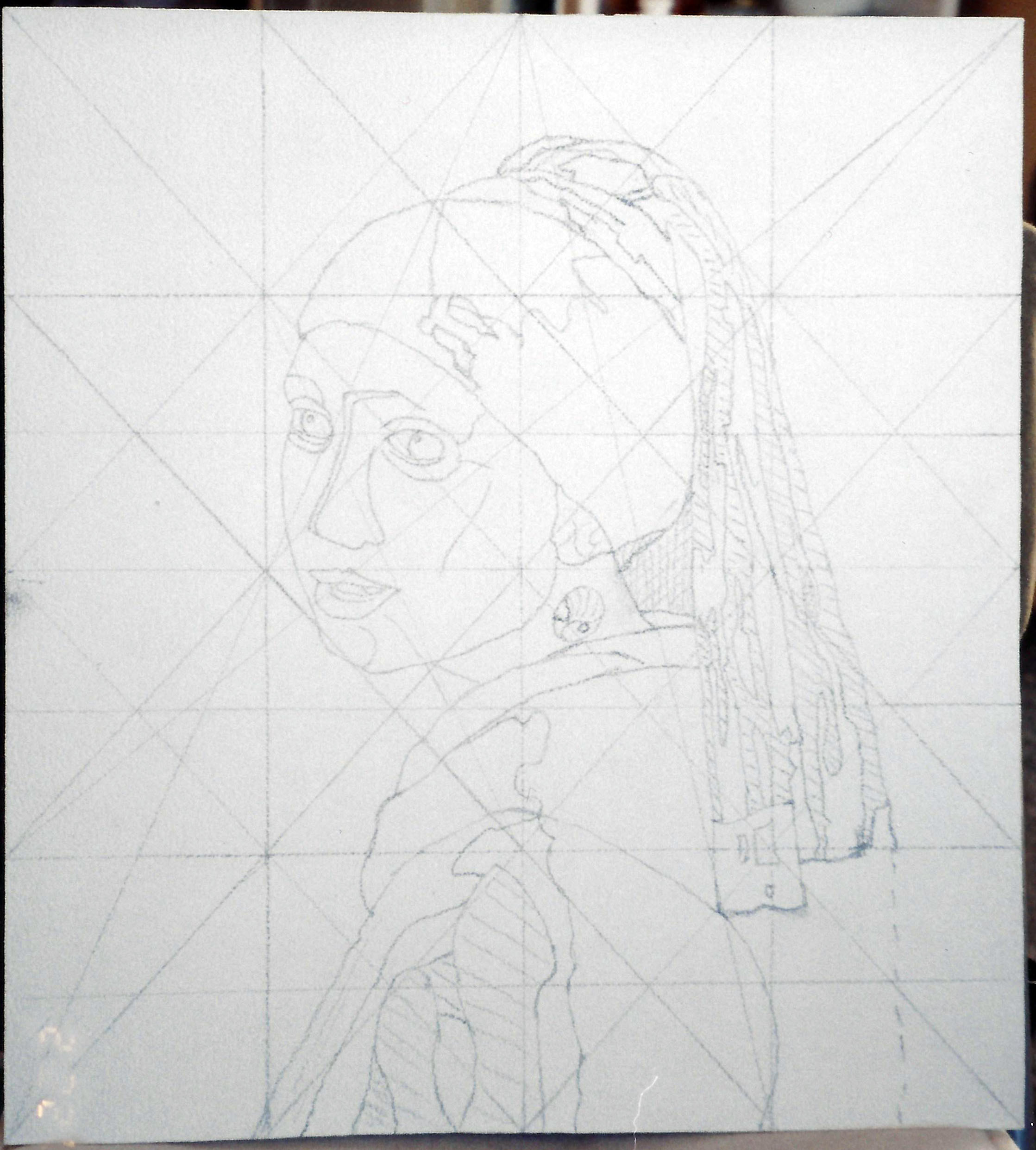
In coming weeks, I will discuss the following: materials, design, compositional unity, applying the Golden Mean, Munsell’s color system and hue, value, and intensity, seven basic color schemes, aerial perspective, the cartoon, accurate enlargement/graphing and transferring to panel, gessoing masonite board, inking the drawing, sculpting with gesso for bas relief, the charcoal study, underpainting, mixing a flesh palette, and colored oil glazes.

It is a lengthy syllabus, but I hope you will profit from the instruction in some way.

Creating fine art is very much a science; therefore, you should come to this training with an open mind and put your previous painting experience on hold for awhile so that you can see with fresh eyes.  This is not quick art, but I promise you that with proper instruction and following the process outlined, along with self-discipline, persistence, and  patience, you can achieve the high degree of quality in your painting you have hoped for.  It is better to spend weeks on one excellent painting that can be considered significant art, than to spend a couple of hurried days on a piece that will end up in the trash.

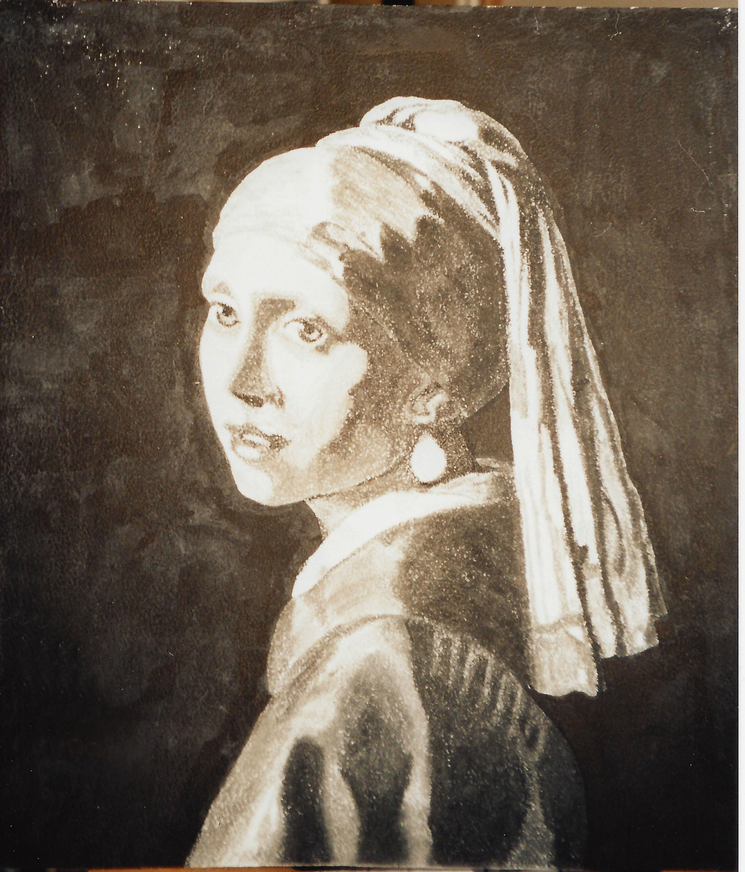
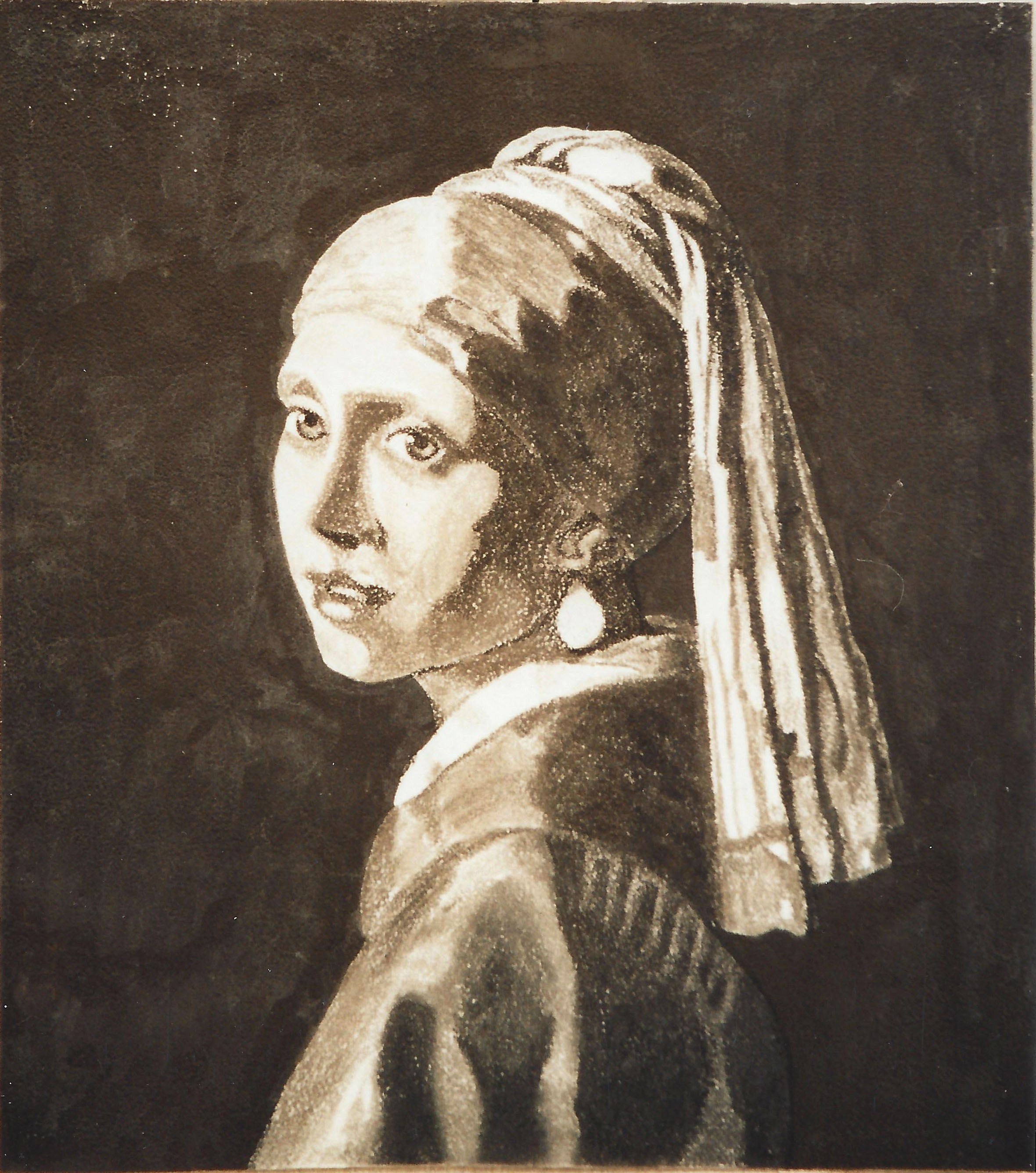
Keep in mind there are preliminaries we will skip for now and come back to later, as I am sure you want to get to the actual creation of a portrait.  Beginning with how to get an accurate drawing, our ultimate purpose here is to get an excellent likeness and end up with a high quality, Renaissance-style classical academic painting that will never find itself in a garage sale.  You will be copying an Old Master oil portrait of your choice–you can paint family AFTER you have learned the basics and “mastered the Masters.”

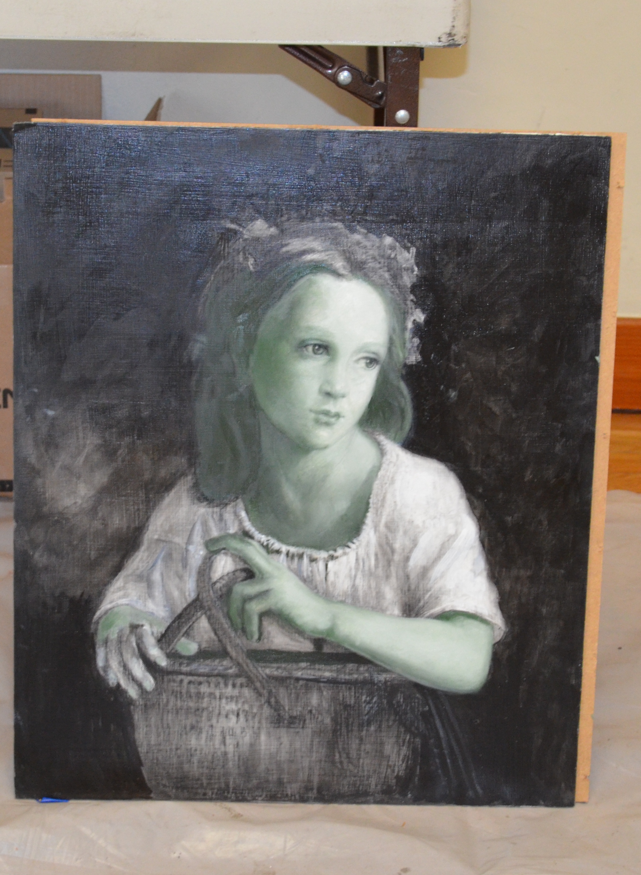
Your first assignment:  Choose an Old Master portrait that you love.  Keep the goal in mind; you are learning the process here, so you will want to choose a picture that is not too complex, has clearly delineated eyes, nose, mouth, hair, clothing, and a simpler background.

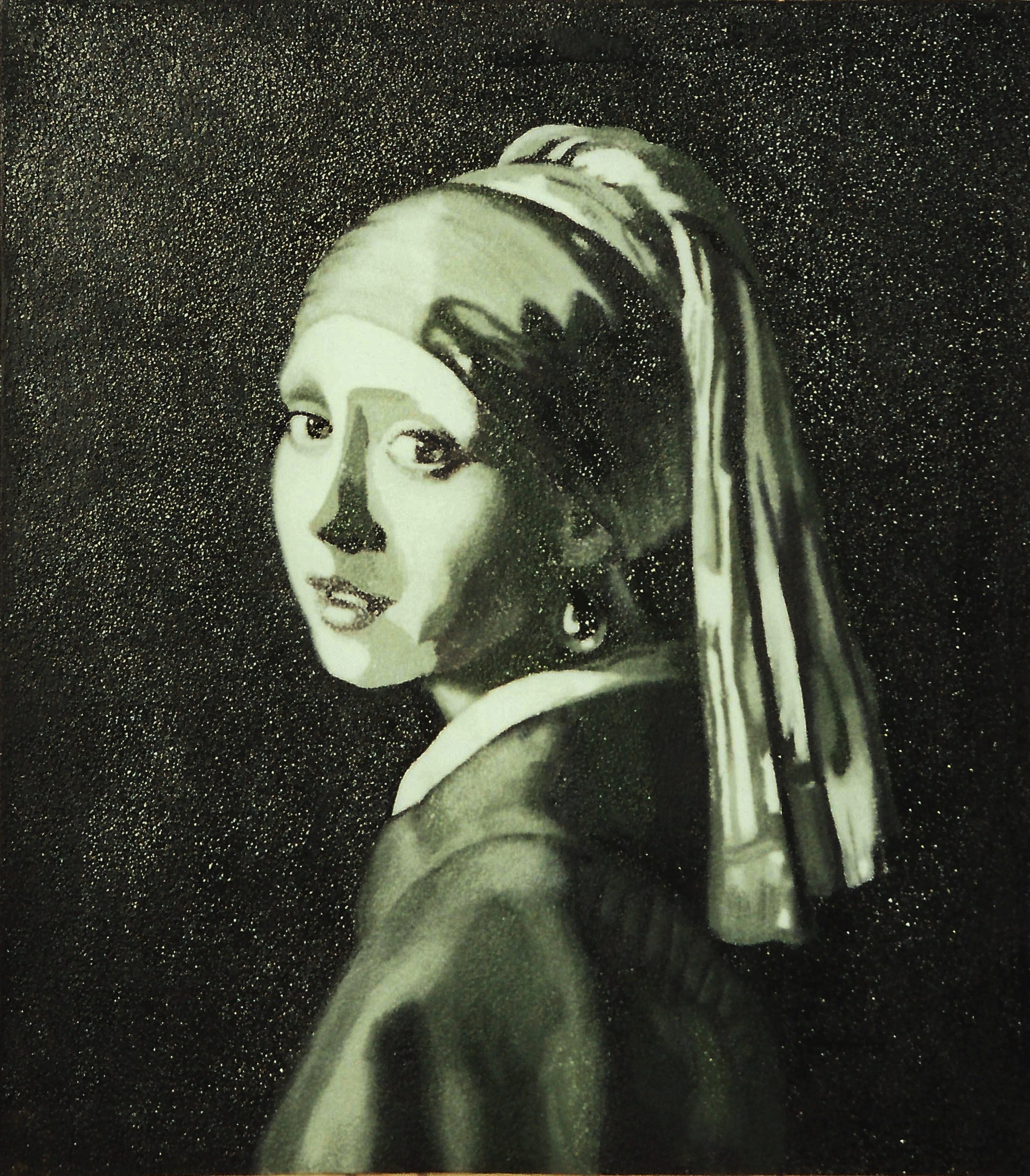
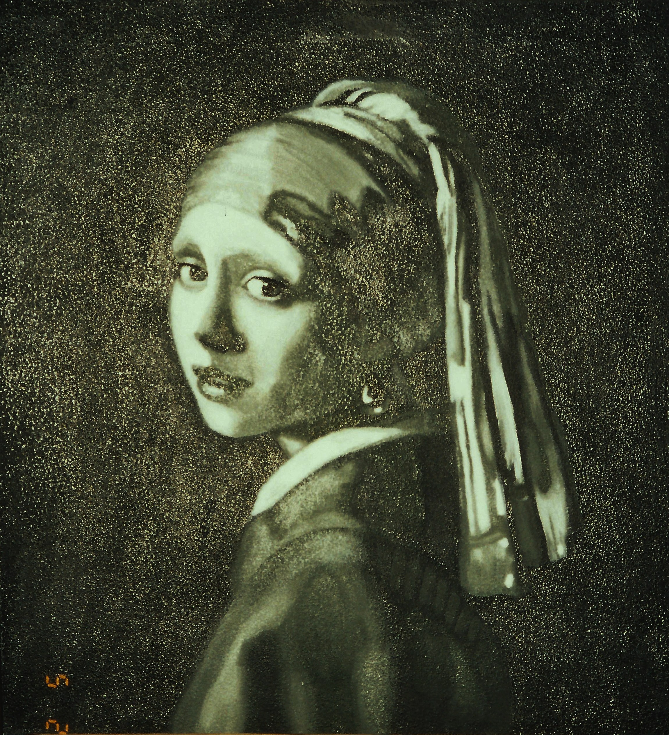
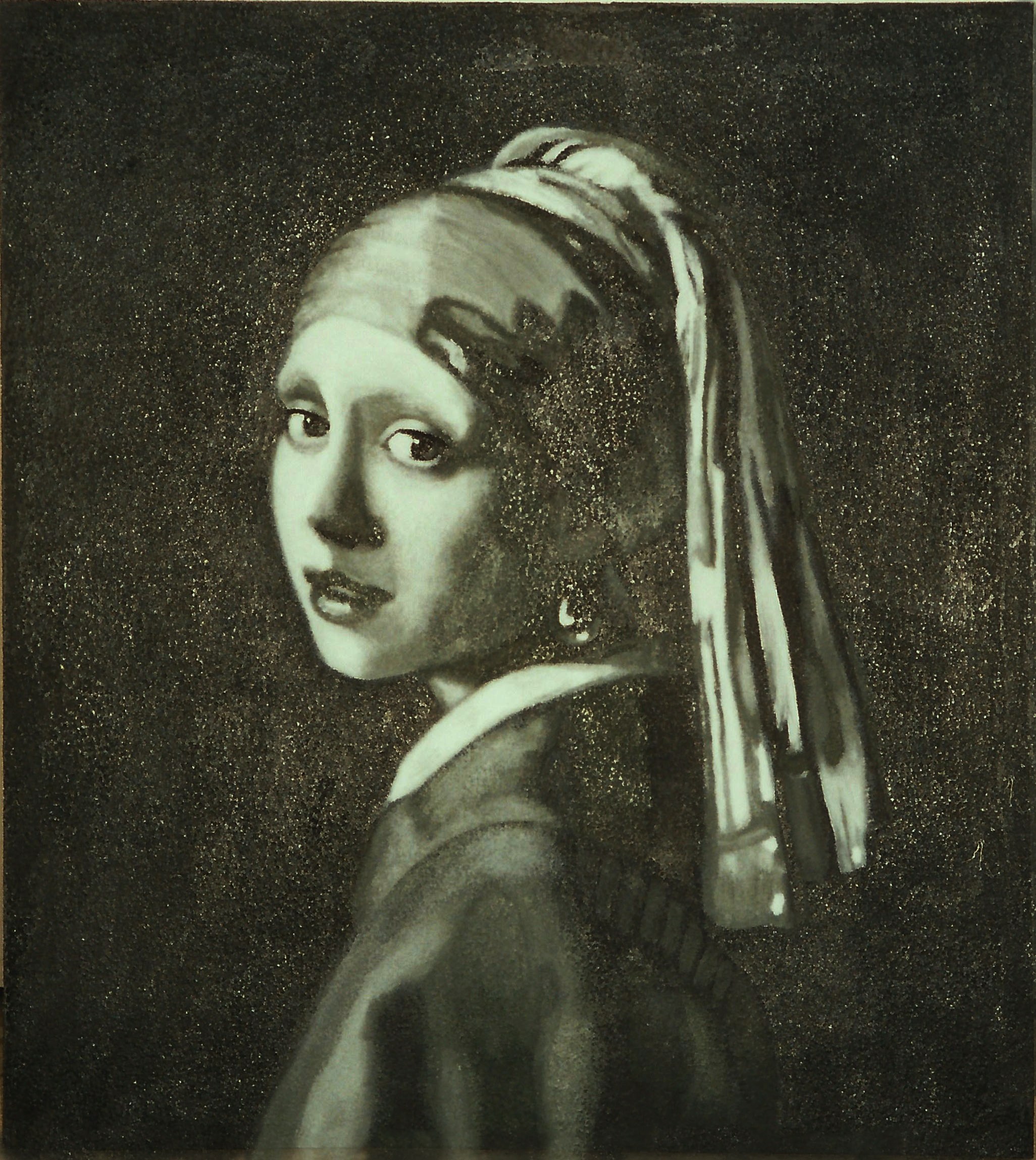
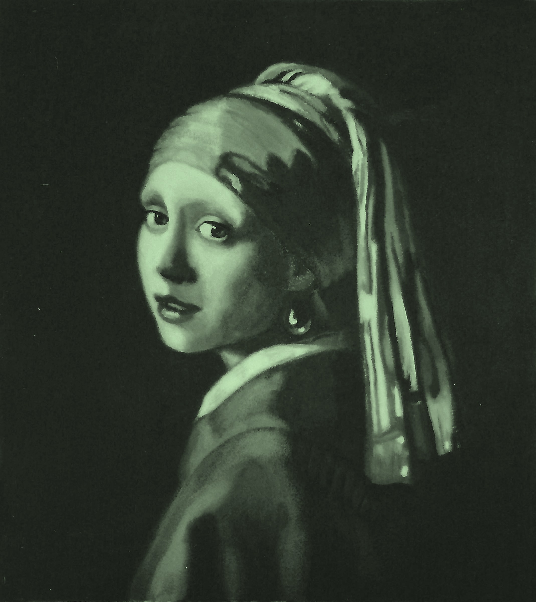
I will be using Vermeer’s Girl with a Pearl Earring.

Make sure your reference is very high resolution, and high quality.  Two superb online sources are the Getty Museum or Art Renewal Center.  You should never undermine your efforts by beginning with inferior reference, as I have seen students who, despite admonition, try this and give up in frustration.

Print the reference on glossy photo paper, as it shows detail much better than other surfaces.  Print one in grayscale and one in color, ledger size if possible, otherwise 8 1/2″ x 11″.  You can put them on a flash drive or CD and have it printed at FedX or any print shop.  It is helpful to save the references on your computer desktop as well, for quick access.  I use my computer to enlarge certain small areas as I go along and need to get a closer look.  The computer, however, will not replace your printouts in this process.

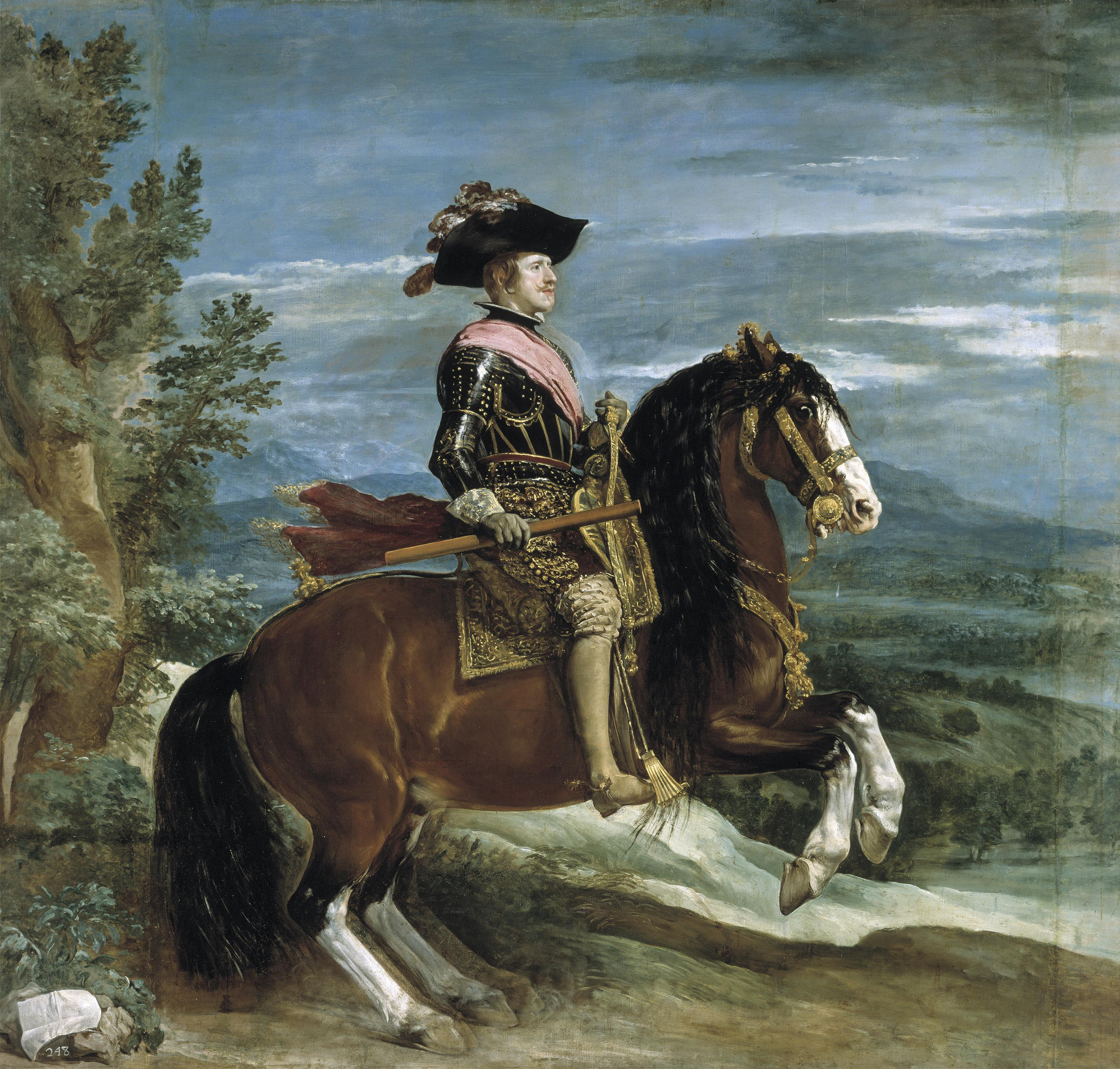
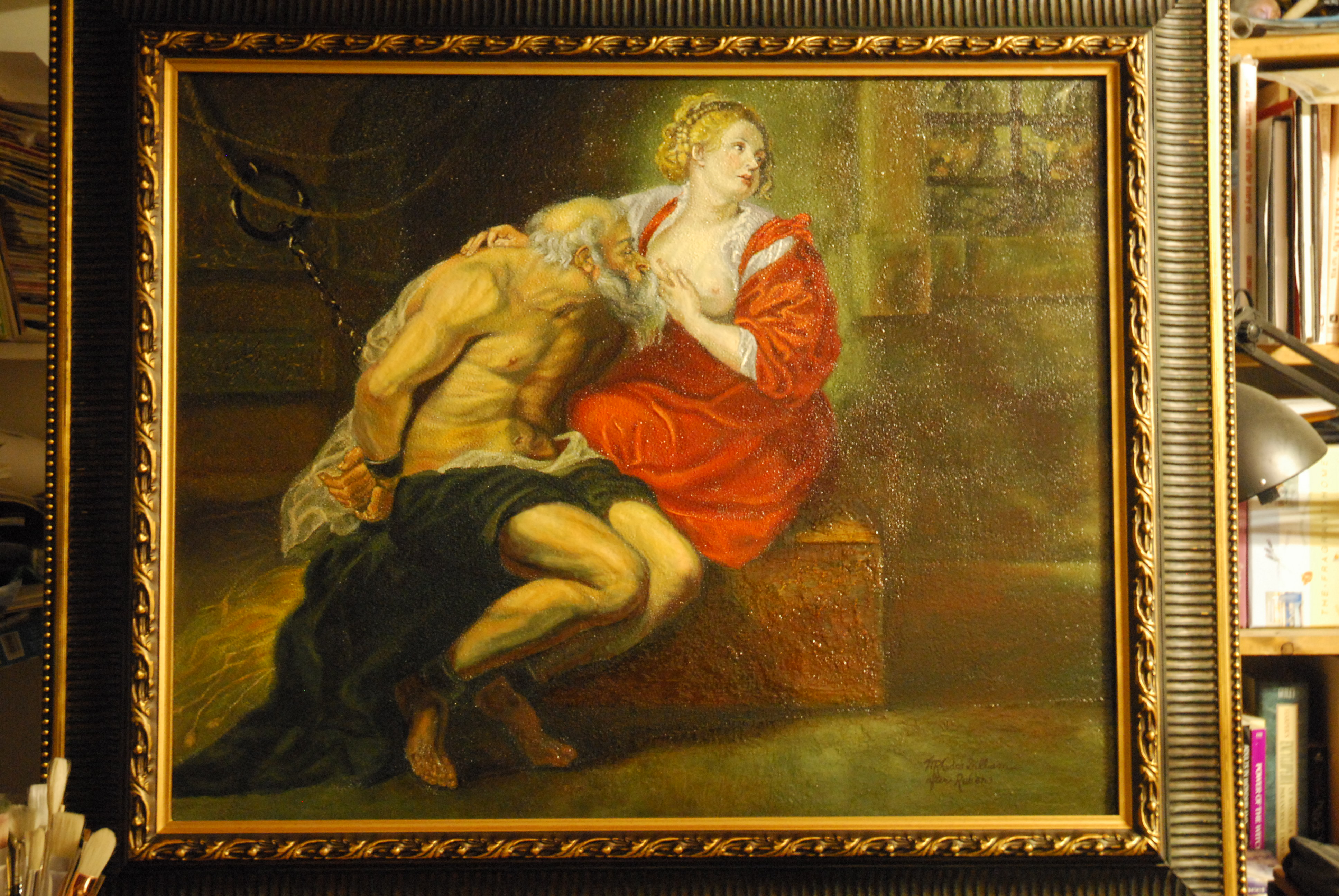
Some Masters to consider for our purposes are (in no particular order):  Titian, Caravaggio, Rubens, Rembrandt, Velasquez, David, Vermeer, Gerome, Godward, Leighton, Alma-Tadema, and Bouguereau are all excellent artists from which to learn, although there are so many more.

GeromeBlackBashi-Bazouk1869-26x32
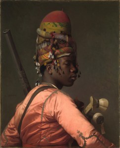
Jean Leon Gerome, Black Bashi-bazouk, 1869, 26×32″
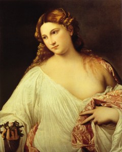
TitianFlora1515-22x31
Titian, Flora, 1515

Here are the materials you will need for the process:

Oil Painting Materials:
references
pens/pencils
extra-fine permanent markers(Sharpies), black, blue, green, red
acetate
General’s charcoal pencils
vine charcoal
blending stumps (tortillions)
metal yardstick
metal 18” ruler
transparent triangle, 18”
kneaded eraser
India ink and liner sable brush
spray workable fixative
Exacto knife
clear tape
artist’s white tape
Golden acrylic matte medium
Masonite or hardwood board
sandpaper very rough #40-60, very smooth #100-200
natural sponge
Knox Gelatin
paint roller for application of gesso
retouch varnish
Liquin
turpentine for brush cleaning
olive oil for brushes, cleaning hands, oiling palette
leak proof turpentine container
easel
plastic wrap
blue paper towels
mahl stick
notebook
palette knives

Brushes:
bright sable #2, 4, 10
flat bristle #2, 4, 10
round sable #1, 8
round bristle #0, 8
mongoose flat #6
mongoose round #0
mongoose filbert #4, 8

Paint:
*titanium white
*flake white
ivory black
mars black
chromium oxide green
pthalo blue
cadmium yellow light
yellow ochre
raw sienna
raw umber
cadmium orange
burnt sienna
burnt umber
cadmium red light
alizarin crimson permanent
cobalt violet
ultramarine violet
French ultramarine blue
cobalt blue
cerulean blue
viridian green
Shiva cadmium green
Grumbacher pthalo yellow green
Winsor and Newton Winsor orange
Indian yellow
napthol red light

*Avoid zinc white (PW4) whenever possible. It is often added to paint colors one would not suspect, such as in titanium white, lead white, and to various other colors to render them more transparent. It is also used as a filler to make them less expensive to manufacture.  Zinc white can make your paintings crack, according to extensive, lengthy studies done with conservators at the National Gallery of Art, Washington.

Also, buy the best quality paint you can afford, as student grade and many professional grades contain excessive aluminum stearate that causes darkening of the paint film over time.  Good commercial brands include professional grades of Utrecht, Williamsburg (both made in the U.S.), Old Holland (Netherlands), and Sennelier (France).  I like the unique textures of handmade paints as well, and buy from colormen like Robert Doak, Michael Harding, and Natural Pigments.

*marble-inclusive gesso
*values palette
*homemade medium

In the next post, we’ll discuss supports, marble-inclusive gesso, and the 9-value (+black and white) palette you will need.

MONA LISA’S SKELETON FOUND?

Leonardo Da Vinci’s model for the Mona Lisa may have been found by a research team in Italy who discovered three skeletons in the basement of a old, now unused convent in Florence last year, where Lisa Gherardini likely spent her final months.

 MonaLisaTomb

Photo by http://www.irishtimes.com/news/world/florence-tomb-opened-in-search-for-mona-lisa-1.1490726

Silvano Vinceti, of Italy’s National Committee for Cultural Heritage, said that another tomb in Florence contains relatives of Lisa Gherardini del Giacondo, probably her son Piero, and that, “Right now we are carrying out carbon-14 tests on three of the eight skeletons found in St. Ursula. The carbon-14 test will tell us which of the three dates back to the 1500s. Only then will we know which skeleton to do the final DNA test on.” After that, they plan to do a digital reconstruction of her face.

For more on this story, go to:

http://www.independent.co.uk/news/world/europe/researchers-open-florence-tomb-in-search-for-identity-of-the-real-mona-lisa-8755463.html

For a picture of the skull:

http://www.independent.co.uk/news/science/archaeology/news/the-dig-that-may-have-unearthed-leonardos-muse-8196544.html

Another version of Mona Lisa discovered:

MonaLisaLouvrePrado

photo by http://www.theartnewspaper.com/articles/Earliest-copy-of-Mona-Lisa-found-in-Prado/25514

http://www.independent.co.uk/arts-entertainment/art/news/so-she-truly-was-leonardos-labour-of-love-7645955.html

The Arizona Renaissance Art Guild does one-week workshop intensives three times per year, and in addition, we get together to paint all day on the third Saturday of every month.  If you are in the Phoenix Metro area and are interested in finding out more or possibly joining our colony, please let me know through this blog.  ~Marsha

FINISHING UP THE DUTCH/FLEMISH PHOTOS

Today, I am posting a lot of photos I took of Dutch/Flemish works that were on exhibit at the de Young and the Getty museums, beginning with Frans van Mieris the Elder (Dutch, 1635-1681). The first is Pictura (Allegory of Painting), 1661, oil on copper. This one was behind glass so please excuse the reflection.

The caption reads, “The allegorical figure shown here represents the art of painting. She holds a palette,, brushes, and a small plaster sculpture. The mask on a chain may refer to art’s deceptive illusions. Instead of being hung on a wall, a painting of this size, like a precious object, would have been kept in a cabinet for close examination. ”

FransVanMierisOilCopperPicturaAllegoryOfPainting

FransVanMierisTheDoctor'sVisit

The Doctor’s Visit, 1667, oil on panel

“Van Mieris was well known for his finely painted works. Here a young woman faints as a doctor examines a vial of her urine. The ostentatious doctor, whose extravagant clothes suggest that he is a quack, was a stock figure in contemporary theater. The erotic painting over the fireplace hints that the woman suffers from lovesickness, while the burning ribbon held by the crying girl was seen at the time as a sign of pregnancy.”

FransVanMierisAYoungWomanFeedingAParrot

A Young Woman Feeding a Parrot, 1663, oil on panel

Painted in the same year as Vermeer‘s “A Woman Holding a Balance,” Van Mieris’ elegant scene was one of the most celebrated and most copied compositions of the time.

The following two Frans Hals paintings are quite large–larger than life.

HalsLucasDeClercque

Lucas de Clercq, Dutch, about 1635, Frans Hals, oil on canvas, 49 13/16 x 36 5/8

HalsFeynaVanSteenkiste

Feyna van Steenkiste, Dutch, about 1635, Frans Hals, oil on canvas, 48 7/16 x 36 5/8

HalsFeynaVanSteenkisteHandsCloseup

Closeup of Feyna’s hands

These two paintings came to the Getty as part of the conservation partnership program. For information on the restoration and removal of old varnish on these two paintings as well as stories about Lucas and Feyna’s lives and additional insights into Hals’ working methods, go to http://www.getty.edu/museum/conservation/partnerships/rijksmuseum_hals/index.html

This painting by Anthony van Dyke was huge. I include the first photo to give you an idea of just how large it was:

AnthonyVanDyckPortraitOfAgostinoPallavicini

AnthonyVanDyckPortraitOfAgostinoPallavicini2

Portrait of Agostino Pallavicini, About 1621, oil on canvas, Anthony van Dyck, Flemish, 1599-1641

“This portrait commemorates the sitter’s service as ambassador of the Republic of Genoa to the newly elected Pope Gregory XV. The artist depicted Agostino Pallavicini, the future head of the state of Genoa, in his sumptuous robes of office, seated before a billowing curtain that bears his family’s coat of arms. The elegant formality of the image exemplifies van Dyck’s highly influential approach to portraiture.”

Note: All text in quotes is taken from the Getty or de Young museum placards posted beside paintings.