VERMEER AT THE GETTY

VermeerWomanInBlue

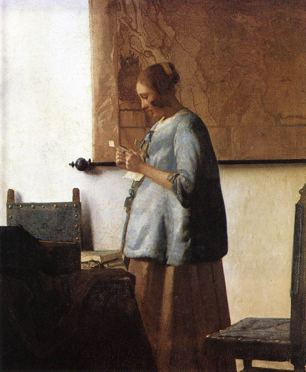
Woman in Blue Reading a Letter, about 1663–64, Johannes Vermeer (Dutch, 1632–1675)

Oil on canvas (18 5/16 x 15 3/8 in.), Rijksmuseum, Amsterdam. On loan from the City of Amsterdam (A. van der Hoop Bequest).

VermeerWomanInBlueBeforeRestoration

Woman in Blue Reading a Letter,  before restoration.

Information from the Getty Museum, Los Angeles:

http://news.getty.edu/press-materials/press-releases/vermeer-masterpiece-woman-in-blue-reading-a-letter.htm

One of Johannes Vermeer’s most celebrated masterpieces, Woman in Blue Reading a Letter, “comes to the Getty on special loan from the Rijksmuseum in Amsterdam, which is completing ten years of extensive renovations this year. Since October 2012, Vermeer’s masterpiece has traveled the world as an “ambassador” for the Rijksmuseum’s remarkable collection of Dutch paintings. Following presentations in Shanghai and São Paulo, Los Angeles is the last and only North American stop on the painting’s tour, after which it will return to Amsterdam in time for the Rijksmuseum’s much-anticipated opening on April 13, 2013.”

“’This truly represents an extraordinary opportunity for Southern California,” explains Timothy Potts, director of the J. Paul Getty Museum. “Vermeer’s Woman in Blue is one of his greatest and most famous masterpieces. It has very rarely traveled outside of Amsterdam and this is the painting’s first visit to the West Coast. Vermeer’s paintings of women reading letters and engaged in other private, domestic activities have a unique intimacy and reality to them that can only be fully appreciated in the flesh. His finest works, like the Woman in Blue, have a magical immediacy that has never been rivaled.’”

“Praised as one of Vermeer’s most beautiful paintings, Woman in Blue Reading a Letter demonstrates the artist’s exceptional command of color, light, and perspective. Portraying a young woman absorbed in a letter, it exemplifies the artist’s ability to create innovative scenes of everyday life imbued with great emotional intensity.  The mystery of the painting makes it even more compelling— although it is most likely a love letter, we do not know who the letter is from, what it is about, or why the painting’s subject is so engrossed by the correspondence.”

“’This small but powerful painting is exquisitely nuanced, with a marvelously balanced composition and refined use of light that creates a soft, diffuse atmosphere,” suggests Anne Woollett, curator of paintings at the Getty Museum. “Vermeer’s extraordinary command of color is apparent here and visitors will surely be taken with the varied hues of blue that he used throughout the painting.’”

“Woman in Blue Reading a Letter was recently cleaned and studied in Amsterdam by the Rijksmuseum’s restoration department. Past treatments were rectified and the yellowed varnish was removed, reestablishing the legibility of the composition. Significantly, the treatment revealed Vermeer’s brilliant range of blue hues, visible in their remarkable intensity for the first time in generations, along with a subtle palette of taupes, yellows, ochres, and whites, which themselves have a bluish tint.”

“Technical studies of the painting, also done at the Rijksmuseum, have revealed that Vermeer made important adjustments to the composition while working on the painting. For example, he extended the left vertical edge of the map on the wall behind the woman toward the window, narrowing the field of white created by the wall. He also eliminated the flared shape of the back of the woman’s blue jacket, emphasizing her vertical presence. Both changes serve to focus the viewer’s attention on the female subject and her thoughts.”

I feel so fortunate to have seen this painting. It is a work of fine, delicate beauty that one must really see to fully appreciate.

Note: All text in quotes is taken from the Getty or de Young museum placards posted beside paintings.

PHOTOGRAPHS OF PAINTINGS AND CAMERA LENS DISTORTION

On our trip to the de Young and Getty museums last week, we took photos of paintings wherever possible. Of course I know it’s difficult for photography to capture the true essence of paintings and their myriad nuances of colors and values, but now I really know it. There aren’t many paintings like Girl with a Pearl Earring with which I have such intimacy, so arriving at a more complete understanding of this was a kind of epiphany for me.

During the painting’s latest restoration (1994), they discovered that Vermeer’s original background had a dark green enamel-like surface, accomplished through the application of glazes. However, the pigments available to him faded so much over 350 years, that the background looked blackish. This was corrected by the restorers and now, you can almost see the brushstrokes of the slightly sketchy transparent earthy-green glaze applied over the dark background underpainting.

Here is a photo of a high-quality postcard I bought, since the de Young did not allow photos of the special exhibit on loan from the Mauritshuis, particularly of the “Dutch Mona Lisa,” as she is called. They had her under guard at all times. Although a photo doesn’t pick up on the background color that well, can you see the slightest hint of  green?

VermeerGirlWithAPearlEarring

And here is a photo of the installation of Vermeer’s Woman in Blue Reading a Letter. Look at how the line curves where the floor and wall meet–this is an excellent example of barrel lens distortion:

vermeerinstall

And on the subject of picture taking, what photography can and cannot do has been discussed and written about ad infinitum, so I won’t go into it much here other than to say that if you are painting from photographs, a solid understanding of the way the camera plays tricks on you is essential. Certainly it matters the quality of camera and lens you use. However, beyond that, you must be aware of how all cameras visually distort images, and then make adjustments in the painting you create from these photos.

For example, make sure to adjust your composition to account for the camera’s barrel distortion (convex lines), pincushion distortion (concave lines),  flattening; and adjust for the fact that reds will “read” much darker in value than they really were when you took the photo. You can make these changes right on you drawing, or they can be adjusted in Photoshop first. We all love what cameras do for us, but be aware that edges will appear sharper and you will have to soften them in your painting to create recession in your work. As Frank Covino always teaches, “Don’t gray the shadows; gray the shadow’s edges.” You must soften edges where you want to round your images and make them appear recessional.

You can always tell when someone paints from photos and is unaware of flattening, for instance. The subject’s hands or feet will appear larger than they are in real life, and out of proportion with the rest of the figure, because hands or feet are typically in front of the figure. You must know this and make them proportionately smaller in your drawing to compensate and adjust sizes to their correct proportions. In other words, don’t make the hands as big as the head, even though they may appear that way in the photo.

You can find out more about the subject of camera distortion at this excellent site: http://www.kenrockwell.com/index.htm

Also, James Gurney at http://www.gurneyjourney.blogspot.com (the famous creator of Dinotopia) has provided an ongoing and wonderfully thorough exploration into how we humans see.

Something that struck me about these exhibits were that, no matter how much impasto the artist used, they began with the smoothest of canvases or boards. I looked up at various angles and marveled at how perfectly prepared they were. I can never seem to get mine that smooth but I continue to search for the trick to it.

Another thing that surprised me was Girl with a Pearl Earring‘s eye color; they are not light golden brown, or blue, or green, or gray. They are gray-blue with the absolute slightest hint of light golden brown, so difficult to describe. I stood there trying to figure out how he accomplished that and if I were trying to duplicate that color without causing the eyes to become greenish, I would paint them gray-blue first, let them dry completely, and then ever so gently, glaze just a small part of the reflected light area of the iris with a golden brown glaze. I still can’t imagine how Vermeer really did it, but that would be how I would approach it.

Below are some other photos (including 2 closeups) I took that you might enjoy:

A Banquet Piece, About 1630, Pieter Claesz, Dutch, 1596/97-1660, Oil on panel

“A shaft of light from an unseen window poetically illuminates the textures and surfaces of a few objects on a stone ledge. This type of still life, known as a “monochrome banquet piece” for its harmonious though limited palette of browns and grays, was an artful invention intended to astonish the viewer with its beauty rather than a portrayal of an actual meal. Imported items such as a peeled lemon and the overturned Venetian-style glass contrast with local oysters and the monumental Dutch drinking glass with a textured stem. Claesz’s nuanced rendering reveals his interest in optical effects, such as the reflected windowpanes and the fall of light across the luminous lemon rind.”  de Young Museum

PieterClaeszTheBanquetPiece

PieterClaeszABanquetPieceCloseup1

PieterClaeszABanquetPieceCloseup

Mars and Venus Surprised by Vulcan, About 1606-10, Joachim Wtewael, Dutch, 1566-1638, Oil on copper

“Here the blacksmith god Vulcan pulls back the fine metal net in which he has trapped his wife, Venus, and her lover, Mars, exposing them to the laughter of their fellow gods. Like other Mannerist painters, Wtewael delighted in complexity and paradox. In this work he presents heroic figures on a tiny scale and Olympian gods in a compromising situation.”

JoachimWte

I had to take this photo through a glass case. I have been experimenting with painting on copper as many of the Old Masters did so, and saw the paintings on copper exhibit at the Phoenix Art Museum many years ago. They are exquisite to this day, with no craquelure. Experts attribute this to the fact that copper expands and contracts at approximately the same rate and temperature as does traditional oil paint.

Note: All text in quotes is taken from the Getty or de Young museum placards posted beside paintings.