RAINBOW HUES

We have already “hammered away” at the importance of Value, so this is a good time to introduce the set of terms devised by Munsell, that help us discuss and reproduce color:

Hue–the name of a specific color as it appears in the color spectrum.
Value–the specific darkness or lightness of a color.
Chroma–the specific intensity (brightness or dullness) of a color.

Color_Wheel_Finished_Website1

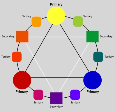
Here, we will address “hue.” Although there are many varied color wheel designs, Munsell incorporates ten basic hues that come from the color of light as seen through a prism, or the rainbow spectrum. By shaping them in a circle, they become the color wheel. They are:

red-purple, red, yellow-red, yellow, yellow-green, green, blue-green, blue, blue-purple, purple

Every color falls into one of these ten basic HUE categories, or possibly between two of them, where reside the interhues.

Most artists have had at least one important teacher. Mine was/is Frank Covino. He designated tube names and value numbers for Munsell’s ten hues.

At first, you may be tempted to gloss over this list, but imagine going to the store and selecting the most useful green, red, or yellow, and then assigning its value as you go, all the while keeping in mind how the colors will all interact, and choosing those that work best together in the largest variety of situations–methinks not the easiest of tasks.  This work has been done for you, here:

Red-purple is Alizarin Crimson, which is a value 1 tube color.
Red is Cadmium Red Light, which is a value 5 tube color.
Yellow-red is Cadmium Orange, a value 7.
Yellow is Cadmium Yellow Light, a value 9.
Yellow-green is Pthalo Yellow Green, value 8.
Green is Cadmium Green, value 1.
Blue-green is Viridian Green, value 1.
Blue is Cerulean Blue, value 3 or 4 (depending on the brand).
Purple-blue is Ultramarine Blue, value 1.
Purple is Cobalt Violet, value 1.

These tube colors should visually disappear when placed on corresponding value numbers in the value chart (Don’t forget to squint, as discussed in the last post.).  If they look like freckles instead of disappearing, you know you either have them in the wrong place, or your value chart is not correct.  That’s why we use the Covino Palette–those values are already prepared for you to start using at once, without a lot of fumbling about.

Follow my blog to get the latest post sent to you.

All the best,

Marsha
WORTH REPEATING

This subject was addressed a long time ago, but it is so critically important that it bears repeating. Of course, it’s about values because, without a thorough understanding of them, you cannot create significant paintings.

Many teachers assume that we all know what “value” in paintings means, so they don’t really elaborate and tell us HOW to see them. The concept is easy to understand when we’re talking about a greyscale, but extrapolate that to color, especially the various colors juxtaposed together to make a painting, and the values concept becomes murky.

You can make an entire painting a monochromatic green or even pink and, as long as those pinks have correct values, your painting will “read” and make sense to the viewer no matter what color you make it. Value is simply how dark or how light that color is.

Yes, but so what? Where’s the “how?” Well, first you have to learn to squint enough at something until the color disappears and you are left with a percentage of light. What amount do you see? Make your own value scale and go around your house placing it next to various objects; squint to make the color disappear so that you can just see the value of the object and not the color. This is a great way to train your eye.

Here is a value scale you can print, showing values 1-9 with the addition of black (which is the absence of light) and white. The lowest value is 1, or 10 % light; the next is 2, or 20% light and so on, up to value 9 at 90%, with white being 100% light:

value scale

When making a painting, values aren’t actual light, of course, but values create the illusion of dark and light in varying degrees (shadows and highlights). Value deals with the lightness or darkness of a color.

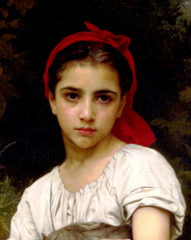
Here is part of Bouguereau’s Vendangeuse (The Grape Picker) in color:
Vendangeuse (The Grape Picker)BouguereauCropped
And here it is in greyscale, showing just the range of lights and darks (aka “values”):

Vendangeuse (The Grape Picker)BouguereauGrayscale

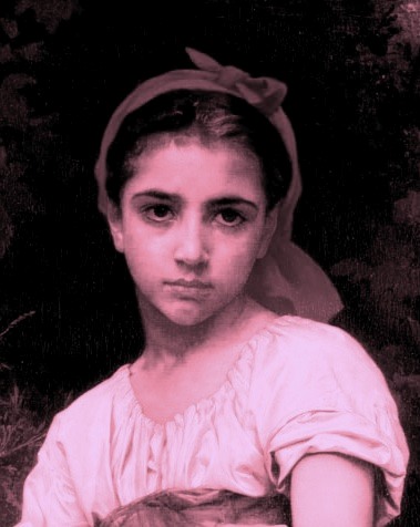
And here is the pink version:

Vendangeuse (The Grape Picker)BouguereauGrayscale

So, even in pink values, we still see the little girl, instead of a Botox Babe.

When we do a value-scale underpainting, we are separating the problems of seeing values in one hue vs. seeing those values in juxtapositions of many colors (hues). This makes the painting much easier to execute, and more accurate, because now you have a process.

And that’s why I say you must know how to see value because value analysis and then value duplication is the basis of all perception. It is the common denominator for the replication of all things, whether landscapes, still lifes, or portraits.

Follow my blog to get the latest post sent to you.

All the best,

Marsha