Palden Gyatso, Glorious Ocean

Hello, Everyone,
I’m excited to let you know that an article about my recently completed painting of Palden Gyatso, Glorious Ocean, has just been published in the East Valley Tribune by writer and reporter, Srianthi Perera.

PaldenGyatsoGloriousOceanCopyResized1JPG

This painting and the story of how it came about is close to my heart, and I am so glad to share it with you. The paper is also packed with other stories that are of interest, no matter where you live. You can pick up a free copy at newsstands in downtown Gilbert or at the Gilbert Museum on the SW corner of Elliot and Gilbert Rd., and you can also read the story online, page 11, at:
https://issuu.com/timespub/docs/evt_0609_southeast_book/1?e=8633901/70436667

Wishing you a fantastic summer,
Marsha Rhodes Gilliam

https://savetibet.org/palden-gyatso-tibetan-monk-who-was-tortured-and-jailed-for-33-years-passes-away/

Mediums, Solvents, and Flashpoints

Medium1   Summer is coming, so I want to caution you all that if you are still using turpentine-type spirits with your oil painting, remember that they can spontaneously combust at 86 degrees fahrenheit–just a mere 86 degrees!  They have the lowest flashpoint, coupled with the highest volatility rating, of any other kind of combustible. So if you leave a paper towel or rag with turpentine on it in your studio, you could have the recipe for a fire.

You can buy a special can and lid made specifically for oily rags, but the least expensive way to ensure safety is to have a metal trash can outside, away from your house, with a little water in it; then drop your rags in there each day when you finish work. Later, you can take the lid off and let the water evaporate, rather than polluting the ground or pouring it down a drain to get in the water system. Then just throw the dried rags in the trash.

Solvent vapors can cause cancer with prolonged exposure, so don’t keep medium and brush cleaning solvent containers open on your taboret any longer than you have to. The less exposure you have over time, the healthier you’re going to stay. If you can’t do without spirits, choose the least damaging kind and keep it stored in an airtight container.

There is a new one out with a flashpoint of 200 degrees, called Turpinoid Odorless Mineral Spirits Light–this doesn’t mean that it’s safe to leave it uncovered, or to breathe deeply just because you can’t smell it, but it is a better alternative because of the lesser fire hazard. Just remember that Turpinoids are not for use in oil painting. They are just for cleaning brushes, because they tend to have residues that can inhibit or prevent complete curing of your paint film.

And remember that solvents of any kind are not for cleaning hands! No, No, No! Instead, use any kind of oil (olive, coconut, baby oil, etc.) followed up by soap. Same with brushes. Remove as much paint as you can from your brushes, then use olive oil to remove the rest, followed up by soap. And speaking of soap, some of you probably already know about this and have some under your sink, but I’m a “newbie” and have just tried Murphy Oil Soap for the first time–I love it. There’s a reason why it’s been around for more than 100 years–what an amazing soap! It so easily and quickly removed oil paint residue from my shirt, that I tried it on my brushes. It cleaned them faster and more thoroughly than anything else I’ve ever tried, and left them soft and beautiful with no residue–and Murphy has 98% natural ingredients and is non-toxic. We keep learning, right?

It is easy and just as effective to create beautiful oil paintings with non-toxic mediums like Oleogel, or Oil of Spike Lavender mixed with artist-grade linseed/stand oil. If you want to glaze, Oleogel (an inert fumed silica) will do that just as well, or better, than toxic mediums made with turpentine. Then use cleanup materials like olive oil, safflower oil, or Oil of Spike Lavender (behaves like turpentine only better), followed up with Murphy’s. Find out more about these products here:

http://www.jerrysartarama.com/lavender-spike-oil-essence

The Chelsea Classical Medium, Lavender Spike Oil Essence, is handcrafted using the finest quality lavender which is imported from Spain. A safer natural alternative …

https://www.naturalpigments.com/oleogel.html

Oleogel is a firm thixotropic gel made with linseed oil and fumed silica. Add to thicken colors for creating impasto effects that do not sink. Contains no driers, so …

https://www.amazon.com/Murphys-134005-Oil-Soap-32-Ounce/dp/B0006ZHCK0

Buy Murphy’s Oil Soap, 32-Ounce on Amazon.com FREE SHIPPING on qualified orders

ART OF THE MASTERS Workshop

Hello, Artists,

gilbertsunnewsarticle6-2016

We are planning a workshop the week of November 14, 2016, which is our only opportunity window for quite a few months. Can you make it? We will also have a Free Prep Day on November 7, a week before the workshop, in order to help you get a wonderful start. The cost for the 5 days is $489.

Art of the Masters Workshop
When: Nov. 14-18, 2016
Where:  Gilbert, Arizona
Time: daily, 9:00 – 5:00

If you feel undecided, maybe now is the time to get off that fence and embrace your true art self. We promise that you will get more step-by-step art instruction in one week with us, than you will get anywhere else, even in workshops that cost more than twice what we charge. We also give you helpful handouts (most art classes don’t) because we want you to be able to remember and continue working on what we’ve taught you. To us, the most important thing is continuing the legacy of the Old Masters, and we are passionate about passing on their wisdom and techniques to others. We would love to have you with us!

And like Maestro Frank Covino always did, we offer $100 off the cost of your tuition for each of your friends that sign up for the class.

Below is a sample of first-time student drawing (24″ x 30″), in preparation for painting.  Amazing, huh!

P1110792

Here are things needed for the Free Prep Day:

Materials for board preparation, graphing, and drawing:
Ampersand Gessobord brand surface
metal yardstick and ruler
ultra-fine Sharpies, various colors (black, blue, and red are probably enough)
General’s charcoal pencils, soft
kneaded eraser
High quality photo of Old Master painting to work from, printed on 8 1/2”x11” glossy photo paper, one grayscale, one color–Art Renewal Center is an excellent online museum source– https://artrenewal.org/pages/search.php
blending stumps (tortillions)
Exacto knife
spray workable fixative
clear tape
acetate

Other helpful items:
transparent 18” triangle
India ink and sable liner brush
artist’s white tape, removable

Please respond below, and we’ll get right back to you!

Marsha and Karen
Art of the Masters

ART OF THE MASTERS Workshop Wonders!

Hello, Artists,

We thought you might want to see some of the work just completed at our first Art of the Masters workshop last week in Gilbert, Arizona.  Karen and I were so proud of our students’ success thus far.  Here are some pictures:

P1110751

Shelly H.  in early stages of drawing At the Fountain, after William-Adolphe Bouguereau, 1897

P1110754

Shelley B. drawing The Laundress, after Jean-Baptiste Greuze, 1761

P1110760

Teachers Marsha Gilliam (in the mirror) and Karen Schmeiser, with student Shelly H.

P1110794

Completed charcoal drawing~

P1110795

Completed drawing with partial verdaccio underpainting~

Below are the students’ drawings alongside actual paintings by Greuze and Bouguereau.  When completed, students’ works will look like these original works, and Shelley and Shelly will have learned much about seeing, drawing and painting during this process of copying the Masters:

P1110792GreuzeTheLaundress1761

P1110788BouguereauAtTheFountain1897

We hope you enjoyed seeing some student work, and hope you will be able to join us for our next event.  Where else can new artists get a five-day workshop with two teachers for $489?  We are in this to perpetuate the systems and processes of the Old Masters, and are planning another workshop in the fall, to be announced.

YOU CAN CAN CAN do this too,

Marsha and Karen 🙂

THE SPIRIT OF FRANK COVINO

CovinoMarshaAndFrankPhoto2009

Hello Artists,

The spirit of Frank Covino visited me this morning and I wound up with white paint on the back of my hand, that had transferred to the sink and countertop before I realized it.  I searched all over but couldn’t find the source, and was blaming the cats for perhaps stealing a tube of my paint–so I was frantically looking for that as well–don’t need any mentally challenged lead-white-eater kitties in my life.

My husband found the source on the underside of a shelf wire in the refrigerator, the result of a paint storing fiasco last week.  I thought I had cleaned it up thoroughly, but I guess not.  It’s amazing how far a little dot of paint can travel when you don’t want it to.

Remember how Frank was so good at getting more paint on our painting tables and on himself, than on our canvases? 🙂  So, two days before Karen Schmeiser and I begin our Art of the Masters workshops in Arizona, I’m guessing Frank stopped by this morning on his Memorial Celebration Day to remind me to loosen up and not be so picky about making a mess with paint.

Frank will always live on in all our hearts and memories of him.  Will you please share below, some of your memories with the rest of us?

Peace.

ART OF THE MASTERS WORKSHOP

ANNOUNCEMENTArt of the Masters classical oil painting workshop, plus free additional day.

Karen Schmeiser and I are carrying on Maestro Frank Covino’s legacy by teaching workshops here in the Phoenix Metro. It was an important decision for us, and since each of us have studied with Frank for over twelve years and we both love teaching, we honor his memory by doing our part to assure that these Old Master techniques do not get lost.

  • Learn to paint like the Old Masters.
  • Receive the expertise of two instructors (Marsha Gilliam and Karen Schmeiser) as you learn the methods of the Old Masters in a 5-day workshop, June 27-July 1, 2016 Open to artists of all levels.  Get more instruction for your money.
  • Cost: $489.  If you check the prices of art workshops these days, you will find they cost nearly twice as much.  A supply list will be provided upon registration.
  • Also included at no extra charge is a free preparation day on June 20, 2016, to help you properly begin your drawing on your painting panel.

YOU can do this! The three most important things to bring with you are your patience, your determination, and an accepting mind.  Here are examples of what you can expect to achieve:

First painting by Karen Schmeiser:

KarenTheShepherdessBouguereau

Copy of The Shepherdess, 1866, after Johann Baptist Hofner

First painting by Marsha Gilliam:

MVC-004F

Copy of Girl with a Pearl Earring, 1665, after Johannes Vermeer

The author and associate editor of the East Valley Tribune, Srianthi Perera, recently published this article about our upcoming workshop, and there is also an article about it just released in The Gilbert Sun News  https://issuu.com/timespub/docs/gsn_june_2016_issue:

MarshaNewspaperArticleEastValleyTribune5-29-16

We hope you will join us–it was a life-changing experience for us, and we hope it will be for you, too.

Sincerely,

Marsha and Karen

PAINTING WORKSHOP IS COMING UP

Hello, Artists~~

The author and associate editor of the East Valley Tribune, Srianthi Perera, just published an eloquent article today about our upcoming workshop.  Karen and I wanted to share it with you:

MarshaNewspaperArticleEastValleyTribune5-29-16

  • Learn to paint like the Old Masters.
  • Receive the expertise of two instructors (Marsha Gilliam and Karen Schmeiser) as you learn the methods of the Old Masters in a 5-day workshop, June 27-July 1, 2016.  Open to artists of all levels.  Get more instruction for your money.
  • Cost: $489.  If you check the prices of art workshops these days, you will find they cost nearly twice as much.

YOU can do this too,

Marsha and Karen

WE’RE STARTING TO TEACH WORKSHOPS–ALL LEVELS ARE WELCOME

ANNOUNCEMENTArt of the Masters oil painting workshop and Open House!!!

  • Learn to paint like the Old Masters.
  • Receive the expertise of two instructors (Marsha Gilliam and Karen Schmeiser) as you learn the methods of the Old Masters in a 5-day workshop, June 27-July 1, 2016.  Open to artists of all levels.  Get more instruction for your money.
  • Interested students are invited to an Open House, May 31, 7:00-8:00 p.m., where you will sign up for the upcoming workshop, receive needed info, and actually see painted models of what you will be creating. Light refreshments will be served.
  • Please RSVP for the Open House (see contact form below).

The three most important things to bring with you are your patience, your determination, and an accepting mind.

Karen Schmeiser and I have decided to carry on Frank Covino’s legacy by teaching workshops here in the Phoenix Metro. It was a big decision for us , but we feel that, since each of us have studied with Frank for over twelve years and we both love teaching, we owe it to him to assure that these Old Master techniques do not get lost.  Here is an example of what you can expect to achieve:

First painting by Karen Schmeiser:

KarenTheShepherdessBouguereau

First painting by Marsha Gilliam:

MVC-004F

YOU can do this too!

All the best to you,

Marsha

CARESSING A FOOT

I just completed this commission, The Apotheosis of Love, on the occasion of a wedding, and my patrons loved it.  It went on a plane to Boston:

PaintingMarshasTheApotheosisOfLoveGlazedCompletedRtchdP1110668

Here it is, framed, with brass title:

PaintingMarshasTheApotheosisOfLoveFramedGlazedCompletedRtchdP1110668

I especially addressed the front foot–I studied the subtle shadows that make it work–or not.  In the first foot picture below, the toes, nails, and veins still need completion, but the most important area that needed altering was on the top front.  It was just slightly too dark–not even half a value–but what a huge difference it made when I lightened it ever-so-slightly!  I am attaching a “before and after,” with the original model, just so you can see what I mean.  Here is the model:

PaintingRefApotheosisFeet

Here, the top front half looks flattened and scooped like a spoon because its value is too dark, even though I followed the model:

ApotheosisFeetStillNeedCompletedToesNailsVeinsCoveredWflesh

and here is the corrected version:

ApotheosisFeetCompleted

Yes, the overall tone of the pictures are different because one was taken at night, but it is the VALUE difference that counts.  The foot, with toes, nails, and veins, is completed in the second picture.  I changed nothing on the drawing itself.  Just the slight value change is all that mattered.

I will eventually come up with a step-by-step to share, but even then, it is mostly just a lot of work, time, and careful observation, stepping back six feet and comparing it to the model, squinting, looking at it through a mirror–you have to pull out all the tricks!  And even when you think you’ve nailed the drawing and the underpainting, the slightest color shift matters, even when the color values you are applying match the value of the underpainting perfectly.

Regarding the importance of slight color shifts, I have a theory that I can find no information about.  Perhaps it already has a name, but I am going to call it something like “How Color Shifts Value Perception.” I wonder if anyone else has observed this phenomenon?  Have you? It would probably be a boring topic for anyone but an artist.

I’m designing another painting that has a tight time limit for completion.  My Aunt Goldie will be 95 years old  in July, and I want to do a painting of her, quilting, since she has been an award-winning quilter all her life.  I have the references, we’re picking up the precut board tomorrow, and I’m doing a square format (24″ x 24″).  This is one of those rare occasions when traditional formats will not work, due to the length of the quilt frame in relation to her body.  I hope to have the drawing finished by the end of next week.   I’ll post it when I can.  There is only one hand showing in the reference, complete with thimble and needle, so it won’t be a good candidate this time for my step-by-step model.

Giclée prints from The Apotheosis of Love will be available soon, and I will write more on its conception in a later post.

Best wishes to you,

Marsha

PAINTING WHITE TO PLEASE THE HUMAN EYE

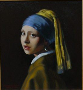
Since Aristotle was the first person we know of that gave serious, objective thought to the rainbow and rainbow color theory, it behooves us as artists to contemplate it as well. This instruction is written as though the artist is new to the concepts of painting in spectrum white color, and approaching the process for the first time. Thus, I apologize in advance if what follows seems overly simplistic, but these details may prove helpful to some.

Firstly, two important points should be mentioned here:

1) When mixing the greyscale, this is how to get a true, neutral set of greys; otherwise, they will tend toward blue: adding just the barest touch of raw umber to the black pile of paint on your palette is important. Preferably use mars black, as it is generally less blue than ivory black. Then lighten a small bit of it to check that you have not added too much umber—this will make it look dirty if you have, and you do not want the whole pile polluted.

2) Although the tube colors for white spectrum are customary for the purposes of demonstration, they are still somewhat flexible. For example, you may find that you have manganese violet in your paint box but not cobalt violet; or you may find that your garment is in a warmer light setting and you would prefer using a violet commensurate with that. It is okay.

It Always Goes Back To Values

However, despite guides and formulae, you must still understand why you are choosing to paint with spectrum white, and be able to determine your darkest and lightest values in the three situations/conditions outlined below: *Light, Shadow, and Sunset. After determining the situation, you look at the garment and think like this: “My darkest dark is a value 3 so, since purple is first on the rainbow spectrum (following their order) and comes out of the tube at value 1, I will lighten my purple with white until it is a value 3. Then, I can tint some grey with it, which should result in a purple-ish white value 3. The next color in the spectrum is ultramarine, so I will lighten that color to a value 4, and then mix it with a value 4 grey,” and so on, up the spectrum.

Remember that, ultimately, we don’t want the whites on our paintings to be white, but we want to portray a colorful rainbow spectrum that viewers perceive as white, thereby adding an almost otherworldly glow and sparkle. However, avoid excessive color in the greyscale.  We want the viewer to remark, “What a vibrant white dress!” not, “Look at all the colors in that dress—what is that supposed to be?”

Paint Mixing

SpectrumWhitePaletteP1110237

Situation 1:  Here are the Munsell/rainbow spectrum colors in the light, by name, from dark to light, and their oil paint equivalents:

  • (*1) Purple —Cobalt Violet (or Dioxazine Purple, or Ultramarine Blue+Alizarin Crimson Perm.)
  • (*1) Purple-Blue —Ultramarine Blue
  • (*3 or 4) Blue —Cerulean Blue (or Phthalo Blue+Phthalo Green)
  • (*1) Blue-Green —Viridian Green (or Phthalo Green)
  • (*5) Green —Cadmium Green (or Hansa Yellow+Viridian)
  • (*8) Yellow-Green —Phthalo Yellow Green (or extra Hansa Yellow+Viridian)
  • (*9) Yellow —Cadmium Yellow Lt.
  • (*7) Yellow-Red —Cadmium Orange
  • (*4 1/2) Red —Napthol Red Lt.
  • (*1) Red-Purple —Alizarin Crimson Permanent (or Phthalo Rose)
                –Titanium White
                –Mars Black

*numbers indicate the value of the color, directly out of the paint tube

Situation 2:  The oil paint colors to use for spectrum white in shadow, dark to light, are:

  • Alizarin Crimson Permanent (or Phthalo Rose)
  • Cobalt Violet (or Dioxazine Purple, or Ultramarine Blue+Alizarin Crimson Perm.)
  • Ultramarine Blue
  • Cerulean Blue (or a mixture of Phthalo Blue+Phthalo Green)

Situation 3:  Finally, although it may seem strange to start in the middle of the spectrum with Cerulean as the darkest value, the list still follows the spectrum order. The oil paint colors to use for sunsets, seascapes, or snow, dark to light, are:

  • Cerulean Blue (or a mixture of Phthalo Blue+Phthalo Green)
  • Ultramarine Blue
  • Cobalt Violet (or Dioxazine Purple, or Ultramarine Blue+Alizarin Crimson Perm.)
  • Alizarin Crimson Permanent (or Phthalo Rose)
  • Napthol Red Lt.
  • Cadmium Orange
  • Cadmium Yellow Lt.

Here is the resulting color chart, and the explanation of each row of the chart:
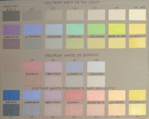
PaintingSpectrumWhiteColorChart        

Situation 1
Row 1, Greyscale, V3-9
Row 2, each color lightened to match respective grey values
Row 3, the result of mixing greys with respective color values
Situation 2
Row 2, lightened to match grey values 5-8
Row 3, the result of mixing greys with respective color values
Situation 3
Row 2, each color lightened to match respective grey values from row 1
Row 3, the result of mixing greys with respective color values

A note here—Sometimes you will need half-steps in your values, so keep in mind that just because you have only 4 colors to use for shadows (for example), does not mean you necessarily have only 4 values to address in your white shadows. You may have 5 or more values in your shadows, so you simply spread these four colors to a broader value range, commensurate with the needs of your painting. The same holds true for the other two situations outlined above.

We must also keep in mind the concept of “reflected light” as it relates to white objects and how they will be affected. Everything that is near your white object or garment, whether it is an apple or a curtain, will be reflected somewhere in that white object or garment, so a way to handle those reflected lights might be to gently glaze the reflected light color on top of the painted spectrum white object after it dries. Of course, the handling of this will be very painting-specific, and the way you accomplish it for one painting, might not be the same for the next, but it is something to keep in mind.

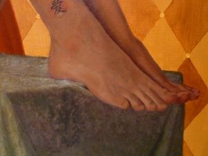
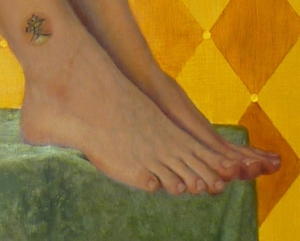
Now What? Analyze which situation applies to your painting, then paint it from dark to light using these instructions.  In a previous post, I have painted a quick example on the use of spectrum white that might be a useful reference.

*A big “thank you” goes to Charlene Higley for differentiating and fine-tuning these three conditions.