HOMAGE TO MY TEACHER AND MENTOR, FRANK COVINO

There is a difference between instructors and teachers–instructors show you how, but teachers provide the “who, what, where, why,” and “how” of a subject.  A teacher teaches you the theoretical aspects of the subject, helps you understand where you are going, why you’re going, and what to do when you get there. To me, that makes a tremendous difference.

All too often, I read articles by painters that parrot my teacher, Frank Covino, but fail to thank him for all they learned.  Since I have been taught by him, I recognize his phraseology instantly. Well, to quote Frank, “It’s never too late to ameliorate,” so, as not to become one of those painters who forgets where they came from, I want to say that Frank’s giving, unselfish nature has truly been a gift I will forever cherish. I learned more about painting in my first week’s study with Frank Covino than I learned in all past workshops (that shall remain nameless), put together. What I learned from him way back then (and continue to learn) led me to see art and painting as truly a process and not a haphazard accident, with logic and a systematic method that removes the guesswork. This allows me to concentrate on creating and making fine-tuned judgments on value and color in my paintings. I will be always grateful to Frank for starting me on this path, as his dedication and striving for perfection in all aspects are inspirational and a great model to emulate. I wonder if he realizes how much so many of his students hold him in awe, and love and respect him for all the lives he has affected in such profound ways.

Covino Portrait1

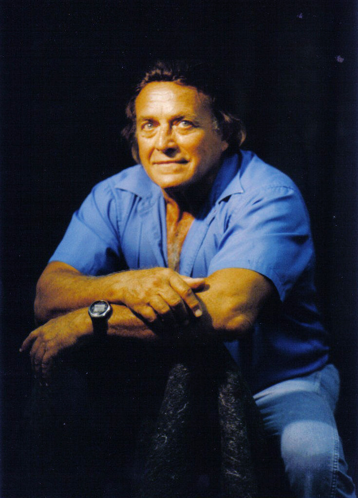
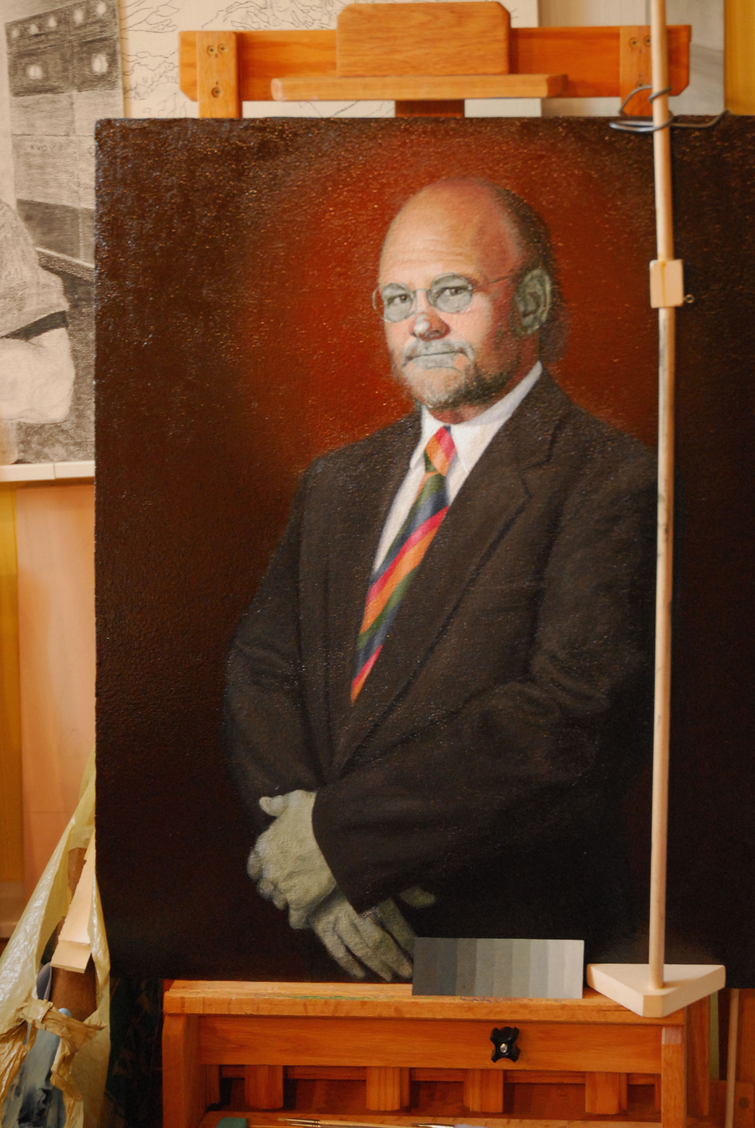
Photo of Frank Covino

Is there some kind of knowledge transference at birth? Perhaps there is, given that Frank Covino has been painting portraits since he was six years old. His mission: “To pass on the classical academic system of painting to the young so it doesn’t get lost.” This craft has been in the Covino family for centuries and, with over fifty years of teaching experience, Frank has made it his life’s work to impart the secrets of the Old Masters.

He reflects, “I teach because I was given an extraordinary, innate gift which revealed itself very early in my life.  History has proven that the most extraordinary artists and musicians were also the best teachers and I like to think that I stand on the shoulders of those giants. Therefore, to exploit that gift would be a sacrilege. Thus, I will continue to teach as long as there are students who seek my guidance as it is my obligation to preserve this ancient tradition of my Italian ancestors.”

In this blog I’m writing, A Pigment of Your Imagination, I hope to pass on some of what I have learned as well.

ON THE IMPORTANCE OF THE GOLDEN MEAN

We recognize whether an art object has good proportion or not by whether it is pleasing to our eye (or not), although we may not always be able to say why.  This phenomenon is related to the Golden Mean, a proportion that goes all the way back to antiquity. It is an aspect of beauty that we can easily adopt in our designs and be assured of success.

A portrait that goes to the waist will look more visually pleasing than one that goes to the armpit.  Why?  It is the Golden Mean.  The head in relation to the torso is the Golden Mean Ratio of 1:1.6, or 3 parts wide and 5 parts tall.

DennisVerdaccioWordpress1

Portrait in progress by Marsha Rhodes Gilliam

DennisVerdaccioWordpress

Portrait in progress by Marsha Rhodes Gilliam

You will find that most Renaissance portraits are done in ¾ view with the model looking back at the spectator because, if you run a central divisional line right down the face, there will be one part of the face to one side of the division, and 1.6 parts to the other side of the division—the Golden Mean.

This Golden Ratio was used extensively by Leonardo da Vinci.  Look at his Last Supper and notice how the primary dimensions of the center, the room and the table were based on it.  You can also see it in Leonardo’s Mona Lisa; here are some Golden Mean divisions, superimposed:

MonaLisaGoldenMean

Image Source From: http://in2visualdesign.blogspot.com/2011/04/week-7-golden-ratio.html

In addition to the Renaissance Old Masters, many other famous painters from Dali and Seurat, to Bouguereau and Burne-Jones have made extensive use of the ratio as well.

THE GOLDEN MEAN WILL NEVER FAIL YOU. 

As a painter, you must create unity in your composition to make its message and visual impact cohesive.  Unity is the constant characteristic of all great art, and designing with the repetition of ratios helps to create and maintain that cohesion. Unity is an essential attribute of superior art, whether a portrait, landscape, or still life, and the repetition of ANY ratio will add unity (but the Golden Mean is best).

Let us say you wanted to do a landscape with 20% ground and 80% clouds (2:10 ratio).  You would make the composition more visually pleasing by including a stand of trees placed at the proper ratio.  Divide your surface horizontally into 10 parts and, at 2 parts of 10, place the trees; that ratio of 2:10 echoes the ratio of ground to sky.  And the more often you echo that ratio, even to the construction of rocks and trees, the more unity your painting will have and the more visually pleasing it will be.

When designing, do a geometric pattern that adheres to the Golden Mean first.  Then drop in recognizable images to take the place of those geometric patterns.

5 is to 13 as 1 is to 1.618.  In other words, since the Golden Mean is actually a hair less than 1/3, one of the easiest ways to implement the ratio in your paintings is to apply the Rule of Thirds on your design to guide you in your placement of important focal areas.  Divide your drawing surface by placing a “tic-tac-toe” of nine equal blocks on it. The four points where the lines intersect indicate the best points for high interest locations.  The human eye likes these areas and gravitates toward them. Avoid centering your subject. In addition, don’t place your horizon line across the center of your composition—use one of the horizontal grid lines instead. You can break any of those nine areas down further by dividing into thirds again, then again, depending upon your design objectives.

RuleOfThirdsCat

Image Source From: http://www.alibony.com/graphics/def_rule_of_thirds.html

WHAT’S THE VALUE OF THIS?

You must have a thorough understanding of the critical role values play in order to create significant paintings.  I think back to the days when the concept of values was enigmatic to me.  I read about it in books and heard teachers refer to it, but somehow the true “value” of this eluded me, partly because I didn’t want to stop and take the time to learn it–I would rather play with all the beautiful colors.  So at first, the idea that values of gray would make up much of most of my paintings did not excite my visual sense—boring is the word springing to mind.

But once my thorough, process-oriented teacher, Frank Covino, explained it, the light came on in my head and I understood–then I was able to do it, kind of like riding a bike. This may seem to be an odd comparison, but this was how it felt to me. Once I understand something, many related things make more sense, thus giving me that aha moment when I can finally experience the ride, rather than falling off the bike because I’m still searching to find my balance.

Anyway, it was when the “aha” happened that values became real to me then, and I started actually seeing instead of just looking.  I went around squinting at everything, internalizing and honing my newfound ability.  My husband told me that people were staring at me.  He used to tease me and say, “your eyes will get wrinkly doing that.”  And then he started doing it himself just to see what the fuss was all about.

People all learn in different ways, and I am one of those who needs a process—I have a hard time with things when people put something in front of me and say, “Do this,” without explaining how. That’s what a process provides for me. You can make an entire painting a monochromatic green or even pink and, as long as those pinks have correct values, your painting will “read” and make sense to the viewer no matter what color you make it.

And that’s why I say you must know your values because value analysis and then value duplication is the basis of all perception.  It is the common denominator for the replication of all things, whether landscapes, still lifes, or portraits.

Yes, but so what? Where’s the “how?” Well, first you have to learn to squint enough at something until the color disappears and you are left with a percentage of light. What amount do you see? Keep your eyes squinted and go look at the world in a new way, and we will talk about values more in-depth in later posts.

Here is a value scale showing values 1-9 with the addition of black (the absence of light) and white.  The lowest value is 1, or 10 % light; the next is 2, or 20% light and so on, up to value 9 at 90%, with white being 100% light:

value scale

FIGURE DRAWING PRACTICE

Here is a figure drawing site I just have to tell you about. I’ve been using it for years and it is fabulous. I don’t know exactly how many poses it has but certainly over 1,000 assorted males, females, a few children, and some hands, all categorized in a variety of ways for easy navigation. You have the option of making them full-screen, and you can rotate each pose a full 360 degrees to choose the one just right for your composition. The program is also able to give you a series of thirty-second poses so that you can do some quick-sketching practice, or study the notans that are available. This is a free site but if you find it as useful as I do, I’m sure the site owner wouldn’t mind a contribution. It’s called “posemaniacs,” located at:

www.posemaniacs.com

I hope you enjoy it!

PART 2–OTHER INFO I PROVIDE TO BUYERS

Here is the second page of information (referred to in yesterday’s post) that I provide to patrons so they can become more acquainted with the process that goes into creating their classical-style painting. Its title is “On The Process and Materials Used in Your Painting” and here is the link and the text:

Painting-ProcessMaterialsUsedinYourPainting

I hope you find it helpful.

On The Process and Materials

Used in Your Painting


This painting was created with the finest professional materials,

following the procedures of the Old Masters of the Renaissance. 

The process begins with a carefully selected piece of marine-grade

plywood from fine-grained hardwood or masonite.  The Old Masters

would have used this if it had been available since it does not split

or crack like wood panel, and is highly resistant to warping.


Six to ten coats of Renaissance Bonded Marble are applied to create

a highly reflective white surface.  The ground needs to be as white as

possible because the oil binding in the paint becomes more

translucent with age, thus more light from the white ground is

refracted through it.  This is why the Old Master paintings seem to

have so much depth and luminosity.


Preparatory sketches are used to make a complete, highly-detailed

charcoal drawing directly onto the surface.


Following that, a precise underpainting is executed in verdaccio,

azuraccio, grisaille, or bistre, depending upon the subject.


The medium used is made from these ingredients:

a.  the finest purified, cold-pressed, clear golden linseed oil;

b.  stand oil, used extensively by the Old Masters;

c.  triple-rectified turpentine, the most important of the painter’s

essential oils;

d.  and, dammar varnish is included in the medium, as well as

being the final protective (and removable) coat.


I believe it is the professional painter’s responsibility to warrant

their patron’s trust by ensuring that their purchase will endure the

ages.  I use as few mass-market art materials as possible.  I make

my own dammar varnish and stand oil and trust two or three cottage

colormen for mulling and preparing my tubes of oil paint, thereby allowing

me more personal control over the quality of pigment and grinding oils used.

~~Marsha Rhodes Gilliam

© Marsha Gilliam 2005

PART 1: CARING FOR CLASSICAL-STYLE OIL PAINTINGS

When I sell a painting, I always make sure to teach people how to care for it.  I can’t expect them to already know this; they appreciate fine art but generally don’t create it themselves.  So here are the instructions I provide with the painting to make it easier for buyers, AND to assure that my “progeny” going out into the world will stand a chance of surviving a few hundred years.

I also include a synopsis of the process I used to create it, which will probably be of more value to a later restorer than the owner, but it does let them know all the pains I went through to provide them with a top-quality product.  I’ll post my synopsis of “Process and Materials Used” tomorrow but, in the meantime, here is Part 1,  the care instructions:

Painting-Caring for Your Classical Oil Painting

  Caring for Your Classical Oil Painting

1.  Apply Vaseline on the inside front edge of the frame
where the painting will touch.  This prevents the painting
surface from damage by sticking to the frame.

2.  Avoid extremes of temperature for long periods.  In an
ideal world such as a museum, paintings are maintained
at 68-72 degrees with 40-55 percent humidity.

3.  Do not hang your painting on an uninsulated outer wall, or
where sunlight will hit and cause it to fade, or where heavy
smoke from cigarettes or a wood fireplace will discolor it.

4.  Every two months, examine the lighter colors to see if
they are losing their sheen.  It is important that I re-glaze
these colors in preparation for the final varnish.  When this
process ceases and the painting fully cures (about 6-12 months
in Arizona), I will apply a final coat of protective varnish.  Once
dry, it is safe to lightly and very occasionally clean off the
surface dust with a damp, lint-free cloth (water only).

5.  Hang the painting so that it tilts slightly forward at the top.
This helps keep dust off and cuts down on reflected light.

6.  When lighting the painting, triangulated track lights are
ideal.  Given the bonded marble texture, this provides even
light from both sides and minimizes cast shadows and
reflections on the museum finish.

ANOTHER VERMEER, JUST DOWN THE ROAD…

well, almost.  I just found out about it so we have decided to visit the Getty Center as well, on our way to the deYoung in San Francisco.  Here are some of the details:

http://www.getty.edu/art/exhibitions/vermeer/index.html

Vermeer’s Woman in Blue Reading a Letter (ca. 1663-64), on loan from Amsterdam’s Rijksmuseum, is being exhibited at the Getty Center in Los Angeles, daily through March 31, 2013.  It will then go back to its home for the grand reopening of the Rijksmuseum on April 13, 2013, after extensive renovation.

From the Getty Museum site:

“Woman in Blue Reading a Letter represents one of Vermeer’s most enigmatic depictions of a new theme in Dutch genre painting (subjects from everyday life): well-to-do women in domestic settings, often so preoccupied that they are oblivious to the viewer’s gaze. This special installation highlights the variety of artistic contributions to the popular theme of the intimate interior in the 1660s to complement Vermeer’s quiet, harmonious reader. Gerard ter Borch’s Music Lesson, Jan Steen’s Drawing Lesson, Pieter de Hooch’s Woman Preparing Bread and Butter for a Boy, and Frans van Mieris’s The Doctor’s Visit from the Getty Museum’s collection, as well as Gabriel Metsu’s An Elegant Lady Writing at Her Desk with a Dog beside Her (on loan from a private collection in New York) share refined brushwork and dazzling illusionism in the rendering of highly-constructed private spaces.”

In addition, they are exhibiting a pair of large Franz Hals‘ paintings which will also go back to Amsterdam on March 31st.

Lucas de Clercq by Frans Hals (ca. 1635)

Image

Feyna van Steenkiste by Frans Hals (ca. 1635)

Image

Here is more info from the Getty:

“About the Sitters–Lucas de Clercq (about 1603–1652) was a wealthy Haarlem merchant who dealt in potash (an alkaline material used in bleaching), bleached linens, and linen yarn.  Lucas married Feyna van Steenkiste (1603/4–1640), whose family was also involved in Haarlem’s linen and bleaching enterprises, in 1626.  Lucas de Clercq and his wife were prominent members of the extensive Mennonite community in Haarlem, most of whom were involved in the city’s textile industries. Proponents of non-resistance, Mennonites strove to follow the example of the apostles and to live a modest life. Both Lucas and Feyna are dressed modestly in sober black garments that do not ostentatiously display their wealth and social standing.”

Apparently, these paintings have never been in the Western United States until now, and who knows when they will return.

A VISIT FROM VERMEER, et al

http://www.mauritshuis.nl/index.aspx?chapterID=9017
The “Dutch Mona Lisa,” Girl with a Pearl Earring, is now showing at the de Young Museum in San Francisco, along with 35 other works by the Dutch Masters! Next, it moves to the High Museum of Art in Atlanta, and last on the three-museum tour will be the Frick Collection in New York. The show will only make these three stops in the U.S. so, for many of us, this may be a once-in-a-lifetime chance to see this.

The Mauritshuis is renovating and expanding, so they are sending some of their best paintings on tour. The last time (1995) Girl with a Pearl Earring was in the U.S. was at the National Gallery in Washington, where lines to see it circled the block; the time before that was in 1984 at the Met in New York City.

Paintings in the exhibit include:

Goldfinch, Fabritius, 1654
Goldfinch_C._Fabritius
“Tronie” of a Man with a Feathered Beret, Rembrandt, ca. 1635
Tronie’ of a Man with a Feathered Beret rembrandt
The Way You Hear It, Is The Way You Sing It, Steen, ca. 1665
The Way You Hear it is the Way You Sing it by Jan Steen
Girl with a Pearl Earring, Vermeer, ca. 1665
Girl with a Pearl Earring Vermeer
View of Haarlem with Bleaching Grounds, van Ruisdael, 1670–1675
View of Haarlem with Bleaching Grounds van Ruisdael

Girl with a Pearl Earring was last restored in 1994 and at that time, restorers discovered that Vermeer used organic pigments, indigo and weld, in the background. Thus, he intended it to be a deep green color accomplished with glazes, but these glazes have faded over time.

Interestingly, more recent Vermeer research points to the image being a “tronie,” or “face,” a term for figures not intended to be identifiable (like a genre painting). Tronies are often in elaborate or exotic costumes and the portrait, whether done using a sitter or not, would be sold without identifying the model.

My husband and I will be going to the show in San Francisco in late March, at which time I will probably discover that I need to come back home and put some green glazes over the background of my Girl with a Pearl Earring (see post, Feb. 23, 2013). Thank goodness for art books, but there is nothing like seeing the real paintings hanging on the wall.

For more information:

http://deyoung.famsf.org/pressroom/pressreleases/girl-pearl-earring-dutch-paintings-mauritshuis
de Young Museum, San Francisco
Girl with a Pearl Earring: Dutch Paintings from the Mauritshuis
January 26, 2013 – June 2, 2013

https://www.high.org/Press/Press-Releases/2012/January/High-Museum-of-Art-to-Bring-Girl-with-a-Pearl-Earring-to-Southeast-for-the-First-Time-in-2013.aspx
High Museum of Art, Atlanta
Girl with a Pearl Earring: Dutch Paintings from the Mauritshuis
June 22, 2013 – September 29, 2013

http://www.frick.org/exhibitions/mauritshuis
The Frick Collection, New York City
An abbreviated show of 10 paintings, including Girl with a Pearl Earring by Johannes Vermeer, The Goldfinch by Carel Fabritius, and As the Old Sing, So Twitter the Young and Girl Eating Oysters by Jan Steen.

GIRL WITH A PEARL EARRING

As promised in yesterday’s “comments,” here is my copy of Vermeer‘s Girl with a Pearl Earring. In future, I will take you through my process–a quite involved one, but it speaks for itself. It is not for everyone’s temperament, and does require much patience. Certainly it isn’t the only method I use, but it does produce good paintings; and of course, there are all the planning, sketches, and design preliminaries one goes through. More on this later, as I bring it together for you in a logical and, what I hope will be, an easy to understand method.

Image

Girl with a Pearl Earring after Vermeer, by Marsha Rhodes Gilliam

WELCOME TO MY ART BLOG~A TINY PAINTING ON QUARTZ CRYSTAL…

and I am the farthest thing from a miniaturist.  This is the first post of my new blog and here I am talking more about radio than painting.  My husband is an NPR radio engineer and Ham Radio operator, and he just gave me a teeny, thin quartz crystal from a damaged oscillator unit.  He said, “Can you use this for anything with your artwork?”
I looked at the 3/4″ x 3/4″ piece of lovely translucence and imagined a very small portrait with an led edge-lit display and an ornate magnifying glass on a goosneck.  It could be attached to the side of a larger matted frame (6″ x 6″?) for viewing the painting (Otherwise, you wouldn’t be able to see it very well with the naked eye!).
Normally, I do life-size classical realism so this art tributary would be a diametric departure for me.  Do I have brushes tiny enough?  I would need a magnifier of my own just to create something this small. Strange how the painting muse strikes.  What do you think?
Image
Anyway, this new blog of mine will be an amalgam of art techniques, step-by-step processes, conversation we share together, books, and art “flotsam and jetsam,” that colloquial reference to miscellanea.  I welcome your conversation and hope you will share your wisdom and discoveries.

Marsha Rhodes Gilliam